Band 5.0 IELTS Writing Task 1 Model Answer
Overall Band Score: 5.0 · Cambridge IELTS 18 · 2026-11-10
IELTS Writing Task 1 question
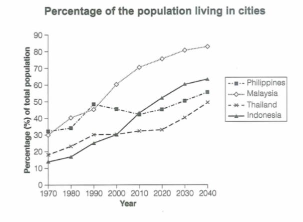
The graph below gives information about the percentage of the population in four Asian countries living in cities from 1970 to 2020, with predictions for 2030 and 2040. Summarize the information by selecting and reporting the main features and make comparisons where relevant.
Student answer (Band 5.0)
This graph is showing percentage of the population four asian countries linving in cities from 1970 to 2020 and also prediction for 2030 to 2040.
Here Indonesia statistics showing in 1970 they had around 10.4% population in cities, 1980 little more increase to around 10.5% then 1990 more increase toaround 20.3%, 2000 had 20.5%, 2010 more increase to 40.1% , 2020 it increased to around 50%.There is also some predictions 2030 will be around 50.9% and in 2040 will be around around 60.1%
For Thailand statistics accrding tp 1970 they had population around 10.9% then 1980 around 20.1%, 1990 had around 20.9%,in 2000 also was same no any change,but in 2010 slightly improve to around 30% , in 2020 also silghtly more improve to 30%. There is also some predictions in 2030 will be around 30.8% and in 2040 will be around 50.2%.
Next is Malaysia staticstics according to 1970 they had 30% population in cities, in 1080 it increase to around 30.9%, in 1990 it increase to around 40.3%, in 2000 high increase to around 60%, in 2010 more increase to around 7.2% then in 2020 it increase to 70.8%.There is also some statistics in 2030 it will be around 80% and in 2040 it will be around 80.5%.
So the final one is Philippines, according to 1970 statistics their population had around 30.2%, in 1980 had around 30.3% , in 1990 had around 40.9%, in 2000 had around 40.7% then in 2020 slightly more increase to arpund 40.8%.There is also some predictions in 2030 it will be around 50% and in 2040 it will be around50.2%.
So if we compare populatin of these four countries for cities, there is mostly different population statics many of countries. but her in 2000 the statistics of Indonesia and Thailand match exactly. Also in 2010 for Indonesia and Philippines matchs records.
AI examiner evaluation
| Criterion | Band |
|---|---|
| Task Achievement / Task Response | 4.0 |
| Coherence and Cohesion | 5.5 |
| Lexical Resource | 5.0 |
| Grammatical Range and Accuracy | 5.0 |
| Overall | 5.0 |
Task Achievement / Task Response: Band 4.0
You identify all four countries and attempt to report changes across the period, but the account is largely a sequence of figures rather than a clear summary of the main features. Several values are substantially inaccurate: for example, Indonesia starts at about 14%, not 10.4%, and reaches about 64% by 2040, not 60.1%; Malaysia is about 71% in 2010, not 7.2%. The Philippines also falls after 1990 before rising again, a key pattern your account misses, and its 2010 figure is omitted. The closing comparison is useful in principle, but the 2010 claim that Indonesia and the Philippines match is not supported by the chart. Add a concise overview of the main trends and check figures against the graph.
Coherence and Cohesion: Band 5.5
The response is divided into paragraphs by country, which gives the reader a basic way to follow the information, and sequencing phrases such as “Next” and “So the final one” signal transitions. However, the organisation is mostly a repeated year-by-year list, with little grouping of related trends or comparison between countries until the final paragraph. That ending introduces comparisons abruptly, and the claim about matching figures is unclear and inaccurate. Some transitions are mechanical, while long run-on passages and missing spaces after full stops make the progression harder to follow. A stronger structure would use an introduction, a brief overview, and two body paragraphs grouping countries by their trends, with comparisons integrated throughout.
Lexical Resource: Band 5.0
You use a basic set of relevant terms, including “population,” “increase,” “predictions,” and “compare,” so the general subject is usually understandable. However, vocabulary is repetitive and several word choices or forms are inaccurate, such as “statistics” where “figures” or “proportion” would be more natural, and “slightly improve” for a change in a percentage. Spelling errors—including “linving,” “accrding,” “staticstics,” and “populatin”—are frequent enough to distract the reader. Some phrases, such as “no any change” and “high increase,” are not idiomatic. Build a more precise range for describing trends and comparisons, and proofread spelling and collocations carefully.
Grammatical Range and Accuracy: Band 5.0
Most sentences use simple reporting patterns, and the reader can often identify the intended year and figure. However, the range is limited, and errors recur in sentence structure, articles, agreement, and tense. For example, “This graph is showing percentage” lacks an article and uses an awkward progressive form; “in 2000 also was same” has an incomplete structure; and “their population had around 30.2%” does not form a clear grammatical relationship between the population and the percentage. Several sentences run together without appropriate punctuation, as in the Indonesia paragraph. Practise accurate patterns such as “the proportion rose from X to Y” and “it is projected to reach Y,” then vary these with correctly formed comparison clauses.
See this exact question answered at other band scores. The same prompt compared across bands.
Browse more IELTS Writing model answers or get your own writing scored by the same AI examiner.