Band 4.5 IELTS Writing Task 1 Model Answer
Overall Band Score: 4.5 · Cambridge IELTS 18 · 2026-11-10
IELTS Writing Task 1 question
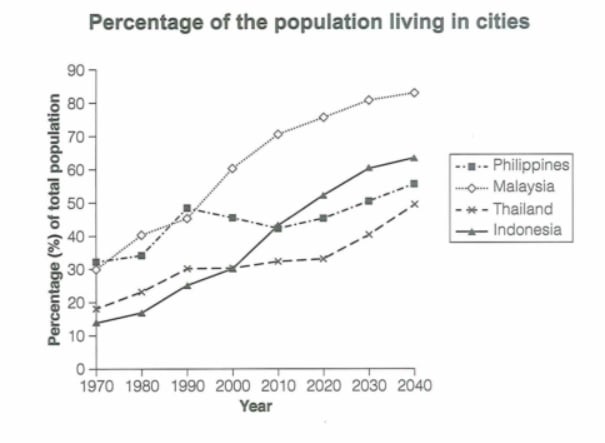
The graph below gives information about the percentage of the population in four Asian countries living in cities from 1970 to 2020, with predictions for 2030 and 2040. Summarize the information by selecting and reporting the main features and make comparisons where relevant.
Student answer (Band 4.5)
"The line graph illustrates different proportions of the population living in cities according to
different years.The country of malaysia was approximately 15%in 1970 and then its rosed
90% in 2040. The country of philppines 30%in 1970 then gradually decreased and at end it was gradullay increased 50%in 2040.The country of thailand 20%in 1970 then its rosed to 40% in 2040.The country of indonesia was 10%in 1970 then it was rosed 60%in 2040.Overall,the country of indonesia was lowest.And the country of malaysia was highest.These are the two axis mentioned on the line graph.On x-axis different years 1970 to 2040 and on y-axis 0,10,20 to 90 were mentioned in which different percentages of population four Asian countries which lived in different countres present.And after some predictions for 2030 ad 2040 these values were mention in the line chart.These data were shown the different countries of philppiness,Malaysia,Thailand and indoenisa which affects this line graph."
AI examiner evaluation
| Criterion | Band |
|---|---|
| Task Achievement / Task Response | 4.5 |
| Coherence and Cohesion | 4.0 |
| Lexical Resource | 5.0 |
| Grammatical Range and Accuracy | 4.5 |
| Overall | 4.5 |
Task Achievement / Task Response: Band 4.5
You identify the topic and make a basic overall comparison by saying Indonesia was lowest and Malaysia highest. However, the account is only partial and several key figures are inaccurate: Malaysia starts at about 30%, not 15%, and reaches roughly 84%, rather than 90%; Indonesia begins at about 14%, not 10%. The Philippines does not simply decrease before rising: it peaks around 48% in 1990, falls to about 43% in 2010, then increases. The response also gives little coverage of the middle years or the countries’ changing relative positions. Focus on the main trends across the period and support the overview with accurate, selected figures.
Coherence and Cohesion: Band 4.0
The response contains some relevant information, and the opening identifies the graph’s subject. However, ideas are not arranged into a clear report structure: country figures, the overview, and a description of the axes are mixed together in one paragraph. The repeated pattern “The country of…” makes the account feel like a list, while “Overall” appears after several details rather than introducing a clear summary. The final sentences repeat the chart labels without advancing the comparison. Organise the response into an introduction, an overview of the main trends, and one or two paragraphs comparing the countries. Use linking expressions to show contrasts and changes over time, rather than repeating the same sentence pattern.
Lexical Resource: Band 5.0
You use basic task-related vocabulary such as “population,” “percentage,” “decreased,” and “increased,” so the general subject is understandable. However, the range is limited and several word choices or forms are inaccurate, including “its rosed,” “different countres,” and “these values were mention.” Repetition of “country” and “different” also limits precision, and the explanation of the axes uses words without adding useful data description. Build a small range of accurate trend language and use it to compare the series, for example, describing a figure as rising, falling, remaining stable, or overtaking another. Check spelling and word forms carefully, especially country names and common reporting verbs.
Grammatical Range and Accuracy: Band 4.5
The response relies mainly on short, simple statements, with little variety in sentence structure. Frequent errors affect clarity, as in “The country of malaysia was approximately 15%in 1970 and then its rosed 90% in 2040,” where the verb form and the relationship between the figures are unclear. Other examples include missing spaces after punctuation, “Overall,the country,” and incomplete or awkward constructions such as “in which different percentages … were mentioned.” Use complete sentences with a clear subject and verb, and practise accurate past-tense descriptions and future predictions. A few well-controlled complex sentences using “while,” “whereas,” or “by” would help express comparisons more clearly.
See this exact question answered at other band scores. The same prompt compared across bands.
Browse more IELTS Writing model answers or get your own writing scored by the same AI examiner.