Band 5.5 IELTS Writing Task 1 Model Answer
Overall Band Score: 5.5 · Cambridge IELTS 18 · 2026-11-10
IELTS Writing Task 1 question
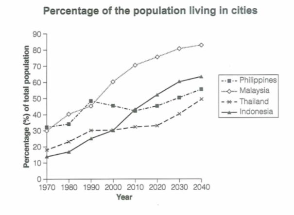
The graph below gives information about the percentage of the population in four Asian countries living in cities from 1970 to 2020, with predictions for 2030 and 2040. Summarize the information by selecting and reporting the main features and make comparisons where relevant.
Student answer (Band 5.5)
The Line Graph shows the population in four countries living in cities from 1970 to 2020 and their have also some prediction for 2020 to 2040 with analysis of previous years data.
The lowest perecentage is about 12% in 1970 and highest perecent is 61% of Indonesia in 2040 which is prediction based. The low and high percent of Thailand is 18% and 49% . The minimum percent ratio of total population of Malaysia is about 30% and maximum percent is 86% in by analyzing pervious years data. The highest percent of total population of Philippines is 55% and lowest is 32%.
Overall, If we talk about Indonesia population percentage in 1970 its around 12% and its rises with years. Analysis of Thailand population percentage is 18% in 1970 and its line increase but decline in 1990 which means that is time when population percentage goes to decrease and then its constantly increases. If we see the Malaysia , its initial year means 1970 percentage is 30% and its rapidly increases as compared to other Asian countries. Lastly we see Philippines , in 1970 its percentage is 32% and randomly increases and decreases year to year.
AI examiner evaluation
| Criterion | Band |
|---|---|
| Task Achievement / Task Response | 5.5 |
| Coherence and Cohesion | 5.5 |
| Lexical Resource | 5.0 |
| Grammatical Range and Accuracy | 5.0 |
| Overall | 5.5 |
Task Achievement / Task Response: Band 5.5
You identify the four countries and include several starting and ending figures, so the response is relevant to the graph. However, the main trends are only partly and sometimes inaccurately reported. For example, Indonesia rises from about 14% to 64%, rather than from 12% to 61%, and Malaysia ends at about 84%, not 86%; these are small discrepancies, but the overview also misses that Malaysia becomes the most urbanised country and that the Philippines fluctuates before rising again. The claim that Thailand declines after 1990 is incorrect: its share increases gradually throughout. The opening also gives an unclear time span for the predictions. Select the most important overall comparisons and describe each trend accurately, rather than listing isolated minimums and maximums.
Coherence and Cohesion: Band 5.5
The response has some paragraphing and a recognisable attempt to group information: the second paragraph gives figures, while the final paragraph discusses countries in turn. However, the progression is not consistently clear, and the overview is not separated effectively from detailed reporting. Repeated openings such as “If we talk about,” “Analysis of,” and “If we see” make the account feel like a sequence of loosely connected comments. Some links also lead into unclear or contradictory ideas, particularly the statement that Thailand declines after 1990. Organise the response around an overview followed by meaningful comparisons, such as the strongest growth and the contrasting Philippine pattern. Use linking phrases to show relationships between trends, not simply to introduce each country.
Lexical Resource: Band 5.0
You use some relevant graph vocabulary, including “percentage,” “prediction,” “increases,” and “decreases,” and the reader can generally identify the topic. However, the range is limited and several expressions are imprecise or unnatural, such as “minimum percent ratio,” “randomly increases,” and “by analyzing previous years data.” Repetition of “population percentage” and “percent” also makes the description less flexible. There are noticeable spelling errors, including “perecentage,” “perecent,” and “pervious,” which reduce accuracy. Aim for concise, conventional language for describing data: for example, say that a figure “rose steadily” or “fluctuated,” and refer to the “proportion of the population living in cities.” Check spelling and avoid using “analysis” where a direct description is clearer.
Grammatical Range and Accuracy: Band 5.0
The response attempts some longer sentences, but control is inconsistent, and many sentences contain errors that make the relationships between ideas difficult to follow. For example, “The Line Graph shows … and their have also some prediction” has faulty clause structure, while “its rises with years” and “its line increase” show problems with verb forms and agreement. Sentence boundaries and punctuation are also unreliable, as in “Overall, If we talk about Indonesia population percentage in 1970 its around 12% and its rises with years.” Most sentences rely on simple patterns or joined clauses rather than controlled variety. Practise accurate subject–verb agreement, articles and possessives, and separate complete ideas with full stops. Then add a few well-controlled complex sentences to compare trends.
See this exact question answered at other band scores. The same prompt compared across bands.
Browse more IELTS Writing model answers or get your own writing scored by the same AI examiner.