Band 5.0 IELTS Writing Task 1 Model Answer
Overall Band Score: 5.0 · Cambridge IELTS 18 · 2026-11-11
IELTS Writing Task 1 question
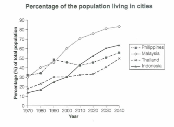
The graph below gives information about the percentage of the population in four Asian countries living in cities from 1970 to 2020, with predictions for 2030 and 2040. Summarize the information by selecting and reporting the main features and make comparisons where relevant.
Student answer (Band 5.0)
The graph below illustrate information about the percenage of the population in four asian countries living in cities from 1970 to 2020, with predictions for 2030 and 2040.
It can be seen that the population in Philippines had a moderate change due to the fact that In 1970,it began from 30 percentage and in 2020 it lies on 45 percentage and it also grew in next two decade and lies on 48 percent.While the population of Malaysia grew rapidly between 1970 to 2020 because it began from just 31 percent and it lies on 70 percent in 2020 and also grew in upcoming years.The population of Thailand had a moderate change and grew slightly between these 70 years due to the fact that it began from from 19 and lies on 40 percentage in 2040.The population of Indonesia grew dramatically because it lies from just 14 percentage and lies on 48 percentage in 2020 and also increase in upcoming 20 years and lie on 60 in 2040.
Overall,it can be seen that the population of these four countries of asia increase between 1970 to 2020 and also grew in upcomming 20 years.
AI examiner evaluation
| Criterion | Band |
|---|---|
| Task Achievement / Task Response | 5.5 |
| Coherence and Cohesion | 5.0 |
| Lexical Resource | 5.0 |
| Grammatical Range and Accuracy | 5.0 |
| Overall | 5.0 |
Task Achievement / Task Response: Band 5.5
You identify the general upward trend and make relevant comparisons, including Malaysia’s rapid growth and Indonesia’s substantial rise. However, the account is only partly accurate and the main features are not clearly prioritised. For example, the Philippines reaches about 48% in 1990, then falls before rising again; your description instead says it grows from 45% in 2020 to 48% later. Thailand is around 33.5% in 2020 and 49.5% in 2040, rather than 40% in 2040, while Indonesia is about 52% in 2020 and 64% in 2040. The overview also says all countries increased, but does not highlight that Malaysia is highest by the end. Select accurate key figures and summarise the contrasting patterns more clearly.
Coherence and Cohesion: Band 5.0
The response has a basic sequence: it introduces the graph, discusses the four countries, and ends with an overall statement. This gives the reader some organisation, and phrases such as “while” signal a comparison. However, most information is packed into one long paragraph, so the country-by-country details and overview are not clearly separated. Linking expressions such as “because” and “due to the fact that” are repeated and do not always show a clear relationship between the figures. The final overview largely repeats the general rise already mentioned. Use distinct paragraphs for the overview and details, group countries by similar or contrasting trends, and use concise links to make the progression easier to follow.
Lexical Resource: Band 5.0
You use some relevant vocabulary for describing trends, including “grew rapidly,” “moderate change,” and “grew dramatically,” so the general meaning is usually understandable. However, the range is limited and several phrases are repetitive or imprecise. “The population … lies on 45 percentage” is not a natural way to report a proportion, and “upcoming years” is less suitable for describing forecast data. There are also noticeable spelling and word-form errors, such as “percenage,” “upcomming,” and “asia.” Aim for precise chart language such as “the proportion of the population living in cities stood at…” and vary trend verbs while keeping them accurate. Check spelling and avoid repeating “lies” and “grew.”
Grammatical Range and Accuracy: Band 5.0
You attempt to combine ideas using clauses with “because,” “while,” and “that,” but the sentence structures are often difficult to control, and errors occur frequently. For example, “The graph below illustrate” has subject–verb disagreement, while “the population in Philippines had” needs an article and a more suitable tense for describing the chart. Several sentences run together without appropriate punctuation, as in “45 percentage and it also grew…”. Tense and agreement are also inconsistent in “increase” and “lie” when describing past and forecast figures. Use a wider mix of shorter, controlled sentences and carefully check subject–verb agreement, articles, verb tense, and sentence boundaries.
See this exact question answered at other band scores. The same prompt compared across bands.
Browse more IELTS Writing model answers or get your own writing scored by the same AI examiner.