Band 5.0 IELTS Writing Task 1 Model Answer
Overall Band Score: 5.0 · Cambridge IELTS 18 · 2026-11-11
IELTS Writing Task 1 question
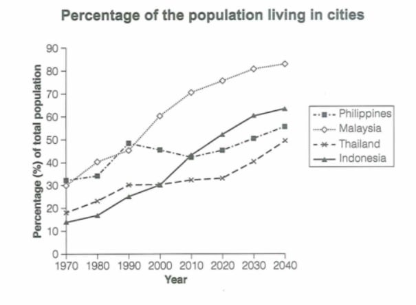
The graph below gives information about the percentage of the population in four Asian countries living in cities from 1970 to 2020, with predictions for 2030 and 2040. Summarize the information by selecting and reporting the main features and make comparisons where relevant.
Student answer (Band 5.0)
Graph contains information about percentage of population in four asian countries who are living in cities from 1970 to 2020, it also predict about the graph will grow up till 2040 onward from 2030. Generally it can be seen that with time people liked to move to cities for better life. The highest increase occur for Malaysia and indonesia during 1970 to arround 2000. Then after a short pause this value started to increase again abrubtly. As for Philippines there is rise and fall in the graph. Lowest number of indonasian population in cities shown during 1970 to 1980. Then there was increase in the number during 1980 to 1990. during 1990 to 2010 number started to decline with slight increase till 2020. But it is predicted that number will increase from 2030 to onward. unlike indonesia in Thailand population increased stabily during 1970 to 2020, and there is prediction that it will increase gradually.
AI examiner evaluation
| Criterion | Band |
|---|---|
| Task Achievement / Task Response | 4.5 |
| Coherence and Cohesion | 4.5 |
| Lexical Resource | 5.0 |
| Grammatical Range and Accuracy | 5.0 |
| Overall | 5.0 |
Task Achievement / Task Response: Band 4.5
You identify the general subject and mention several relevant patterns, including Malaysia’s rise and the Philippines’ fluctuations. However, the response only minimally covers the chart’s main features and includes important inaccuracies. For example, you say Indonesia declined from 1990 to 2010, whereas its urban population rose from about 25% to 43%; the decline in that period belongs to the Philippines. The claim that Malaysia and Indonesia had their highest increase before 2000 also overlooks Malaysia’s continued strong growth and Indonesia’s sharp rise after 2000. The overview that people moved to cities “for better life” is not shown by the graph. Focus on accurate comparisons across all four countries and summarise the overall ranking and projected trends.
Coherence and Cohesion: Band 4.5
There is some attempt to organise the response chronologically, using phrases such as “during 1970 to 1980” and “from 2030 to onward.” However, the ideas are presented as one continuous paragraph, and the sequence is difficult to follow because the discussion shifts between countries and periods without a clear plan. The repeated use of “Then” and “during” creates a mechanical progression, while references such as “this value” do not clearly identify which country or figure is meant. Group the information into a brief overview and focused paragraphs comparing related trends—for example, the stronger growth in Malaysia and Indonesia, followed by the more moderate patterns in Thailand and the Philippines. Use clear links between those comparisons.
Lexical Resource: Band 5.0
Your vocabulary is sufficient to communicate the basic topic, with relevant terms such as “percentage,” “population,” “increase,” and “decline.” However, the range is limited and several expressions are imprecise or unnatural for describing a graph. “The graph will grow up” does not clearly describe a projected percentage, and “people liked to move to cities for better life” introduces an unsupported explanation. There are also noticeable spelling errors, including “arround,” “abrubtly,” and “indonasian,” which reduce accuracy. Build a more precise set of trend expressions and use them consistently to describe figures rather than people’s motives. For example, describe a percentage as rising, falling, remaining stable, or being projected to increase.
Grammatical Range and Accuracy: Band 5.0
You attempt some longer sentences and use time clauses, but the range of sentence structures is limited and errors occur frequently. The opening sentence joins two independent ideas with a comma: “Graph contains information …, it also predict …”; it also lacks an article and has incorrect subject–verb agreement. Other examples include “The highest increase occur” and “population increased stabily,” where verb forms or agreement are inaccurate. Capitalisation and punctuation are inconsistent, particularly at the starts of sentences and around country names. These errors sometimes make relationships between ideas harder to understand. Practise forming accurate simple sentences first, then combine them with controlled clauses such as “while” or “whereas,” checking articles, tense, agreement, and sentence boundaries.
See this exact question answered at other band scores. The same prompt compared across bands.
Browse more IELTS Writing model answers or get your own writing scored by the same AI examiner.