Band 5.0 IELTS Writing Task 1 Model Answer
Overall Band Score: 5.0 · Cambridge IELTS 18 · 2026-11-13
IELTS Writing Task 1 question
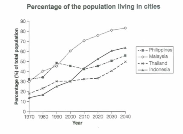
The graph below gives information about the percentage of the population in four Asian countries living in cities from 1970 to 2020, with predictions for 2030 and 2040. Summarize the information by selecting and reporting the main features and make comparisons where relevant.
Student answer (Band 5.0)
The vertical graph provides data about the percentage of population in four major asian countries living in cities between 1970 to 2020, with expectations for 2030 and 2040 by comaring their total population.
Overall, Malaysia has the highest percentage of tal population in cities, while thailand has the lowest population living in cities.
This graph shows the percentage of population living in different cities in asia, and also anticipate the future population in cities in coming years. Philippines has about 30% of total population living in cities in 1970 and 1980, nearly 50% in 1990, 48% in 2000, 45% in 2010, again 48% in 2020, it is expected to be 50% in 2030, and 55% in 2040, Malaysia has 30% of its total population living in cities in 1970, 40% in 1980, 45% in 1990, 60% in 2000, 70% in in 2010, 80% in 2020, it is assumed to be 85% in 2030, and 90% in 2040. Thailand has 20% of its total population living in cities in 1970, 22% in 1980, 30% in 1990 to 2020, it is expected to be 40% in 2030 and 50% in 2040; meanwhile, Indonesia has the lowest percentage in 1970 about 12%, 15%, 20%, 25%,45%, and 50% in 1980, 1990, 2000, 2020 respectively, hope so in future it would increse upto 60% during 2030 to 2040.
AI examiner evaluation
| Criterion | Band |
|---|---|
| Task Achievement / Task Response | 5.0 |
| Coherence and Cohesion | 5.0 |
| Lexical Resource | 5.0 |
| Grammatical Range and Accuracy | 5.0 |
| Overall | 5.0 |
Task Achievement / Task Response: Band 5.0
You identify the general subject and include an overview that Malaysia is highest and Thailand lowest, and you report several figures across the period. However, the overview is incomplete: Thailand is not the lowest throughout, since Indonesia starts lower, and Malaysia is the highest mainly in the later years. Several details are inaccurate or unclear. For example, the Philippines is about 45.5% in 2000 and 2020, not 48%, while Malaysia is about 76% in 2020 and is forecast at roughly 81% and 84%, rather than 80%, 85% and 90%. The Indonesia sequence also omits 2010 and confuses later values. Select the main trends and make accurate comparisons, especially noting Malaysia’s strong rise and Indonesia’s rapid growth.
Coherence and Cohesion: Band 5.0
The response has a basic structure: an introduction, a brief overview and a longer account of the countries. This gives the reader some organisation, and words such as “Overall” and “meanwhile” signal relationships. However, there is no clear progression within the main paragraph: all four series are crowded into one long sentence, with several figures joined by commas. The Indonesia figures are especially difficult to follow because the years and values do not align clearly. The repeated opening “This graph shows” also adds little. Use separate paragraphs for the overview and grouped details, and organise the body by meaningful trends—for example, Malaysia and Indonesia’s rises, then the Philippines and Thailand—using clear year-value links.
Lexical Resource: Band 5.0
You use some relevant task vocabulary, including “percentage,” “expected,” and “living in cities,” so the topic is generally understandable. However, the range is limited and several choices are inaccurate or unnatural, which makes parts of the report harder to interpret. “Vertical graph” is not the usual term for this visual; “line graph” is more precise. “By comaring their total population” misstates what is being compared, and “hope so in future” is informal and unsuitable for an academic report. There are also noticeable spelling errors, such as “comaring,” “increse,” and “tal.” Aim for precise trend language such as “rose,” “remained stable,” and “was projected to reach,” and check spelling and collocations carefully.
Grammatical Range and Accuracy: Band 5.0
You attempt some longer sentences and use time references to describe changes, but the range of sentence structures is limited and complex sentences are often faulty. The opening has an incorrect time construction (“between 1970 to 2020”), and the long data sentence beginning “This graph shows” becomes a run-on, with country descriptions joined by commas rather than clearly separated clauses. There are also problems with articles and phrasing, as in “percentage of population” and “it is expected to be 50%,” where the subject is unclear. These errors sometimes make the sequence of information difficult to follow. Build shorter, complete sentences, use consistent past tense for historical data and “is projected” for forecasts, and check punctuation and clause boundaries.
See this exact question answered at other band scores. The same prompt compared across bands.
Browse more IELTS Writing model answers or get your own writing scored by the same AI examiner.