Band 5.0 IELTS Writing Task 1 Model Answer
Overall Band Score: 5.0 · Cambridge IELTS 18 · 2026-11-15
IELTS Writing Task 1 question
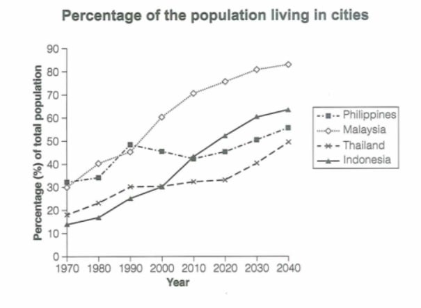
The graph below gives information about the percentage of the population in four Asian countries living in cities from 1970 to 2020, with predictions for 2030 and 2040. Summarize the information by selecting and reporting the main features and make comparisons where relevant.
Student answer (Band 5.0)
The line diagram illustrates the percentage of the population in four different Asian countires living in the urban area between years 1970 to 2020. This data use to predict the future population for the year 2030 and 2040.
The line shows that there is a significant increase in the population in the years between 1970 to 2000 year and following the medium gradient in 4 different countires. The philippiness has the highest percentage rate of the increase in the human number increase while the thailand has the least among others.
Studying the rate of change of the population from year 1970 to 2040 in Malaysia, it explain that the population will be reach to about just above 80% in the year 2040 starting from exactly 30%. If we see the line diagram of Philipiness, it has the least gradient and the change in the population reaches to almost 50% in 2040. While seeing the Indonesia graph, the population changes from about 12% and reaches to just below 60% which results in the around 48% difference.
In conclusion, We can found that the maximum population changes is about 50% in malaysia and minimum difference about 20 in thailand.
AI examiner evaluation
| Criterion | Band |
|---|---|
| Task Achievement / Task Response | 5.0 |
| Coherence and Cohesion | 5.5 |
| Lexical Resource | 5.0 |
| Grammatical Range and Accuracy | 5.0 |
| Overall | 5.0 |
Task Achievement / Task Response: Band 5.0
You identify the topic and make some relevant comparisons, including Malaysia’s rise to just over 80% and Thailand’s comparatively small overall change. However, the response only partially reports the main features. The overview claims the Philippines had the highest increase and Thailand the lowest, but Indonesia actually rises most sharply overall, from about 14% to 64%, while the Philippines ends near 56% after fluctuating. Several details are also inaccurate: the Philippines does not reach almost 50% in 2040, and Indonesia is about 14% in 1970 and 64% in 2040, not 12% and just below 60%. Include a clearer overview of the ranking and contrasting trends, and support it with accurate comparisons across the period.
Coherence and Cohesion: Band 5.5
The response has a basic paragraph structure: an introduction, a broad statement about trends, country-specific discussion, and a conclusion. This gives the reader some organisation, and phrases such as “In conclusion” signal the final point. However, progression is not consistently clear. The second paragraph makes a broad claim about increases from 1970 to 2000, then gives a ranking that does not match the data; the following paragraph shifts between countries without a clear comparison framework. “While seeing the Indonesia graph” is also an awkward transition, and the conclusion repeats the idea of maximum and minimum change without resolving the earlier inaccuracies. Grouping countries by their trends and using clearer comparisons would improve the flow.
Lexical Resource: Band 5.0
You use some relevant task vocabulary, including “percentage,” “gradient,” “rate of change,” and “difference,” so the topic is generally understandable. However, the range is limited and several choices are inaccurate or unnatural, such as “human number increase,” “medium gradient,” and “population changes.” Repetition of “population” and “increase” also makes the account less precise. Spelling errors in country names, including “countires,” “philippiness,” and “Philipiness,” are noticeable and reduce accuracy. Aim for standard terms for describing a line graph, such as “urban population share,” “rose,” “fell,” and “fluctuated,” and check country-name spelling carefully.
Grammatical Range and Accuracy: Band 5.0
You attempt both simple and more complex sentences, including a conditional-style comparison beginning “If we see the line diagram” and a sentence using “while.” However, errors are frequent and sometimes make relationships difficult to follow. Examples include “This data use to predict,” “it explain,” and “the population will be reach,” where verb forms are incorrect. There are also problems with articles, agreement, and sentence construction, as in “the thailand has the least” and “the maximum population changes is.” Tense use is inconsistent when describing past data and forecasts. Practise accurate past-tense reporting for historical figures and use “is projected to” or “will reach” for predictions.
See this exact question answered at other band scores. The same prompt compared across bands.
Browse more IELTS Writing model answers or get your own writing scored by the same AI examiner.