Band 6.0 IELTS Writing Task 1 Model Answer
Overall Band Score: 6.0 · Cambridge IELTS 18 · 2026-11-19
IELTS Writing Task 1 question
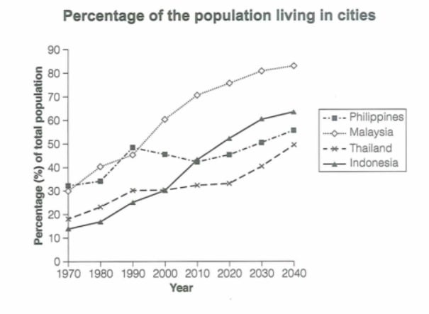
The graph below gives information about the percentage of the population in four Asian countries living in cities from 1970 to 2020, with predictions for 2030 and 2040. Summarize the information by selecting and reporting the main features and make comparisons where relevant.
Student answer (Band 6.0)
The line graph illustrates the data of the people living in cities from four Asian countries between 1970 to 2020,with predictions for next 20 years.
Overall,the percentage of population living in cities among these four cities depicts rise from 1970 to 2020 with perdictions for 2030 to 2040 aswell.In Malaysia,highest proportion of people are moving towards city life as the time goes while Philippineans percentage demonstrate the flactuations throughout the graph.
To begin with,the citizens of Thailand showed the steady rise till 2020 meanwhile perdictions showed the sharp increase for 2030 and 2040 roughly about 45%.On the contrary, Philippineans demonstrated the continuous flactuations in immigrants percentage with rise in initial years till 1990 then a steady decline till 2010.
On the other hand,the migration percentage of Indonesian people to the cities illustrated the substancial rise about above 60% from 1970 to 2040 with predictions and Malaysia correspondingly accounted for the highest percentage approximately greater than 80% of shifting people to the cities from 1970 to 2040.
AI examiner evaluation
| Criterion | Band |
|---|---|
| Task Achievement / Task Response | 6.0 |
| Coherence and Cohesion | 6.0 |
| Lexical Resource | 5.5 |
| Grammatical Range and Accuracy | 5.5 |
| Overall | 6.0 |
Task Achievement / Task Response: Band 6.0
You identify the overall upward movement and make relevant comparisons, including Malaysia’s leading position and the Philippines’ fluctuations. The account of Thailand’s gradual rise and Indonesia’s substantial growth also reflects the graph. However, some key details are unclear or imprecise: Thailand reaches about 33.5% in 2020 and is forecast to approach 50% by 2040, rather than roughly 45%; the Philippines rises again after 2010, which is not included in your description; and Malaysia is already at about 30% in 1970, so saying its proportion is highest “from 1970 to 2040” overstates its position across the whole period. The overview would be stronger if it clearly compared the countries’ endpoints and highlighted Indonesia’s overtaking of the Philippines around 2010.
Coherence and Cohesion: Band 6.0
The response has a recognisable structure: an introduction and overview are followed by two paragraphs describing trends. Linking expressions such as “To begin with” and “On the other hand” help signal movement between points, and the reader can generally follow the comparisons. However, the grouping of information is not always clear: Thailand and the Philippines are discussed together, while Indonesia and Malaysia are combined despite their different trajectories. Some transitions, including “On the contrary,” do not express a clear contrast between the trends that follow. The overview also repeats the idea of an increase without distinguishing the countries’ different patterns. Organise the body around clearer comparisons—for example, Malaysia’s high urbanisation versus the faster growth in Indonesia—and use linking phrases only where the relationship is precise.
Lexical Resource: Band 5.5
You attempt a range of vocabulary relevant to describing trends, including “steady rise,” “fluctuations,” “sharp increase” and “proportion.” This gives you some flexibility beyond basic repetition. However, several choices are inaccurate or unnatural for this chart: “immigrants percentage” and “shifting people to the cities” describe migration rather than the share of the population living in urban areas, while “depicts rise” and “substancial rise about above 60%” are awkward collocations. Spelling errors such as “perdictions,” “flactuations” and “Philippineans” also reduce accuracy. Prefer precise chart language such as “urban population,” “urbanisation rate,” “rose to” and “was projected to reach.”
Grammatical Range and Accuracy: Band 5.5
You use both simple statements and longer sentences with clauses, as in the sentence contrasting Thailand’s rise with the Philippines’ changes. The main trends are usually understandable, but some grammatical errors recur. The opening says “between 1970 to 2020”; use “between 1970 and 2020” or “from 1970 to 2020.” In “the percentage … depicts rise,” the article and verb pattern are incorrect; write “the percentage … shows a rise.” There are also agreement and sentence-construction problems in “the citizens of Thailand showed the steady rise” and “Malaysia correspondingly accounted for.” Missing spaces after commas and inconsistent punctuation further affect control. Check articles, verb agreement and sentence boundaries, while retaining your attempts at complex comparisons.
See this exact question answered at other band scores. The same prompt compared across bands.
Browse more IELTS Writing model answers or get your own writing scored by the same AI examiner.