Band 5.0 IELTS Writing Task 1 Model Answer
Overall Band Score: 5.0 · Cambridge IELTS 12 · 2026-11-09
IELTS Writing Task 1 question
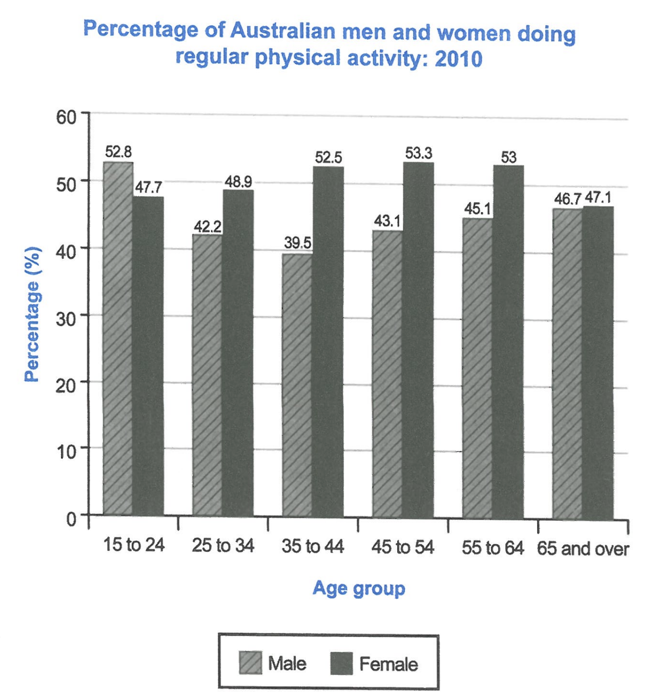
The bar chart below shows the percentage of Australian men and women in different age groups who did regular physical activity in 2010.
Summarise the information by selecting and reporting the main features, and make comparisons where relevant.
Student answer (Band 5.0)
The given chart demonstrates the proportion of Australian residents of various ages performed physical activities on daily basis in 2010.
Overall it is obvious that, women were in large count as compared to mens doing these activities.
By further exploring the diagram we understand that, men having age of 15 to 24 perform physical activities more as compared to other ages groups.In contrast women that lied in the range of 45 to 54 perform 53% of activities of the total and men of aged 35 to 44 perform less similarly, women having age of 65 and over show less physical activities
Furthermore, men having age 25 to 34 show 42% of total and 39.5% of activities perform by the men of 35 to 38 .
AI examiner evaluation
| Criterion | Band |
|---|---|
| Task Achievement / Task Response | 4.0 |
| Coherence and Cohesion | 5.0 |
| Lexical Resource | 5.0 |
| Grammatical Range and Accuracy | 5.0 |
| Overall | 5.0 |
Task Achievement / Task Response: Band 4.0
You identify the chart’s subject and make a broad comparison between men and women, but the response reports only a small part of the data and does not give a clear, accurate overview of the main trends. Women were not higher in every age group: men led among 15–24-year-olds, while women were higher in the other five groups. You correctly note the male peak among 15–24s and the female high point around ages 45–54, but the claim that women aged 65 and over had the lowest activity is inaccurate; the lowest figure is for men aged 35–44. The final figure also refers to ages 35–44, not 35–38. The response is 25 words below the required minimum, further limiting its coverage. Include the key comparisons and more accurate figures.
Coherence and Cohesion: Band 5.0
There is some basic organisation: you begin by introducing the chart, then use “Overall” and “Furthermore” to signal a summary and additional details. However, the progression is difficult to follow because several comparisons are crowded into one long paragraph, and the relationships between figures are not always clear. For example, “women that lied in the range of 45 to 54 perform 53% of activities of the total” does not clearly explain what the percentage represents. The transition “In contrast” is also not used to establish a precise comparison. Separate the overview from the detailed comparisons, and group the figures by age pattern or by sex. Use linking words only where they clarify the relationship between the data.
Lexical Resource: Band 5.0
You use some relevant chart vocabulary, including “proportion,” “age groups,” and “in contrast,” so the topic is generally recognisable. However, the range is limited and several word choices or collocations make the meaning awkward, such as “women were in large count,” “perform physical activities,” and “show less physical activities.” “Men” is also incorrectly written as “mens,” and “lied” appears to be an unintended word choice for describing an age range. These errors sometimes make the comparisons harder to understand. Aim for precise, conventional language for describing charts, such as “the percentage of women,” “were physically active,” and “the figure was lowest.” Check spelling and use the same terms consistently.
Grammatical Range and Accuracy: Band 5.0
You attempt both simple statements and longer sentences, but control is uneven, and errors occur frequently enough to make some comparisons difficult to interpret. For example, “the proportion … performed physical activities” lacks a grammatical link between the people and the activity; “men having age of 15 to 24 perform” uses an incomplete clause and an inconsistent verb form. Commas are also placed awkwardly after introductory phrases, and the long sentence beginning “By further exploring” contains several ideas without clear sentence boundaries. Use straightforward structures such as “The chart shows the percentages of men and women who exercised regularly.” Then make each comparison in a separate sentence, checking subject–verb agreement, articles, plurals, and punctuation.
See this exact question answered at other band scores. The same prompt compared across bands.
Browse more IELTS Writing model answers or get your own writing scored by the same AI examiner.