Band 5.5 IELTS Writing Task 1 Model Answer
Overall Band Score: 5.5 · Cambridge IELTS 12 · 2026-11-16
IELTS Writing Task 1 question
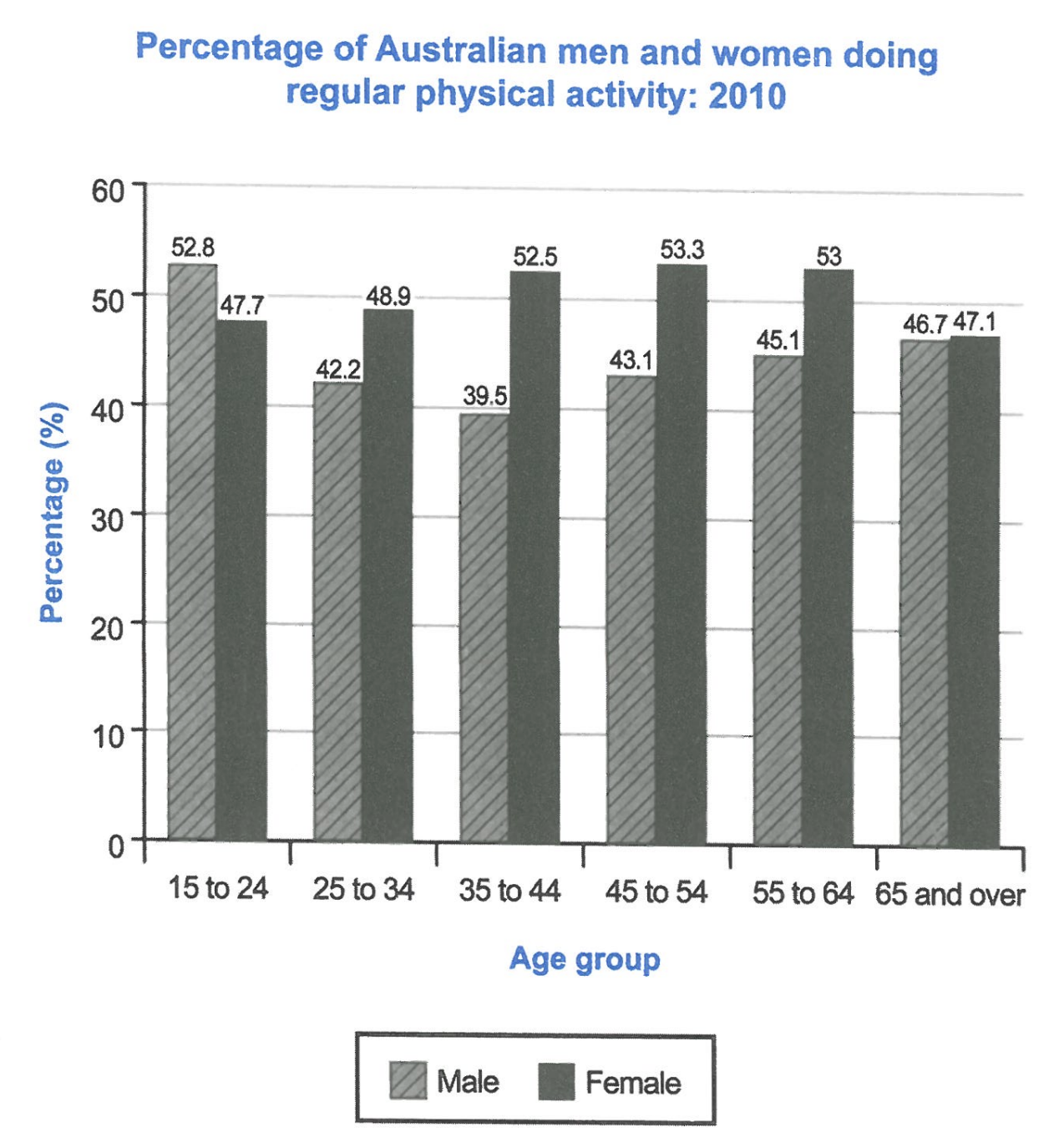
The bar chart below shows the percentage of Australian men and women in different age groups who did regular physical activity in 2010.
Summarise the information by selecting and reporting the main features, and make comparisons where relevant.
Student answer (Band 5.5)
The bar chart illustrate the ratio of Australian men and women in various age groups who did regular physical activities in 2010.
Overall, it is evident that female recorded the highest percentage in physical activities. However in the age group of 15 to 24 female report the lowest ratio then male.
Looking at the detail, the age group of 45 to 54 record the maximum percentage in female 53.3% while in male 43.1. It slightly decrease with .3 and record 53 for female for male increase in percentage was seen 45.1 for 55 to 64. Meanwhile, 15 to 24 accounted for 52.8 % in male and 47.7 % in female this is the only age group in which male had greater figure then female.
Futhermore, In the age group of 35 to 44, again female were more active with greatest percentage 52.3. This group experience the lowest significant in males from all other groups 39.5. 65 and over presents almost similar ratio in both male and female. In each group females reports more active then males.
AI examiner evaluation
| Criterion | Band |
|---|---|
| Task Achievement / Task Response | 6.0 |
| Coherence and Cohesion | 5.5 |
| Lexical Resource | 5.5 |
| Grammatical Range and Accuracy | 5.0 |
| Overall | 5.5 |
Task Achievement / Task Response: Band 6.0
You identify the main comparison: women had higher activity rates in most age groups, while men led among 15–24-year-olds. You also report several useful figures, including 53.3% for women aged 45–54 and 39.5% for men aged 35–44. However, the overview is not fully accurate: women’s highest rate was 53.3% at 45–54, but the lowest female rate was 47.1% among those aged 65 and over, not 15–24. The claim that 65-and-over figures were “almost similar” is supported, but the overall pattern could be clearer: men’s rate fell to 35–44 before rising, while women’s rate generally rose to 45–54 and then declined. Correct the 52.3% figure for women aged 35–44 to 52.5% and report the key trends more precisely.
Coherence and Cohesion: Band 5.5
The response has a recognisable structure, with an introduction, an overview and two detail paragraphs, and it groups some comparisons by age. This gives the reader a basic route through the information. However, progression within the detail paragraphs is sometimes difficult to follow. For example, “It slightly decrease with .3” does not clearly identify which figure is changing, and the shift from the female figure to the male figure is abrupt. “Meanwhile” and “Furthermore” signal relationships, but they do not always make the connection between the data clear. Use a consistent sequence—such as moving from youngest to oldest—and make each sentence state both the age group and the relevant sex or comparison. This would make the organisation more coherent and cohesion less mechanical.
Lexical Resource: Band 5.5
You use relevant chart vocabulary, including “percentage,” “age group,” “active” and “accounted for,” so the topic is generally clear. There is also some attempt to vary wording rather than repeat one expression throughout. However, several choices are inaccurate or unnatural for describing data: “ratio” is not the right term for these percentages, “female recorded” is awkward, and “lowest significant” does not convey a clear meaning. Spelling errors such as “Futhermore” also reduce accuracy. Aim for precise, conventional language for chart reporting, such as “proportion,” “rate,” “stood at” and “reached a low.” Check spelling and ensure that each chosen phrase expresses the intended comparison clearly.
Grammatical Range and Accuracy: Band 5.0
You attempt both simple and more complex sentences, including contrast with “while” and a relative clause in “the only age group in which male had greater figure.” However, grammatical control is uneven, and errors sometimes make relationships between figures hard to follow. Examples include subject–verb agreement in “The bar chart illustrate” and “female report,” missing articles in “in male” and “for male,” and tense or verb-form problems in “It slightly decrease” and “This group experience.” Sentence boundaries and punctuation also need attention, particularly where several ideas are joined without clear separation. Practise accurate present-tense reporting structures and check agreement, articles and complete clauses. More reliable control of these patterns would make your comparisons easier to understand.
See this exact question answered at other band scores. The same prompt compared across bands.
Browse more IELTS Writing model answers or get your own writing scored by the same AI examiner.