Band 6.0 IELTS Writing Task 1 Model Answer
Overall Band Score: 6.0 · Cambridge IELTS 12 · 2026-11-18
IELTS Writing Task 1 question
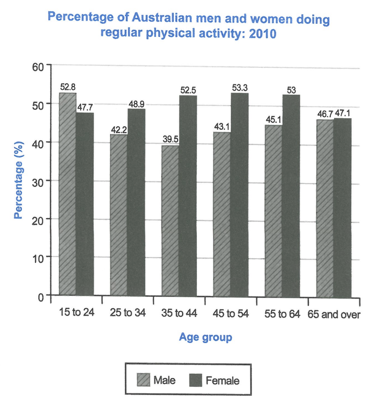
The bar chart below shows the percentage of Australian men and women in different age groups who did regular physical activity in 2010.
Summarise the information by selecting and reporting the main features, and make comparisons where relevant.
Student answer (Band 6.0)
The bar chart compares between Australian male and female of different age group involved in regular physical activity in the year 2010.
Overall, men aged between 15 to 24 were majorly involved in regular physical activity whereas female aged between 45 to 54 were greatly involve in regular physical activity. The bar shows females were majorly active in physical activities in comparision to male.
Regarding data, 52.8% of male between 15 to 24 were involved in regular physical activity which was the highest data in all age group. 42.2% from age group 24 to 34, 39.5% from age group 35 to 44 were involved in physical activity. The data ranges from 43.1% at age group 45 to 54 and 46.7% at age group 65 and over.
Turning towards female data, female were more involved in physical activity except 15 to 24 aged group. There were 47.7% of female involved in physical activity. Then 48.9%, 52.55% and 47.1% were accounted for 25 to 34, 35 to 44 and 65 and over age group respectively. 53.3% was the highest involvement at 45 to 54 age group which was then followed by 53% of involvement at 55 to 64 age group.
AI examiner evaluation
| Criterion | Band |
|---|---|
| Task Achievement / Task Response | 6.0 |
| Coherence and Cohesion | 6.5 |
| Lexical Resource | 5.5 |
| Grammatical Range and Accuracy | 5.5 |
| Overall | 6.0 |
Task Achievement / Task Response: Band 6.0
You identify the chart’s subject and give an overview of the main contrast: men lead in the youngest group, while women are more active in most other groups. You also report many figures accurately, including the male low of 39.5% for ages 35–44 and the female peak of 53.3% for ages 45–54. However, the overview is not fully precise: women’s rates are higher in every group except 15–24, rather than simply being “majorly active” overall. The male figures for ages 55–64 are omitted, and the comparison between the sexes is not quantified. Also, “52.55%” does not match the chart’s 52.5%. A clearer overview and more selective direct comparisons would make the key features more fully developed.
Coherence and Cohesion: Band 6.5
The response has a coherent overall arrangement: an introduction, an overview, and separate paragraphs for male and female data. This makes the information easy to locate, and transitions such as “Regarding data” and “Turning towards female data” signal the shift between groups. The progression is generally logical, but the overview repeats the broad claim that women were more active without clearly setting out the age-group pattern. Within the data paragraphs, figures are mostly listed rather than compared, and the male paragraph skips the 55–64 group, interrupting the sequence. To strengthen progression, organise the details by age group or by the contrasting trends, and use linking language to make comparisons explicit rather than relying mainly on paragraph transitions.
Lexical Resource: Band 5.5
You use relevant vocabulary for describing a chart, including “compares,” “percentage,” “age group,” “highest,” and “followed by.” This is enough to communicate the topic and the main data. However, several expressions are imprecise or unnatural, such as “majorly involved,” “greatly involve,” “the highest data,” and “the data ranges from.” Repetition of “involved in regular physical activity” also limits flexibility. Some word forms and spelling choices, including “comparision,” reduce accuracy. Aim for standard chart language such as “the proportion who exercised regularly,” “the figure peaked at,” and “the rate stood at.” More precise collocations would make the comparisons clearer and give the vocabulary greater control.
Grammatical Range and Accuracy: Band 5.5
You attempt a mix of simple statements and more complex forms, including the overview clause beginning “whereas” and the relative clause “which was the highest data.” Most of the message remains understandable, but some grammatical errors recur. For example, “compares between Australian male and female” has an incorrect construction and number agreement; “female aged between 45 to 54 were greatly involve” has problems with articles, prepositions, and verb form; and “42.2% from age group 24 to 34” is a fragment rather than a complete sentence. There are also inconsistent plural forms and awkward sentence patterns. Practise complete sentences with a clear subject and verb, and check agreement and verb forms when describing percentages. Greater accuracy across these structures would improve readability.
See this exact question answered at other band scores. The same prompt compared across bands.
Browse more IELTS Writing model answers or get your own writing scored by the same AI examiner.