Band 5.5 IELTS Writing Task 1 Model Answer
Overall Band Score: 5.5 · Cambridge IELTS 12 · 2026-11-19
IELTS Writing Task 1 question
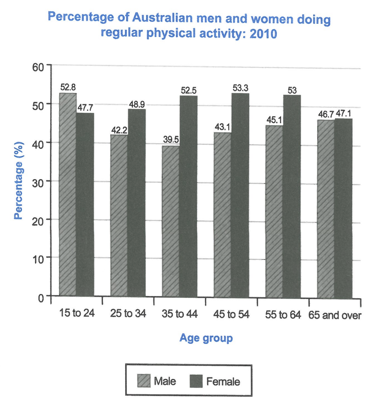
The bar chart below shows the percentage of Australian men and women in different age groups who did regular physical activity in 2010.
Summarise the information by selecting and reporting the main features, and make comparisons where relevant.
Student answer (Band 5.5)
The chart represents compares between Australian male and female regular physical activity in one year.
Overall, women aged between between 35 to 64 have the highest prcentage. Meanwhile men ranked second in all categories exepte (15 to 25) categorie.
At the age of 15 to 24 men marked the highest male physical acitivity with 52.8%. While women have lower number 47.7%. From the age of 25 to 34 and 35 to 44 women activity increased to 48.9% and 52.5% surpassing men witch means that men's activity increased reaching 42.2% and 39.5% .
After, both group between (45 to 54) went up to 43.1% for males .And women reached theire pick 53.3%.
men aged 55 to 64 have slightly rose their acitivity to 45.1%. On the other hand women almost remain the same propotiong at 53% stying on top.
From 65 and above both of them have almost equal acitivity around 47% the lowest percentage of all age groups.
AI examiner evaluation
| Criterion | Band |
|---|---|
| Task Achievement / Task Response | 6.0 |
| Coherence and Cohesion | 5.5 |
| Lexical Resource | 5.5 |
| Grammatical Range and Accuracy | 5.0 |
| Overall | 5.5 |
Task Achievement / Task Response: Band 6.0
You identify the main contrast: men have the highest participation in the youngest group, while women lead in most other age groups. The overview also notes women’s high figures from 35 to 64, and the report includes several accurate values, such as 52.8% for young men and 53.3% for women aged 45–54. However, some comparisons are unclear or inaccurate. Men do not rank second in every other category: they are lower than women in all five older groups, and the phrase “men’s activity increased reaching 42.2% and 39.5%” misrepresents a fall from 42.2% to 39.5%. The final group is not the lowest for both sexes; it is the lowest female figure only, while the male low is 39.5% at ages 35–44. Clearer, more precise comparisons would strengthen the report.
Coherence and Cohesion: Band 5.5
The response has a recognisable structure, with an opening, an overview and paragraphs describing the age groups. This gives the reader a general route through the information. However, progression within the body is sometimes difficult to follow: “After, both group between (45 to 54) went up” does not clearly connect the figures to the preceding age groups, and the final sentence combines two different claims about equality and the lowest percentages. Linking words such as “Meanwhile,” “On the other hand” and “From” are used, but some are awkward or do not express the relationship precisely. Grouping the data into younger and older age ranges, then using consistent comparisons between men and women, would make the organisation clearer and cohesion less mechanical.
Lexical Resource: Band 5.5
You use some relevant chart vocabulary, including “percentage,” “increased,” “surpassing” and “remain the same,” so the topic is generally understandable. However, spelling and word-choice errors are noticeable, including “prcentage,” “exepte,” “acitivity,” “witch” and “propotiong.” Some expressions are also imprecise or unnatural: “men marked the highest male physical activity” and “women almost remain the same” do not describe the data clearly. “Pick” is less suitable than “peak” in this context. These issues sometimes make the reader pause, although the intended meaning is usually recoverable. Aim for accurate, conventional chart language and check spelling carefully; precise terms such as “participation rate,” “stood at” and “declined” would help you report trends more naturally.
Grammatical Range and Accuracy: Band 5.0
You attempt a mixture of simple and more complex sentences, including comparisons with “While” and “On the other hand.” However, some sentence structures are incomplete or incorrectly joined. For example, “While women have lower number 47.7%” is a dependent clause without a complete main clause, and “The chart represents compares” combines two verb forms. There are also errors in agreement and tense, as in “both group … went up” and “women almost remain.” Punctuation and sentence boundaries are inconsistent, particularly around “After” and the age-group clauses. These errors sometimes make relationships between ideas harder to understand. Practise forming complete comparison sentences and maintaining consistent past-tense reporting, while retaining the range of structures you are attempting.
See this exact question answered at other band scores. The same prompt compared across bands.
Browse more IELTS Writing model answers or get your own writing scored by the same AI examiner.