Band 5.5 IELTS Writing Task 1 Model Answer
Overall Band Score: 5.5 · Cambridge IELTS 12 · 2026-11-19
IELTS Writing Task 1 question
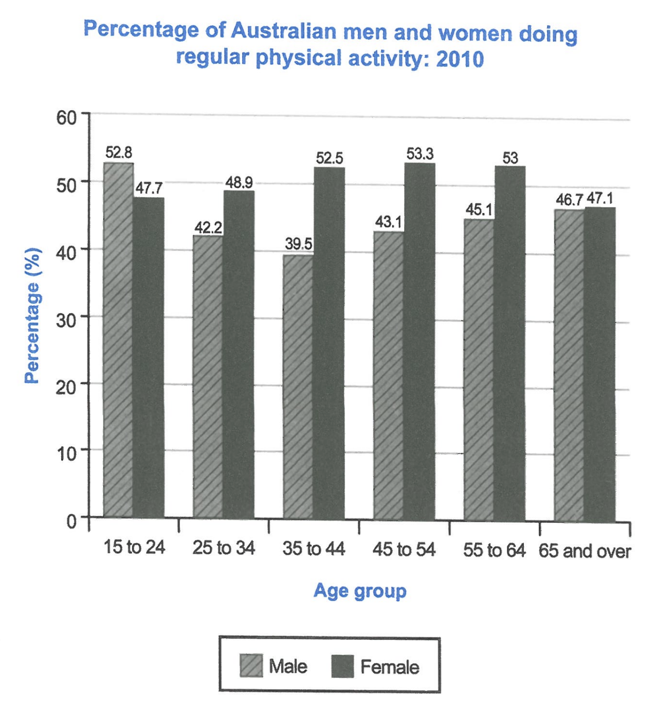
The bar chart below shows the percentage of Australian men and women in different age groups who did regular physical activity in 2010.
Summarise the information by selecting and reporting the main features, and make comparisons where relevant.
Student answer (Band 5.5)
The information about the proportion of different age groups of Australian men and women who did daily physical excercise in 2010 has been illustrated in the bar chart.
Overall, the ratio of women doing physical activities are higher than man. Women aged from 45 to 54 has the highest ratio about 53.3%, while men aged from 15 to 24 has the highest ratio about 52.8%.
The graph depicts as the women aged from 15 to 24 has percentage approximately 53.3%; meanwhile women fron same age has ratio of 47.7%. Across 48.9% of women aged from 25 to 34 has been taking part in regular physical activities, while only 42.2% of men were doing so. Moreover 52.5% of women, and 39.5% of men aged 35 to 44 were taking part in physical activities. Besides 53.3% of women, and 43.1% of men were doing regular excercise, 45.1% of men, and 53% of women aged from 55 to 64,while 46.7% of women, and 47% of women aged from 65 and above were taking part in daily physical games.
AI examiner evaluation
| Criterion | Band |
|---|---|
| Task Achievement / Task Response | 5.5 |
| Coherence and Cohesion | 5.0 |
| Lexical Resource | 5.5 |
| Grammatical Range and Accuracy | 5.0 |
| Overall | 5.5 |
Task Achievement / Task Response: Band 5.5
You identify the chart’s subject and give an overview that women generally recorded higher participation, while correctly noting the male peak among 15–24-year-olds. You also report several accurate comparisons, including 25–34 and 35–44. However, the overview is incomplete: women did not lead in every age group, since men were higher among 15–24-year-olds, and the female peak was shared across the 35–44, 45–54 and 55–64 groups rather than being only 45–54. Some figures are misreported: women aged 15–24 are given as 53.3% instead of 47.7%, and the final comparison incorrectly labels both figures as women. Select the main trends accurately and check each figure against its age group and gender.
Coherence and Cohesion: Band 5.0
The response has a recognisable introduction, overview and detail section, and it moves broadly from younger to older age groups. This gives the reader some organisation. However, the progression becomes difficult to follow in the final long sentence, where several age groups and gender figures are joined together without clear boundaries. Linking expressions such as “Moreover” and “Besides” are used, but they do not always clarify how the information relates, and the repeated “while” constructions make comparisons feel mechanical. Separate the data into shorter sentences or group the age ranges into clear comparisons, and use references such as “in the next age group” only when their meaning is unmistakable.
Lexical Resource: Band 5.5
You use relevant vocabulary for describing a chart, including “proportion,” “percentage,” “aged” and “taking part in regular physical activities.” This shows a basic range suited to the task. However, several choices are inaccurate or repetitive: “daily physical exercise” and “daily physical games” do not match the chart’s measure of regular activity, while “ratio” is not the natural term for these percentages. There are also spelling errors such as “excercise” and “fron,” and phrases like “the graph depicts as” are not idiomatic. Use precise chart language consistently, and check spelling and collocations so that the reader can focus on the comparisons rather than interpreting the wording.
Grammatical Range and Accuracy: Band 5.0
You attempt both simple statements and longer sentences with comparisons, but control is uneven. Agreement errors appear in “the ratio of women … are higher than man” and “women aged from 45 to 54 has,” where the subject and verb do not agree. The sentence beginning “The graph depicts as” has a faulty structure, and the final sentence contains unclear clause boundaries and punctuation, making the relationships between figures hard to follow. Articles and plural forms are also inconsistent. Build comparisons with a reliable pattern, for example, “The figure for women was higher than that for men,” and use shorter sentences when listing data. This will improve accuracy while still allowing you to show varied sentence forms.
See this exact question answered at other band scores. The same prompt compared across bands.
Browse more IELTS Writing model answers or get your own writing scored by the same AI examiner.