Band 5.5 IELTS Writing Task 1 Model Answer
Overall Band Score: 5.5 · Cambridge IELTS 12 · 2026-11-08
IELTS Writing Task 1 question
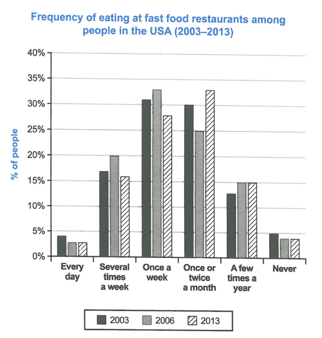
The chart below shows how frequently people in the USA ate in fast food restaurants between 2003 and 2013.
Summarise the information by selecting and reporting the main features, and make comparisons where relevant.
Student answer (Band 5.5)
THE CHART ILLUSTRATES NUMBER OF PEOPLE IN ASPECT OF HOW FREQUENTLY THEY ATE FAST FOOD IN BETWEEN 2003 TO 2013.
OVERALL, HIGHEST RATIO OF PEOPLE VISITED RESTAURANT EITHER ONCE A WEEK OR ONCE OR TWICE A MONTH , WHEREAS COMPARING TO THOSE PERCENTAGE OF PEOPLE VISITED SEVERAL TIMES A WEEK AND FEW TIMES A YEAR IS RELATIVELY LOW.IN CONTRAST, NEGLIGIBLE AMOUNT OF PERCENTAGE CONSIST OF THOSE WHO VISIT EVERY DAY OR NEVER VISITED.
PEOPLE WHO VISITED ONCE A WEEK IN 2003 ARE ALMOST 31%, 33% IN 2006 AND 26% IN 2013 AND ALMOST RELATABLE TRENDS HAVE BEEN SEEN FOR THOSE WHO VISITED ONCE OR TWICE A WEEK WHICH MAKE 30% IN 2003, 25% IN 2006 WHERE AS 33 PERCENT IN 2013.
FURTHERMORE, 17% OF PEOPLE ATE A FEW TIMES IN A WEEK IN 2003, INCREASED TO 20% IN 2006 AND THAN DECLINE TO 16% IN 2013.WHEREAS AMOUNT OF PEOPLE ATE FEW TIME IN A YEAR IS ONLY 13 PERCENT WHICH SLIGHLTY UPLIFTED IN 2006 TO 15% AND REMAINED EQUIVALENT IN 2013.
AT LAST 4% OF PEOPLE ARE THOSE WHO EITHER VISITED EVERYDAY IN 2003 OR NEVER IN 2006 AND 2013
AI examiner evaluation
| Criterion | Band |
|---|---|
| Task Achievement / Task Response | 6.0 |
| Coherence and Cohesion | 6.0 |
| Lexical Resource | 5.5 |
| Grammatical Range and Accuracy | 5.0 |
| Overall | 5.5 |
Task Achievement / Task Response: Band 6.0
You identify the main pattern: weekly and monthly visits account for the largest shares, while daily visits and never eating fast food are uncommon. You also compare all three years for several categories, including the shift from 25% monthly visits in 2006 to 33% in 2013. However, some details are inaccurate or unclear: weekly visits in 2013 are about 28%, not 26%, and “once or twice a week” should be “once or twice a month.” The final sentence also combines separate figures confusingly: 4% refers to daily visits in 2003, while never visiting was about 3.5% in both 2006 and 2013. A more precise overview and clearer reporting of these details would strengthen the response.
Coherence and Cohesion: Band 6.0
The response has a recognisable overall structure: an introduction, an overview, and paragraphs reporting figures for the main frequency groups. This makes the information broadly easy to follow. You also use sequencing and contrast markers such as “Overall,” “Furthermore,” and “Whereas.” However, some connections are mechanical or unclear, especially “At last,” which does not naturally introduce the final data point, and the last sentence merges daily and never-visiting figures. Several long sentences run together without clear punctuation, as in the sentence beginning “Furthermore, 17%...” and continuing into the yearly figures. Grouping related categories more clearly and using accurate linking phrases would improve progression.
Lexical Resource: Band 5.5
You use relevant vocabulary for describing proportions and change, including “increased,” “decline,” “remained,” and “percentage,” so the topic is generally clear. There is also some attempt to vary wording rather than repeat the chart labels exactly. However, several choices are inaccurate or unnatural, such as “highest ratio,” “negligible amount of percentage,” and “relatable trends.” Some phrases also obscure the intended category: “once or twice a week” changes the chart’s meaning, and “a few times in a week” is less precise than the label. Aim for standard chart language and accurate collocations, such as “the highest proportions,” “a small minority,” and “a similar pattern.”
Grammatical Range and Accuracy: Band 5.0
You attempt both simple statements and longer comparative sentences, and the reader can usually understand the broad trends. However, errors in sentence structure and grammatical forms are persistent enough to affect clarity. For example, “the chart illustrates number of people” needs an article and a more suitable construction, while “people who visited ... are almost 31%” does not correctly express a past percentage. The sentence beginning “Overall” also lacks a clear grammatical structure, and several clauses are joined with full stops or commas inappropriately. Work on complete sentence patterns, consistent past-tense reporting, articles, and punctuation; shorter, well-controlled sentences would make your comparisons more accurate.
See this exact question answered at other band scores. The same prompt compared across bands.
Browse more IELTS Writing model answers or get your own writing scored by the same AI examiner.