Band 5.5 IELTS Writing Task 1 Model Answer
Overall Band Score: 5.5 · Cambridge IELTS 12 · 2026-11-09
IELTS Writing Task 1 question
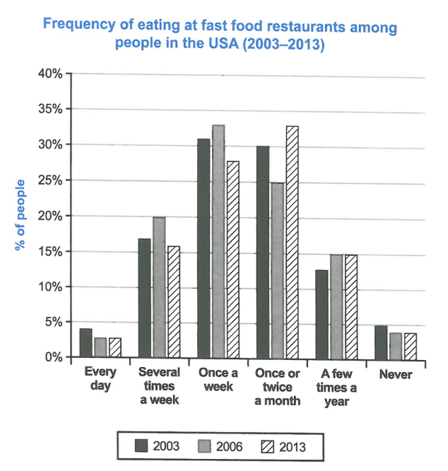
The chart below shows how frequently people in the USA ate in fast food restaurants between 2003 and 2013.
Summarise the information by selecting and reporting the main features, and make comparisons where relevant.
Student answer (Band 5.5)
This chart illustrates how often peope in united states ate in fast food rsetaurants between 2003 and 2013 .
overall ; it is noticable that most americans eat at fast food restaurants either once a week or once or twice a month ; the chart also shows that americans fast food eating habbits did not really change ebtween 2003 and 2013 and were rather stable .
in addition ; two minorities of americans rough five percent each either eat at fast food rsetaurants every day or never . Further more around 30 percent of americans ate a few times a year or several times a week at fast food rsetaurants ; we also notice an anomoly in 2006 where the percenatge of people eating sevral times a week peaked at 20 percent and went back to 15percent in 2013
AI examiner evaluation
| Criterion | Band |
|---|---|
| Task Achievement / Task Response | 5.5 |
| Coherence and Cohesion | 6.0 |
| Lexical Resource | 5.0 |
| Grammatical Range and Accuracy | 5.0 |
| Overall | 5.5 |
Task Achievement / Task Response: Band 5.5
You identify the broad pattern that weekly or monthly visits were most common, and you note that daily visits and never eating fast food were minority responses. However, the overview that habits “did not really change” is too general: the leading category shifted from once a week in 2003 and 2006 to once or twice a month in 2013. Some figures are also inaccurate or unclear. For example, “around 30 percent” combines several-times-a-week and a few-times-a-year groups, which together were closer to 29–35% depending on the year, while the 2013 several-times-a-week figure was 16%, not 15%. The response is 11 words below the required minimum. Add a fuller comparison of the three years and report key figures accurately.
Coherence and Cohesion: Band 6.0
The response has a recognisable overall structure: an opening, an overview, and a paragraph of further observations. The main points are generally grouped sensibly, and connectors such as “overall,” “in addition,” and “furthermore” help signal relationships. However, the progression is limited because the details are not organised as clear comparisons across years, and the final sentence combines a peak and a later change without explaining the full pattern. Some linking phrases feel mechanical, while the semicolon after “overall” and the repeated use of “we also notice” interrupt the flow. Grouping the data into the most common frequencies and the less common frequencies, then comparing their changes, would make the progression clearer.
Lexical Resource: Band 5.0
You use relevant vocabulary for describing the chart, including “minorities,” “peaked,” “stable,” and “percentage,” so the reader can understand the general subject. However, the range is limited and several spelling errors are noticeable, including “peope,” “rsetaurants,” “noticable,” “habbits,” and “anomoly.” Some expressions are imprecise or unnatural: “two minorities” is not a natural way to describe two small groups, and “fast food eating habits” is less precise than describing the frequency of visits. Repeated use of “Americans” and “eat” also limits variety. Use accurate chart language such as “the proportion of people,” “monthly visits,” and “the least common categories,” and check spelling carefully.
Grammatical Range and Accuracy: Band 5.0
You attempt both simple and more extended sentence forms, including a clause beginning “where the percentage…” and a contrast introduced by “either…or.” The main message is usually understandable, but grammatical control is inconsistent. The opening lacks appropriate articles and capitalisation (“in united states”), and the overview sentence has awkward punctuation and sentence boundaries. In “two minorities of americans rough five percent each either eat,” the structure is incomplete and the relationship between the figures and the groups is unclear. The final sentence also runs several ideas together, making the comparison difficult to follow. Practise complete sentences with clear subjects and verbs, accurate articles, and controlled punctuation; separate the 2006 peak from the 2013 figure into a clear comparison.
See this exact question answered at other band scores. The same prompt compared across bands.
Browse more IELTS Writing model answers or get your own writing scored by the same AI examiner.