Band 5.5 IELTS Writing Task 1 Model Answer
Overall Band Score: 5.5 · Cambridge IELTS 12 · 2026-11-09
IELTS Writing Task 1 question
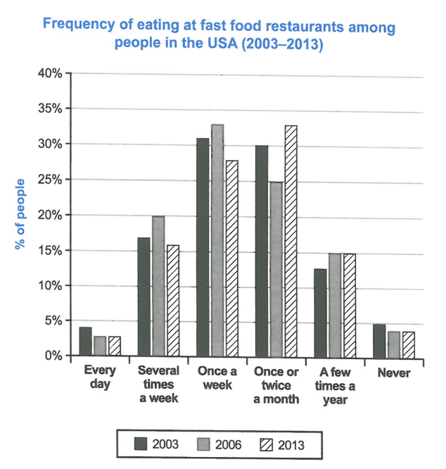
The chart below shows how frequently people in the USA ate in fast food restaurants between 2003 and 2013.
Summarise the information by selecting and reporting the main features, and make comparisons where relevant.
Student answer (Band 5.5)
The line graph illustrate the idea about USA Resident who ate junk food between 2003 and 2013.
Overall, The chart display that in 2003 mostly peoples ate junk food once in a week , However in 2006 many of them eat fast food in week as compared to the other years. While in 2013 many resident eat fast food twice or once in a month as compared to previous years.
According to given analysis in 2003 a very few resident eat junk food everyday , seviral Person eat Many times in a week approximaly 17 % , while mosty prefer once in a week or twice in a month . In further , Between the required period in 2006 mostly resident prefer to eat junk food once in a week approximatly 36%, and the number decrease and approximatly 25 % resident prefer once or twice in a month and 5% resident never eat it.
On the other hand, In 2013 appriximatly 4% people eat fast food rgulerly while a very large number of group eat fast food once or twice a month that are approximatly 34% and 15% eat a few times a year that are also same with the year 2006. and a very few people eat it everyday approximatly 3%.
AI examiner evaluation
| Criterion | Band |
|---|---|
| Task Achievement / Task Response | 5.5 |
| Coherence and Cohesion | 6.0 |
| Lexical Resource | 5.0 |
| Grammatical Range and Accuracy | 5.0 |
| Overall | 5.5 |
Task Achievement / Task Response: Band 5.5
You identify the broad pattern that weekly eating was common in 2003 and 2006, while monthly eating was most common in 2013. However, the overview is not fully accurate: in 2006, the largest share ate fast food once a week, at about 33%, rather than 36%, and in 2013 the monthly category reached about 33%. Some figures are omitted or misreported, including the 2003 monthly figure and the 2013 weekly figure; “4%” eating regularly in 2013 is also unclear because the chart separates daily and several-times-weekly eating. The response covers the main periods but gives limited, sometimes imprecise comparisons. Report the key peaks and changes accurately, and distinguish the frequency categories clearly.
Coherence and Cohesion: Band 6.0
The response has a recognisable structure: an introduction, an overview, and paragraphs describing the years, with transitions such as “Overall,” “According to,” and “On the other hand.” This gives the reader a general route through the information. However, progression within the body is sometimes unclear: the 2006 paragraph moves from weekly eating to monthly eating and then to “never” without a consistent comparison across years. Some linking phrases are mechanical or do not express the relationship precisely, and the final paragraph combines several points in a long sequence. Grouping the data by meaningful trends—for example, the leading category and the less frequent categories—would make comparisons easier to follow.
Lexical Resource: Band 5.0
You use relevant topic vocabulary, including “once in a week,” “once or twice in a month,” and “a few times a year,” so the reader can generally understand the categories being described. However, the range is limited and several choices are informal, repetitive, or imprecise: “junk food” is not the chart’s wording, while “many resident” and “a very large number of group” are awkward. Spelling errors such as “seviral,” “approximatly,” and “appriximatly” are noticeable and reduce clarity. Use the chart’s neutral terms, vary reporting language carefully, and check spelling and collocations. More precise vocabulary would also help distinguish daily, weekly, and monthly frequencies.
Grammatical Range and Accuracy: Band 5.0
You attempt both simple and more extended sentences, including clauses linked with “while” and “as compared to,” but control is inconsistent. Subject–verb agreement errors appear in “The line graph illustrate” and “many resident eat,” while tense shifts occur between “ate,” “eat,” and “prefer” when describing past data. Articles, plurals, and sentence boundaries also need attention; for example, “Overall, The chart display” has incorrect capitalization and agreement, and the final paragraph runs several statements together with a lowercase “and.” These errors sometimes make relationships harder to follow. Practise accurate past-tense reporting and agreement, and divide long sentences into shorter, correctly punctuated comparisons.
See this exact question answered at other band scores. The same prompt compared across bands.
Browse more IELTS Writing model answers or get your own writing scored by the same AI examiner.