Band 6.0 IELTS Writing Task 1 Model Answer
Overall Band Score: 6.0 · Cambridge IELTS 12 · 2026-11-10
IELTS Writing Task 1 question
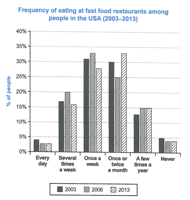
The chart below shows how frequently people in the USA ate in fast food restaurants between 2003 and 2013.
Summarise the information by selecting and reporting the main features, and make comparisons where relevant.
Student answer (Band 6.0)
The chart below shows how frequently people in USA ate fast food restaurants between 2003 and 2013.
Overall it is evident that, the most common habits for Americans was eating fast food either once a week or once or twice a month. On the other hand, very few people ate fast food every single day or never ate it at all.
On a closer observation it can be seen that, the most popular choice in 2003, about 31% of people ate fast food once a week. This number went up slightly to 33% in 2006 but then dropped to 28% in 2013. for people who ate fast food once or twice a month, the number started at 30% in 2003 fell to 25% in 2006 and then jumped up to 33% in 2013.
furthermore, the number stayed relatively low. People eating fast food several times a week changed between 16% and 20% over the years. Arround 13% to 15% of people chose to eat it only a few times a year.
AI examiner evaluation
| Criterion | Band |
|---|---|
| Task Achievement / Task Response | 6.5 |
| Coherence and Cohesion | 6.0 |
| Lexical Resource | 6.5 |
| Grammatical Range and Accuracy | 5.5 |
| Overall | 6.0 |
Task Achievement / Task Response: Band 6.5
The response identifies the main pattern accurately: weekly and monthly visits were the most common, while daily visits and never eating fast food were uncommon. It also reports the key changes in the two leading categories, including the rise and fall in weekly eating and the monthly category’s dip followed by a rise. This gives the overview a sound basis and shows relevant selection of data. However, the account is incomplete: it omits the figures for daily and never, and gives only broad ranges for several-times-a-week and a-few-times-a-year visits, without explaining their changes across the years. The overview also says “the most common habits” without noting that the leading category shifted from weekly in 2003 and 2006 to monthly in 2013. More precise coverage of these features would strengthen the response.
Coherence and Cohesion: Band 6.0
The response has a clear overall arrangement: an introduction, a general overview, and then details about the main frequency categories. This makes the central comparisons easy to follow, and phrases such as “On the other hand” and “furthermore” signal relationships between points. However, progression becomes less controlled in the final paragraph: “furthermore, the number stayed relatively low” does not clearly identify which number is meant, and the paragraph moves between categories without a clear comparison or consistent time sequence. Some linking is also mechanical, while the full stops before “for people” and “furthermore” create awkward transitions. Grouping the less common categories together and linking their trends explicitly would make cohesion more effective.
Lexical Resource: Band 6.5
There is an adequate range for describing chart data, including “most common,” “dropped,” “jumped up,” “relatively low,” and “changed between.” These choices communicate the main trends, and the response uses some variation rather than repeating one verb throughout. However, several expressions are imprecise or awkward for formal data reporting: “ate fast food restaurants” should describe eating at them, and “the number started at 30%” is less exact than referring to the proportion of people. “Arround” is a spelling error, and “every single day” is less formal than “daily.” The phrase “the number stayed relatively low” is also vague because it does not specify the category or figures. More precise collocations and careful spelling would improve control.
Grammatical Range and Accuracy: Band 5.5
The response attempts a mix of simple and complex forms, including a contrastive overview and sentences describing changes over time. The main information remains understandable, but some grammatical and punctuation errors recur. For example, “the most common habits … was” has a subject–verb agreement error, and “people in USA” needs an article. In “On a closer observation it can be seen that,” the introductory phrase and comma are awkwardly handled; similarly, “This number went up … but then dropped … for people who…” runs into a new idea without appropriate sentence punctuation or capitalization. The sentence about the monthly category also needs clearer punctuation around the sequence of changes. Check agreement, articles, sentence boundaries, and capitalization after full stops to make the structures more accurate.
See this exact question answered at other band scores. The same prompt compared across bands.
Browse more IELTS Writing model answers or get your own writing scored by the same AI examiner.