Band 5.5 IELTS Writing Task 1 Model Answer
Overall Band Score: 5.5 · Cambridge IELTS 12 · 2026-11-10
IELTS Writing Task 1 question
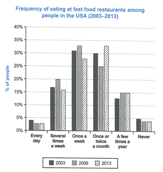
The chart below shows how frequently people in the USA ate in fast food restaurants between 2003 and 2013.
Summarise the information by selecting and reporting the main features, and make comparisons where relevant.
Student answer (Band 5.5)
The bar chart illustrates the percenage of people that ate fast food in resturants in 2003, 2006, and 2013.
Overall, it can be clearly seen that the amount of people ate junk food once a week or twice a month is greeater than eating many times in a week or a few times in a years.
In 2003, 31% people ate food once in a week and 30% ate one or two times in a month while in 2006, 33% people ate food one a week and 25% people ate one or two times a month. In contrast, only 27% people enjoy food once in a week and the value roses up 33% ate one or twice in a month.
The percentage of people is limited that ate food every day or never ate is just under 5%.
And range of people that ate junk food just few times in a year is near 15%.
AI examiner evaluation
| Criterion | Band |
|---|---|
| Task Achievement / Task Response | 6.0 |
| Coherence and Cohesion | 5.5 |
| Lexical Resource | 5.0 |
| Grammatical Range and Accuracy | 5.5 |
| Overall | 5.5 |
Task Achievement / Task Response: Band 6.0
You identify the chart’s subject and report several relevant comparisons, including the weekly and monthly figures for 2003 and 2006, as well as the shift in 2013 toward monthly eating. The overview also recognises that these frequencies were more common than eating several times a week. However, some details are inaccurate or unclear: in 2013, weekly eating was 28%, not 27%, and the statement that daily eating or never eating was “just under 5%” does not distinguish the categories or years. The final observations about daily/never and yearly eating are not developed with clear comparisons. A more precise overview and accurate coverage of the main changes would strengthen the response.
Coherence and Cohesion: Band 5.5
The response has a recognisable sequence: an introduction, an overview, and then details about the main frequency groups. This gives the reader a basic route through the information. However, the final two points are separated into short, loosely connected statements, and beginning one with “And” makes the progression feel abrupt. The overview’s comparison of “once a week or twice a month” with “many times in a week or a few times in a years” is also difficult to follow because the categories are not expressed consistently. Use clearer paragraphing to group the main figures, and connect comparisons explicitly—for example, contrast the decline in weekly eating with the rise in monthly eating by 2013.
Lexical Resource: Band 5.0
You use relevant vocabulary such as “percentage,” “illustrates,” “in contrast,” and “ate … once a week” to describe the chart. However, the range is limited and several word-choice, collocation, and spelling problems are noticeable. “The amount of people” is less suitable than “the proportion of people,” while “enjoy food” does not accurately describe frequency of eating. “The value roses up” is unclear, and “a few times in a years” is not a natural phrase. There are also spelling errors in “percenage,” “resturants,” and “greeater.” Choose precise chart language, vary terms such as “share” and “proportion,” and proofread spelling and collocations.
Grammatical Range and Accuracy: Band 5.5
You attempt both simple statements and longer comparisons, particularly in the sentence beginning “In 2003 … while in 2006 …”. The main meaning is generally recoverable, but some grammatical errors affect clarity. For example, “31% people” needs an article or a different construction (“31% of people”), and “the amount of people ate” lacks a grammatical link between the noun phrase and the clause. In “only 27% people enjoy food once in a week,” the article and tense are inconsistent with the past-year data. The final sentence beginning “And range of people” is also missing a determiner and a complete clause. Practise accurate percentage constructions and maintain consistent past tense when reporting the chart.
See this exact question answered at other band scores. The same prompt compared across bands.
Browse more IELTS Writing model answers or get your own writing scored by the same AI examiner.