Band 5.5 IELTS Writing Task 1 Model Answer
Overall Band Score: 5.5 · Cambridge IELTS 12 · 2026-11-10
IELTS Writing Task 1 question
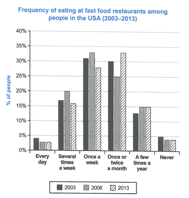
The chart below shows how frequently people in the USA ate in fast food restaurants between 2003 and 2013.
Summarise the information by selecting and reporting the main features, and make comparisons where relevant.
Student answer (Band 5.5)
The bar chart compares frequency of eating at fast food restaurants amoung people in the USA([redacted phone]).
Overall, the percentage of people form all four categories increased over the period.The frequency of eating at fast junk food restaurants once a twice a twice had the second higest figure, while in 2006 frquency eating fast food once a week is largest recorded.Whenver the every day percentage fast is lowest.
Initially, the percentage of people eating fast food every day in 2003 is 4% between in 2006 and 2013 percentage is same only 3%.However, people eating junk food several time a week is rising in 2003 is 17% between in 2006 and 2013 percentage from 20% to 16%.Furthermore, people eating fast food In the USA,frequency once a week has reached high record in 2003 is 31% between 2006 and 2013 is 33% to 27%.
Secondly,once a twice a month percentage in 2003 is 30%, whereas,the percentage is volatility between in 2006 and 2013 from 25% to 33%.In contrast,a few time a year percentage is diminish in 2003 is 12%, while between in 2006 and 2013 at the same value just 15%. The frequency of eating fast food restaurants newer amoung percentage of people in 2003 is 5% between 2006 and 2011 is same percentage just for 4 respectively.
AI examiner evaluation
| Criterion | Band |
|---|---|
| Task Achievement / Task Response | 5.5 |
| Coherence and Cohesion | 5.5 |
| Lexical Resource | 5.0 |
| Grammatical Range and Accuracy | 5.0 |
| Overall | 5.5 |
Task Achievement / Task Response: Band 5.5
You identify the chart’s subject and include figures from all six frequency groups, so the response is relevant and makes an effort to compare the years. However, the overview is unclear and contains a major inaccurate generalisation: “the percentage of people form all four categories increased” is not supported, since several-times-a-week and once-a-week figures fall by 2013, while daily eating is broadly stable. You correctly note that once-a-week eating peaks in 2006, but the final figure is given as 27% rather than about 28%. Some other values are also inaccurate, including the 2013 figure for never eating (about 3.5%, not 4%). A clearer overview of the main shifts, supported by accurately selected data, would make the report more complete.
Coherence and Cohesion: Band 5.5
The response has an introduction, an attempted overview and two body paragraphs, and it groups several related categories together. This gives it some organisation. However, progression is difficult to follow because the overview is internally unclear and the body paragraphs rely on repetitive sequencing such as “Initially,” “Furthermore,” and “Secondly.” Several comparisons are expressed in confusing forms, for example “is rising in 2003 is 17% between in 2006 and 2013 percentage from 20% to 16%,” so the reader must work to identify the trend. The final sentence also refers to 2011, although the chart ends in 2013. Use one paragraph for the overview, then organise the details into clear comparisons, with accurate year references and simpler linking.
Lexical Resource: Band 5.0
You attempt a range of chart-related language, including “percentage,” “frequency,” “recorded,” and “volatility,” and the topic is generally recognisable. However, the vocabulary is limited in precision, and noticeable spelling and word-choice errors sometimes make the meaning difficult to follow. Examples include “amoung,” “higest,” “frquency,” and “newer,” as well as the unclear phrase “once a twice a twice.” Some choices are also unsuitable for describing the data: “volatility” and “diminish” do not fit the simple changes shown, and “fast junk food restaurants” is inaccurate. Build a reliable set of trend verbs and comparison phrases, and check spelling and collocations before using less familiar vocabulary.
Grammatical Range and Accuracy: Band 5.0
You attempt both simple statements and longer sentences with contrast, such as “whereas” and “while,” but complex structures are often faulty and errors occur frequently. For example, “the percentage … in 2003 is 4% between in 2006 and 2013 percentage is same” lacks a clear grammatical comparison, while “once a week has reached high record in 2003 is 31%” combines clauses without a workable structure. Tense and agreement are also inconsistent, as in “percentage … is diminish” and “frequency … is largest recorded.” Punctuation and spacing around sentence boundaries are uneven. Practise concise past-tense reporting patterns, such as “The figure was 4% in 2003, then fell to 3% in 2006 and remained unchanged in 2013.”
See this exact question answered at other band scores. The same prompt compared across bands.
Browse more IELTS Writing model answers or get your own writing scored by the same AI examiner.