Band 6.0 IELTS Writing Task 1 Model Answer
Overall Band Score: 6.0 · Cambridge IELTS 12 · 2026-11-10
IELTS Writing Task 1 question
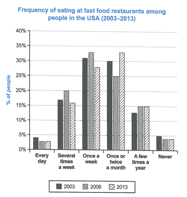
The chart below shows how frequently people in the USA ate in fast food restaurants between 2003 and 2013.
Summarise the information by selecting and reporting the main features, and make comparisons where relevant.
Student answer (Band 6.0)
The bar chart compares the data of residents time frequency of eatong fast food restaurants from 2003 to 2013.
Overall, once a week and once or twice in a month maintain highest percentages throughout the period.
Meanwhile, everyday and never eating such food almost consist of same lowest percentages in the list. Several time a week and a few times a year contain about just below the half percentages.
Everyday eating meal declined during the period as it commences from 4% and reached half of it by 2013. Several times a week fluctuate throughout the period, it starts from 17 percent and reached 20 percent by 2006, somehow it declines at 16% by 2013. Once a week also fluctuate as it starts with 31 percent and rose at one third by 2006, by contrast it decreases at roughly 23 percent by 2013.
Furthermore, once or twice a month increased it starts at 30 percent but it suddenly declines at a quarter by 2006 then it again rise at 33 percent by 2013. A few times a year start at 13 percent by 2003 and it maintains same after increasing to 15 percent by 2013. In addition, residents who never eat such food follow the same pattern as everyday, it consists of 5% by 2003 but it declines at 4% by 2013.
AI examiner evaluation
| Criterion | Band |
|---|---|
| Task Achievement / Task Response | 6.5 |
| Coherence and Cohesion | 6.0 |
| Lexical Resource | 5.5 |
| Grammatical Range and Accuracy | 5.5 |
| Overall | 6.0 |
Task Achievement / Task Response: Band 6.5
You identify the main pattern that weekly and monthly visits account for the largest shares, and that daily visits and never eating fast food are the smallest categories. Most figures and trends are reported accurately: for example, weekly visits rise from 31% to 33% before falling, while monthly visits end at 33%. This gives the response a clear overview and covers the chart’s main categories. However, the overview’s claim that the two highest categories remain highest throughout is imprecise: monthly visits are highest in 2013, while weekly visits lead in 2003 and 2006. The statement that the remaining categories are “about just below the half percentages” is unclear and does not convey a useful comparison. More precise overview comparisons and clearer reporting of these secondary categories would strengthen the response.
Coherence and Cohesion: Band 6.0
The response has a recognisable structure: an introduction, an overview, and two paragraphs describing the figures. The sequence generally follows the chart categories, and linking expressions such as “Meanwhile,” “Furthermore,” and “In addition” help signal movement between points. However, some connections are mechanical or unclear. For instance, “Several times a week and a few times a year contain about just below the half percentages” does not clearly relate the categories to one another, and the long sentence beginning “Several times a week fluctuate” joins several stages without clean punctuation. Grouping related trends more deliberately—for example, the two most common frequencies together and the least common together—would make the progression easier to follow and reduce reliance on repeated transitions.
Lexical Resource: Band 5.5
You use relevant chart vocabulary, including “declined,” “fluctuate,” “increased,” and “percent,” and the reader can usually understand the intended comparisons. There is some variety in how changes are described, but several word choices and collocations are inaccurate or unnatural, such as “residents time,” “frequency of eatong,” “contain about just below,” and “rose at one third.” “Everyday eating meal” also does not clearly express the frequency category. These choices sometimes make the description harder to interpret, despite the figures being mostly understandable. Aim for standard chart language and accurate category labels, such as “the proportion of people who ate fast food daily” and “rose to approximately one-third.” Proofreading spelling and word forms would also improve clarity.
Grammatical Range and Accuracy: Band 5.5
You attempt both simple and complex sentences, including clauses linked with “as,” “while,” and “by contrast,” and the overall meaning is generally recoverable. However, some sentence structures and verb forms are not controlled consistently. For example, “Several times a week fluctuate … it starts … and reached” shifts between subject and tense, while “once or twice a month increased it starts” joins clauses without appropriate punctuation or a clear grammatical link. There are also errors in articles, agreement, and prepositions, as in “it starts at 30 percent” followed by “it again rise at 33 percent.” Use consistent past-tense forms for the chart period, check subject–verb agreement, and separate or correctly connect clauses. These revisions would make your range of sentence forms more accurate.
See this exact question answered at other band scores. The same prompt compared across bands.
Browse more IELTS Writing model answers or get your own writing scored by the same AI examiner.