Band 4.5 IELTS Writing Task 1 Model Answer
Overall Band Score: 4.5 · Cambridge IELTS 12 · 2026-11-10
IELTS Writing Task 1 question
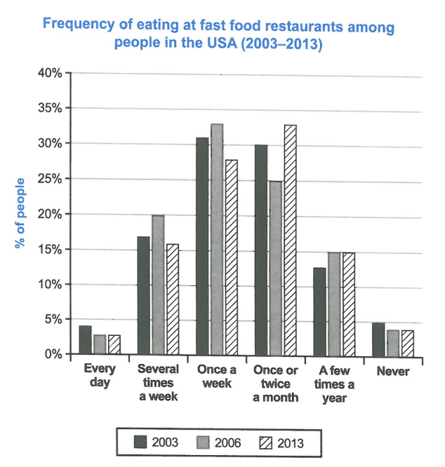
The chart below shows how frequently people in the USA ate in fast food restaurants between 2003 and 2013.
Summarise the information by selecting and reporting the main features, and make comparisons where relevant.
Student answer (Band 4.5)
"The bar chart illustrates different freuquency of eating at fast food restaurants.
The people used every day fast food resturant was approximately 3%in 2003.Morever the people used fast food several times in a week the fast was 20% as compared to the once a week or twice a month.However the people used Unhealthy fast food once a week approximately in 33%in 2006.Morever once or twice a month the percentage of people of eating fast food were 33%.And a few times a year people were used fast food in 2006 which remained same as 2013.Finally,the percentages of people of never used fast food was 5%in 2003,4%in 2006 and in 2013 it was remained same.Overall,the number of eating fast food was was highest in 2013.And between 2003 to 2006 the unhealthy fast food was lowest.These were the four categories dividied of unhealthy fast foods which people used in every day to never all over the world."
AI examiner evaluation
| Criterion | Band |
|---|---|
| Task Achievement / Task Response | 4.5 |
| Coherence and Cohesion | 4.0 |
| Lexical Resource | 5.0 |
| Grammatical Range and Accuracy | 5.0 |
| Overall | 4.5 |
Task Achievement / Task Response: Band 4.5
You identify the chart’s subject and mention several relevant categories, including daily eating, weekly eating, monthly eating and never eating. However, the report only partially selects and describes the main features, and some figures or comparisons are inaccurate: for example, “never” is given as 5%, 4% and unchanged, whereas the chart shows about 4.5%, 3.5% and 3.5%; the 20% figure for several times a week belongs to 2006, but the comparison is unclear. The overview that eating was “highest in 2013” is not supported because the chart gives frequencies rather than an overall total. Focus on the main pattern: weekly eating peaks in 2006, while monthly eating is highest in 2013, and daily eating and never eating remain low.
Coherence and Cohesion: Band 4.0
There is some attempt to guide the reader with sequencing and linking words such as “Moreover,” “However,” “Finally” and “Overall.” The response also moves through several chart categories. However, the information is presented as one continuous paragraph, with no clear separation between an overview and supporting details. Connections between figures are often difficult to follow, as in “20% as compared to the once a week or twice a month,” where the comparison is not specified. Repeated connectors do not create a clear progression, and the final sentences introduce broad claims that do not follow from the data. Group the overview separately, then compare related frequencies and years in a logical order.
Lexical Resource: Band 5.0
The response uses some task-related vocabulary, including “percentage,” “approximately,” “once a week” and “a few times a year,” so the chart’s general subject is usually recognisable. However, the range is limited and several word choices or collocations are inaccurate or repetitive. “Unhealthy fast food” is not a category shown in the chart, and “people used fast food” is an unnatural way to describe eating at restaurants. There are also spelling errors such as “freuquency,” “resturant” and “dividied.” Use precise chart language consistently, such as “the proportion of people who ate out,” “accounted for” and “frequency,” and check spelling before submitting.
Grammatical Range and Accuracy: Band 5.0
You attempt to combine information using longer sentences and linking clauses, but the range of sentence structures is limited and these attempts are often faulty. Errors in verb forms and sentence construction appear in phrases such as “people were used fast food,” “the percentage … were 33%,” and “it was remained same.” Articles, agreement and spacing also need attention, as in “3%in 2003.” These problems sometimes make the relationships between the figures difficult to understand. Practise accurate simple comparison sentences first—for example, “The figure rose to 20% in 2006”—then add more complex structures only when you can control their grammar and punctuation.
See this exact question answered at other band scores. The same prompt compared across bands.
Browse more IELTS Writing model answers or get your own writing scored by the same AI examiner.