Band 5.0 IELTS Writing Task 1 Model Answer
Overall Band Score: 5.0 · Cambridge IELTS 12 · 2026-11-11
IELTS Writing Task 1 question
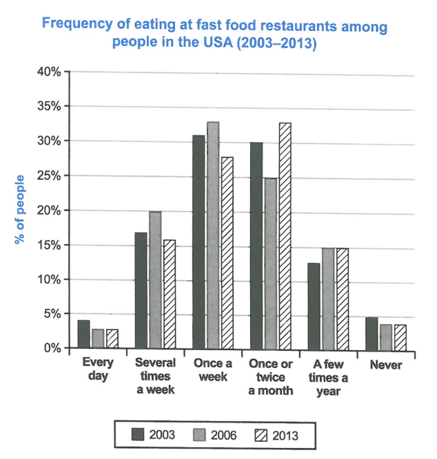
The chart below shows how frequently people in the USA ate in fast food restaurants between 2003 and 2013.
Summarise the information by selecting and reporting the main features, and make comparisons where relevant.
Student answer (Band 5.0)
The chart illustrates the frequently people in the USA ate in fast food resturants between 2003 and 2013.
firstly, The USA had highest ate food in 2013 once or twice a month and once a week, both same range i n two years. In constrast, 2003 had ate food frequency in lowest every day by comparison another years.
Now, ate food frequency every day had highest 2003 approxiamately 4%and 2006and 2013 was almost equal 2.5%. And the other hand several times a week had ate fast food the people was highest 20% in 2006, by comparision another years, was the percentage eat fast food 2003and 2013 17%,16% almost closely.
Moreover, once a week was the percentage of USA people eat fast food in 2006 had highest, and looked by the 2013and 2003.
Once or twice a month had highest percentage 30% people ate fast food in 2013.In contrast, 2006and 2003,
A few times a year had ate fast food 2013and 2006 both equal, and 2003 less percentage comparision by another two years.
At the end the chart Never had ate fast foood people highest 2003 ,5%
another two years 2006 and 2013 both equal almost 4%.
Over all view, the chart had highest ate food USA people in once or twice a month and once a week both equal, 30%.
And the lowest percentage had ate fast food people in every day and never, almost equal.
AI examiner evaluation
| Criterion | Band |
|---|---|
| Task Achievement / Task Response | 5.5 |
| Coherence and Cohesion | 4.5 |
| Lexical Resource | 4.5 |
| Grammatical Range and Accuracy | 4.5 |
| Overall | 5.0 |
Task Achievement / Task Response: Band 5.5
You identify several relevant features, including the rise in monthly visits by 2013 and the relatively low proportions who ate fast food every day or never. However, some key comparisons are inaccurate or unclear. In 2013, once or twice a month was the single highest category at about 33%, while once a week was about 28%; they were not equal at 30%. The daily figures were about 4%, 3% and 3%, rather than approximately 2.5% in the last two years, and the 2003 figure for never was about 4.5%, not 5%. Several categories are mentioned without their figures, so the main changes are only partly reported. A clearer overview and more accurate, selective comparisons would strengthen the response.
Coherence and Cohesion: Band 4.5
The response attempts to group information by frequency and uses signposts such as “In contrast,” “Moreover” and “At the end.” These help show that comparisons are intended. However, the progression is difficult to follow because the opening overview is unclear, individual categories are discussed in a repetitive sequence, and the final overview repeats earlier claims without resolving them. Some linking phrases are awkward or incomplete; for example, “In contrast, 2006and 2003,” is left unfinished. Paragraphing is also limited, with most points presented as separate fragments rather than organised into a clear overview and comparison paragraphs. Grouping the highest-frequency categories together and the lower-frequency ones together, with complete sentences and clearer transitions, would improve the flow.
Lexical Resource: Band 4.5
You use some task-relevant vocabulary, including “percentage,” “frequency,” “highest,” “lowest” and “almost equal,” so the topic is generally recognisable. However, the range is limited and several phrases are repeated, especially “ate fast food” and “had highest.” Word choice and collocation are often unnatural, as in “the frequently people” and “had ate food frequency,” which make the meaning harder to process. There are also spelling errors such as “resturants,” “constrast,” “comparision” and “foood.” Aim for precise chart language such as “the proportion of people who ate out” and “accounted for,” and check spelling carefully. This would make comparisons clearer and more concise.
Grammatical Range and Accuracy: Band 4.5
The response makes an effort to form longer comparisons, but sentence structures are often incomplete or faulty, and the range remains limited. Examples include “the USA had highest ate food in 2013” and “the people was highest 20%,” where the grammatical relationships between the subject, verb and information are unclear. Verb forms are also problematic in phrases such as “had ate” and “people eat fast food … had highest.” Articles and sentence boundaries are frequently missing or inconsistent, and punctuation does not reliably separate complete ideas. These errors sometimes make the intended comparison difficult to understand. Practise building accurate simple sentences first—for example, “The proportion eating once a week peaked at 33% in 2006”—then combine them using a small range of controlled complex structures.
See this exact question answered at other band scores. The same prompt compared across bands.
Browse more IELTS Writing model answers or get your own writing scored by the same AI examiner.