Band 5.0 IELTS Writing Task 1 Model Answer
Overall Band Score: 5.0 · Cambridge IELTS 12 · 2026-11-11
IELTS Writing Task 1 question
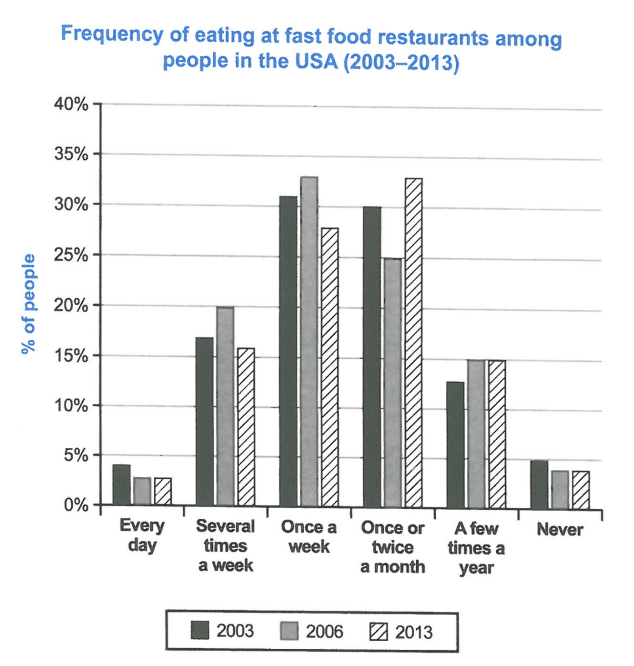
The chart below shows how frequently people in the USA ate in fast food restaurants between 2003 and 2013.
Summarise the information by selecting and reporting the main features, and make comparisons where relevant.
Student answer (Band 5.0)
The bar graph presents the percentage of individuals visitng the fast food resturants in USA from 2003 to 2013.
overall, many individuals visits the fast food shops once a week or once ir twice a month and a small number of people never went to a fast food resturant.
In 2003, less than 5 percent of people visited a fast food resturants everyday and more than 15 percent individuals went to the resturants more than 1 day a week. around 30 percent of population only went to a resturant every week or one to two times a month. Less than 15 percent of people only eats few times a year at a resturant. and 5 percent of people never visited a resturant
In 2006 and 2013, we can see a similar change. The number of everyday visitors fell, declining fropm aproximately 5% to around 2.5% in both years. There is a slight declined in the int he number of people who never ate at a resturant. and we can a slight increase in the number of people who eats a few times a year. also we can a increase in every week visistor and who visitsseveral times a week in 2006 but it decreased in 2013. But the number of every week visitors declined in 2006 but increased in 2013.
AI examiner evaluation
| Criterion | Band |
|---|---|
| Task Achievement / Task Response | 5.5 |
| Coherence and Cohesion | 5.0 |
| Lexical Resource | 5.0 |
| Grammatical Range and Accuracy | 5.0 |
| Overall | 5.0 |
Task Achievement / Task Response: Band 5.5
You identify the chart’s subject and include relevant categories, with an overview noting that weekly and monthly visits were common and that few people never went. However, the overview is broad and does not clearly capture the main change: once-a-week visits were highest in 2003 and 2006, while monthly visits became the most common frequency in 2013. Some comparisons are inaccurate or unclear. For example, the claim that everyday visits fell from about 5% to 2.5% does not match the chart, which shows 4%, 3%, and 3%. The account of weekly visitors also contradicts itself, and “around 30 percent” blurs the separate weekly and monthly figures. Select the key trends and report them precisely to make the summary more complete.
Coherence and Cohesion: Band 5.0
The response has a basic structure: an introduction, an overview, and paragraphs describing the years. This gives the reader some organisation, and time references such as “In 2003” and “In 2006 and 2013” help locate information. However, progression is difficult to follow because the final paragraph combines several trends and then repeats or reverses them: it says weekly visits increased in 2006 and decreased in 2013, then says they declined in 2006 and increased in 2013. Connectors such as “also” and “but” are repeated without making the relationships clear. Group the data by meaningful trends—for example, frequent visits versus monthly or occasional visits—and use clear comparisons to guide the reader.
Lexical Resource: Band 5.0
You use a basic range of task-related vocabulary, including “percentage,” “declining,” “increase,” and “visitors,” so the general subject is understandable. However, the same words and phrases recur, especially “number of people,” “visited,” and “resturant,” and several choices are imprecise for describing the chart. “Every week” is less accurate than “once a week,” while “more than 1 day a week” does not clearly express “several times a week.” Spelling errors such as “visitng,” “resturants,” and “aproximately” are noticeable and reduce control. Aim for accurate category labels and a small range of precise trend verbs, such as “rose,” “fell,” and “remained stable,” rather than repeating general wording.
Grammatical Range and Accuracy: Band 5.0
The response attempts both simple statements and longer sentences with comparisons, but grammatical errors are frequent and sometimes make relationships hard to interpret. Subject–verb agreement is inconsistent in “many individuals visits” and “people who eats”; tense and sentence construction are also faulty in “Less than 15 percent of people only eats few times a year.” The long final paragraph contains incomplete or malformed clauses, including “and we can a slight increase,” and the sentence beginning “But the number of every week visitors” conflicts with the preceding statement. Capitalisation after full stops is inconsistent, as in “overall” and “around.” Practise accurate present-tense descriptions, complete sentence patterns, and punctuation, then check that each comparison has a clear subject and verb.
See this exact question answered at other band scores. The same prompt compared across bands.
Browse more IELTS Writing model answers or get your own writing scored by the same AI examiner.