Band 5.5 IELTS Writing Task 1 Model Answer
Overall Band Score: 5.5 · Cambridge IELTS 12 · 2026-11-11
IELTS Writing Task 1 question
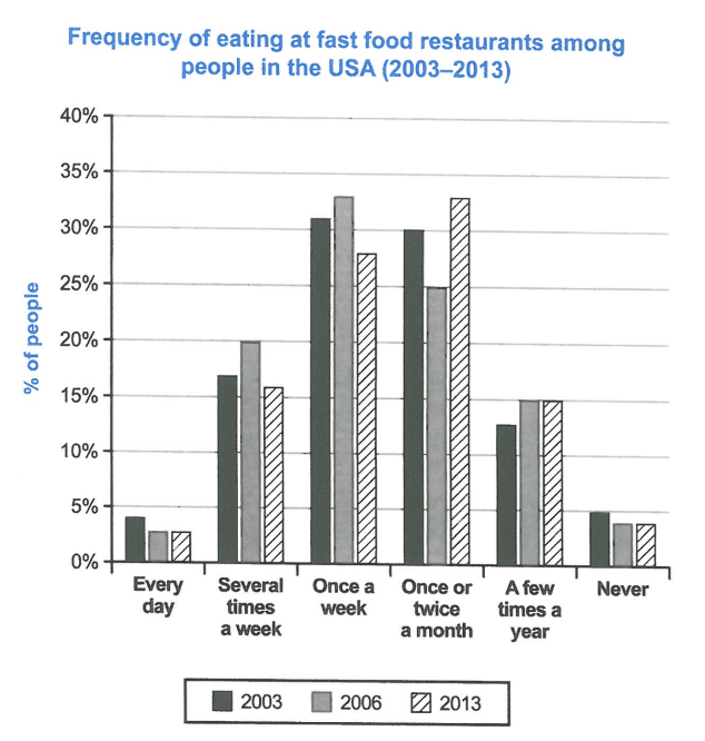
The chart below shows how frequently people in the USA ate in fast food restaurants between 2003 and 2013.
Summarise the information by selecting and reporting the main features, and make comparisons where relevant.
Student answer (Band 5.5)
The bar graph illustrates that how much the population of USA from 2003 to 2013 ate in fast food restaurants. It demonstrates six stages.
Overall, the ratio of once a week and month is the highest. Every day has the lowest ratio that illustrates that people don't eat regularly in restaurants.
Initially, among people in the USA eating fast food in restaurants has similar and highest ratio in once a week and month followed by the years mentioned which is morethan 30 percent. Moreover, the lowest once are everyday and never compared to other days which is eventually lower than a mere 5 percent.
On the other hand, average of the population went to eat in restaurants several times a week. The second lowest ratio is the people's visit a few times a year. The few times a year percentage of followed years was almost same. The comparison can be nade between several times a week and few times a year due to the fact that they are close to each other.
AI examiner evaluation
| Criterion | Band |
|---|---|
| Task Achievement / Task Response | 5.5 |
| Coherence and Cohesion | 5.5 |
| Lexical Resource | 5.5 |
| Grammatical Range and Accuracy | 5.5 |
| Overall | 5.5 |
Task Achievement / Task Response: Band 5.5
You identify the chart’s subject and make an attempt at an overview by noting that weekly and monthly visits were the most common, while daily visits were among the least common. However, the overview is not fully accurate: “once a week and month is the highest” overlooks that monthly visits became the leading category in 2013, while weekly visits peaked in 2006. The response also gives few precise comparisons across the three years, and “average of the population” does not clearly report the several-times-a-week figures. To strengthen the summary, describe the main shifts—for example, monthly visits rose to about 33% in 2013, whereas weekly visits fell to about 28%—and distinguish the low daily and never categories.
Coherence and Cohesion: Band 5.5
The response has a basic paragraph structure, with an introduction, an overview, and two body paragraphs, so the reader can recognise an attempt to organise the report. However, the progression between points is not consistently clear. The opening of the third paragraph, “Initially,” does not establish a clear time sequence, and the final paragraph moves between several-times-a-week and yearly visits without explaining their relationship. Connectors such as “Moreover” and “On the other hand” are used, but they do not always express the intended contrast or addition. Organise the body around clear comparisons, such as the most common frequencies first and the less common ones second, and use linking phrases only where the relationship between ideas is clear.
Lexical Resource: Band 5.5
You use some relevant chart vocabulary, including “ratio,” “percentage,” “comparison,” and “followed,” and the topic remains understandable. However, several choices are imprecise or unnatural for describing proportions: “ratio” is repeatedly used where “percentage” or “proportion” is more suitable, and “the lowest once are everyday and never” is difficult to interpret. There are also noticeable spelling and word-form errors, including “nade” and “morethan,” which reduce the polish of the report. Aim for accurate, conventional expressions such as “the proportion of people who ate out” and “the figures remained almost unchanged.” More precise vocabulary would also help distinguish frequency categories and describe changes over time.
Grammatical Range and Accuracy: Band 5.5
You attempt both simple and more complex sentences, including “The few times a year percentage of followed years was almost same,” but control is uneven and errors sometimes make the meaning difficult to follow. For example, “illustrates that how much” has an incorrect clause structure, while “among people in the USA eating fast food in restaurants has similar and highest ratio” lacks a clear grammatical subject and verb pattern. Articles and agreement are also problematic in phrases such as “the highest ratio in once a week and month.” Use straightforward sentence frames to report figures accurately, such as “The percentage eating out once a week was…” Then add carefully controlled comparisons using “whereas” or “while.” Check articles, verb forms, and sentence boundaries during revision.
See this exact question answered at other band scores. The same prompt compared across bands.
Browse more IELTS Writing model answers or get your own writing scored by the same AI examiner.