Band 4.5 IELTS Writing Task 1 Model Answer
Overall Band Score: 4.5 · Cambridge IELTS 12 · 2026-11-11
IELTS Writing Task 1 question
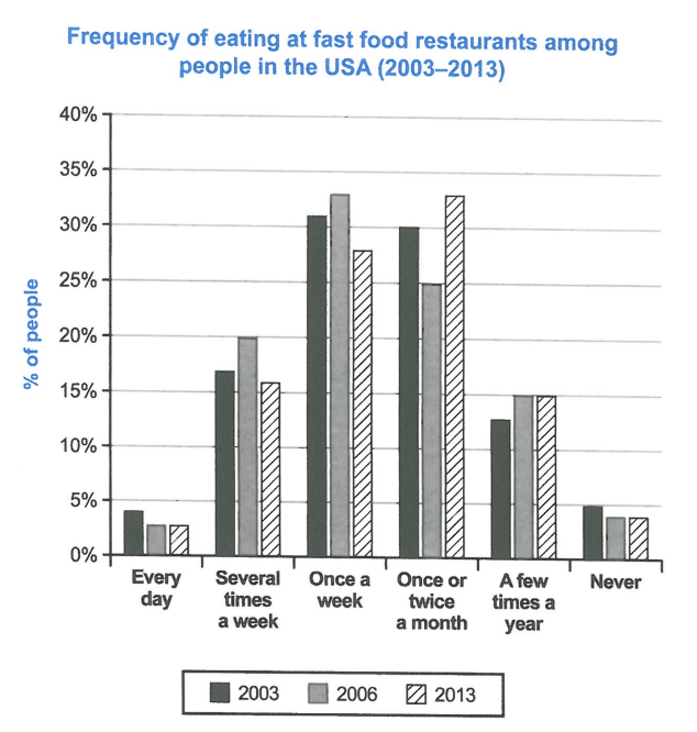
The chart below shows how frequently people in the USA ate in fast food restaurants between 2003 and 2013.
Summarise the information by selecting and reporting the main features, and make comparisons where relevant.
Student answer (Band 4.5)
The illustration gives information about the percentage of people in the USA during the year 2003 to 2013 that ate fast food restaurants. Overall,
It is quite evident from the bar chart that in 2003, there were 4% percent people that ate food everyday as compared to 2006 and 2013 which was 4%. On the other hand, there were on average 17% people that ate fast food resturant in several times a week in 3 different years.
Furthermore,
AI examiner evaluation
| Criterion | Band |
|---|---|
| Task Achievement / Task Response | 3.0 |
| Coherence and Cohesion | 4.0 |
| Lexical Resource | 5.5 |
| Grammatical Range and Accuracy | 5.0 |
| Overall | 4.5 |
Task Achievement / Task Response: Band 3.0
The response identifies the chart’s topic and attempts to report figures, but it covers only a very small part of the data and does not provide a meaningful overview. The claim that daily eating was 4% in 2003 and 2006 is inaccurate: the chart shows 4% in 2003 and 3% in both 2006 and 2013. The statement about 17% eating several times a week is also incomplete, since the figures are 17%, 20% and 16% across the three years. No comparisons are made across the other frequency categories, and the response ends before developing its final point. It is also 72 words below the required minimum. To improve, summarise the main pattern and compare the most notable changes, especially the shift from weekly to monthly eating.
Coherence and Cohesion: Band 4.0
There is a basic attempt to organise the response: an opening identifies the subject, followed by a sentence about daily eating and another about eating several times a week. However, the progression is incomplete and the response stops at “Furthermore,” without presenting the point that should follow. The isolated “Overall,” does not introduce an overview, so the reader is not given a clear summary of the chart’s main features. Linking phrases such as “On the other hand” and “Furthermore” are used, but they do not establish clear relationships between the information. Use complete paragraphs with a clear overview and group comparisons logically, for example by describing the most and least common frequencies before reporting changes over time.
Lexical Resource: Band 5.5
The vocabulary is sufficient to identify the topic and refer to percentages, with phrases such as “bar chart,” “percentage of people,” and “several times a week.” However, the range is narrow and some word choices or collocations are inaccurate, including “ate fast food restaurants,” which suggests people ate the restaurants rather than food there, and “in several times a week.” “Everyday” is also written as one word, although the intended frequency expression is “every day.” The spelling “resturant” is incorrect. These issues do not prevent the general topic from being understood, but more precise chart language would make the report clearer. Practise phrases such as “the proportion who ate at fast-food restaurants” and “once or twice a month.”
Grammatical Range and Accuracy: Band 5.0
The response attempts a few sentence forms, including a comparison using “as compared to” and a clause beginning “that,” but the range remains limited and several grammatical problems affect clarity. In “during the year 2003 to 2013,” the time expression is not formed correctly; use “between 2003 and 2013.” The sentence “there were 4% percent people” has an incorrect construction and repeats the percentage marker. In “which was 4%,” the pronoun reference and agreement are unclear because it refers to two years. The opening sentence also lacks a natural grammatical pattern for describing people eating at restaurants. Build accurate simple sentences first, then add comparisons with clear subjects and verbs, such as “The figure was 4% in 2003, compared with 3% in 2006 and 2013.”
See this exact question answered at other band scores. The same prompt compared across bands.
Browse more IELTS Writing model answers or get your own writing scored by the same AI examiner.