Band 5.5 IELTS Writing Task 1 Model Answer
Overall Band Score: 5.5 · Cambridge IELTS 12 · 2026-11-11
IELTS Writing Task 1 question
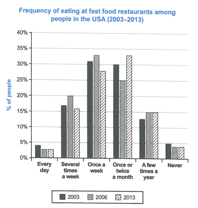
The chart below shows how frequently people in the USA ate in fast food restaurants between 2003 and 2013.
Summarise the information by selecting and reporting the main features, and make comparisons where relevant.
Student answer (Band 5.5)
The bar chart provides information on how oftenly residents of USA had fast food from restaurants between 2003 to 2013.
It is clearly visible that residents of USA that eats everyday have very lower ratio as compared to the people who eat once or twice a week. There are also some people who never eat from fast food restaurants.
Residents eating fast food have various ratio as regular fast food consumers have aronnd 4 percent in 2003 and 3 percent in 2013. Meanwhile, peolple who don't eat fast food are observed 5 percent in 2003, 4 percent in 2006 and 2013. Moreover, there is also a certain group of consumer who nearly have fast food once in a week and have percentage of 31 percent in 2003, 33 percent in 2006 which decreased to 23 percent in 2013. Other group who eat once or twice in a month have 30 percent of usa
AI examiner evaluation
| Criterion | Band |
|---|---|
| Task Achievement / Task Response | 5.0 |
| Coherence and Cohesion | 5.0 |
| Lexical Resource | 5.5 |
| Grammatical Range and Accuracy | 5.5 |
| Overall | 5.5 |
Task Achievement / Task Response: Band 5.0
You identify the chart’s subject and report several relevant figures, including the low proportions eating fast food every day and the weekly figures for 2003 and 2006. However, the response only partially summarises the data: it gives no clear overview of the main changes across the three years, and the final comparison about monthly eating is left incomplete. There is also a significant factual error: once-a-week eating fell to about 28% in 2013, not 23%. The description of people who never ate fast food is also inaccurate for 2003, at about 4.5%, rather than 5%, though this is a small difference. Select the main trends, compare all three years, and check each figure against the chart.
Coherence and Cohesion: Band 5.0
The response has some organisation: it begins with an introduction, then moves to comments about daily, never, weekly and monthly eating. Linking expressions such as “Meanwhile” and “Moreover” help signal relationships between points. However, there is no clear overall progression or distinct overview, and the ideas are presented as a sequence of separate observations rather than grouped comparisons. The final sentence stops after “30 percent of usa,” leaving the monthly category unfinished and disrupting the flow. Some references, such as “Other group,” are also unclear. A clearer structure would use an overview paragraph followed by two body paragraphs grouping the most frequent and less frequent eating patterns, with complete comparisons across the years.
Lexical Resource: Band 5.5
You use some relevant vocabulary for describing the chart, including “percentage,” “consumers,” “decreased,” and “once or twice in a month.” This gives you a basic range for reporting frequency and change. However, several word choices and collocations are inaccurate or awkward, such as “how oftenly,” “had fast food from restaurants,” “very lower ratio,” and “regular fast food consumers.” Spelling errors including “aronnd” and “peolple” also reduce accuracy. Aim for standard chart language and consistent terms: for example, describe the “proportion of people who ate at fast-food restaurants” and say that a figure “fell” or “rose.” More precise vocabulary would make the comparisons easier to understand.
Grammatical Range and Accuracy: Band 5.5
You attempt a mixture of simple statements and longer sentences, including clauses introduced by “who” and “as.” Some meaning is understandable, but grammatical errors recur and sometimes make relationships between ideas difficult to follow. For example, “residents of USA that eats everyday” has problems with the article, relative pronoun and subject–verb agreement; “between 2003 to 2013” uses an incorrect preposition pattern; and “33 percent in 2006 which decreased” needs clearer punctuation and sentence structure. The final sentence is also incomplete. Practise accurate past-tense reporting and agreement, and use complete sentences with clear punctuation. For instance: “The proportion eating once a week rose from 31% in 2003 to 33% in 2006, before falling in 2013.”
See this exact question answered at other band scores. The same prompt compared across bands.
Browse more IELTS Writing model answers or get your own writing scored by the same AI examiner.