Band 5.5 IELTS Writing Task 1 Model Answer
Overall Band Score: 5.5 · Cambridge IELTS 12 · 2026-11-12
IELTS Writing Task 1 question
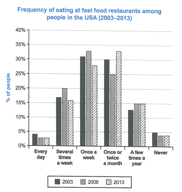
The chart below shows how frequently people in the USA ate in fast food restaurants between 2003 and 2013.
Summarise the information by selecting and reporting the main features, and make comparisons where relevant.
Student answer (Band 5.5)
The bar graph illustrates how frequently individuals in the usa ate in fast food dining establishments between 2003 and 2013.The unit of measurement in percentage.
Overall, it can be seen that frequency of eating at fast food restaurants among people in the usa once a week and once or twice a month was most.While, every day and never was lowest.
To begin with, it can be observed that every day frequency of eating at fast food restaurants among people in the usa in 2003 was only 4% of people after that less to both in 2006 and 2013.Moreover, several times a week in 2003 was 16% following that figure similarly rose around 20% and agen number decrease to approximately 16 %. In addition once a week most in 2006 was 32% and 2003 and 2013 was both miner cheng.
Furthermore, once or twice a month most in 2013 around 32% and after that figure drop to 25% in 2006.Besides a few times a year in 3003 was 15% and afterwards figure increase both 2006 and 2013 was same around 15%.Never fast food eating was almost stared almost unchanged.
AI examiner evaluation
| Criterion | Band |
|---|---|
| Task Achievement / Task Response | 5.5 |
| Coherence and Cohesion | 5.5 |
| Lexical Resource | 5.5 |
| Grammatical Range and Accuracy | 5.0 |
| Overall | 5.5 |
Task Achievement / Task Response: Band 5.5
You identify the chart’s subject and give a broad overview, noting that weekly and monthly visits were the most common while daily visits and never eating out were least common. Several key comparisons are also attempted: for example, you report the monthly category peaking in 2013 and the several-times-a-week figure rising in 2006 before falling. However, some figures and trends are inaccurate or unclear. In 2003, several-times-a-week visits were about 17%, not 16%; the monthly category was about 30% in 2003, not only described through its later peak and fall. The statement that a few-times-a-year figure was 15% in 2003 is incorrect; it was about 12.5%. The final comment on “never” does not clearly report its values. Select the main changes and state them precisely.
Coherence and Cohesion: Band 5.5
The response has a basic structure: an introduction, an overview, and two paragraphs of details. This gives the reader a general route through the information, and linking expressions such as “Moreover,” “Furthermore,” and “Besides” show an attempt to connect points. However, progression within the detail paragraphs is uneven, and several links are mechanical or do not clarify the relationship between figures. For instance, “afterwards figure increase both 2006 and 2013 was same” is difficult to follow, while the final sentence about “never” is disconnected from a clear comparison. Group the categories more deliberately, and use complete comparisons that identify the year and value in each clause. Clearer paragraph-level organisation and referencing would make the account easier to follow.
Lexical Resource: Band 5.5
You use some relevant chart vocabulary, including “frequency,” “percentage,” “rose,” “decrease,” and “unchanged,” so the topic is generally recognisable. However, the range is limited and several word choices or collocations make the meaning unclear, such as “was most,” “both miner cheng,” and “almost stared almost unchanged.” There are also spelling and form errors, including “usa,” “agen,” and “3003,” which reduce precision. Aim for standard expressions used to describe data, such as “accounted for,” “reached a peak,” “fell to,” and “remained stable.” Check spelling carefully and avoid replacing precise chart language with phrases whose meaning is uncertain.
Grammatical Range and Accuracy: Band 5.0
The response attempts some longer sentences and uses time references to compare years, but sentence structures are often incomplete or faulty, which can make the data difficult to interpret. For example, “Moreover, several times a week in 2003 was 16% following that figure similarly rose around 20%” lacks clear clause boundaries, and “Never fast food eating was almost stared almost unchanged” is not grammatically complete. There are recurring problems with articles, agreement, and sentence punctuation, as in “frequency … was most” and the missing space after the first sentence. Use shorter, complete sentences with a clear subject and verb, and check that each comparison has a grammatical structure—for example, “The figure rose from about 17% in 2003 to 20% in 2006, before falling to 16% in 2013.”
See this exact question answered at other band scores. The same prompt compared across bands.
Browse more IELTS Writing model answers or get your own writing scored by the same AI examiner.