Band 6.0 IELTS Writing Task 1 Model Answer
Overall Band Score: 6.0 · Cambridge IELTS 12 · 2026-11-14
IELTS Writing Task 1 question
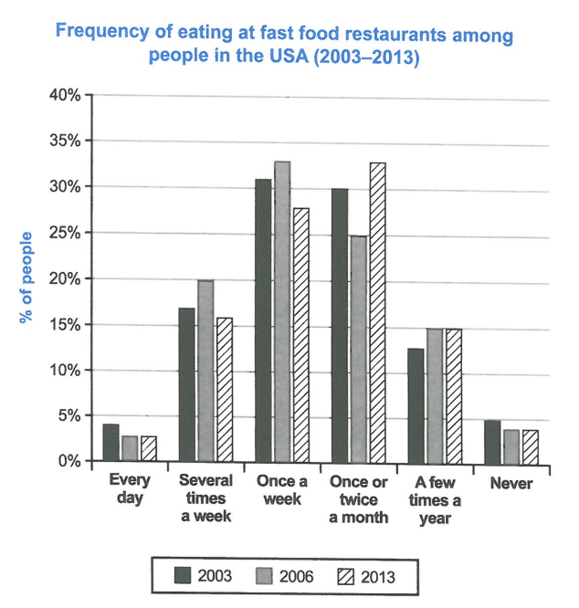
The chart below shows how frequently people in the USA ate in fast food restaurants between 2003 and 2013.
Summarise the information by selecting and reporting the main features, and make comparisons where relevant.
Student answer (Band 6.0)
The graph illustrates the trend of eating at fast food resturants in USA. Data under observation is from three different years. The frequency of eating is divided into 6 main categories. The most popular frequencies of fast food eating at resturants in all the three years are once a week and once or twice a month. The least percentage of people lie in the category of eating every day at resturant and never eating.
In 2003, 2006 and 2013, less than 5 percentage of the US population were those who went out for eating everyday. Similary, in all the three years the percentage of people who never ate fast food outside at a resturant was 5 percent in 2003 and less than 5 percent in 2006 and 2013.
In 2003, approxiamately 31 percent people were those who ate outside once a week while 30 percent chose to eat fast food at a resturant once or twice in a month. Approximately 18 percent people were thosed who ate outside several times a week. While 13 percent of people prefered eating at a restutrant a few times a year.
In 2006, the highest percentage of people (above 30 percent) were those who ate fast food outside once in a week. The second largest category was those who chose to eat outside once or twice a month (25 percent).
In 2013, almost 33 percent people in the USA were those who ate at a resturant once or twice in a month while almost 27 percent ate out once in a week. More than 15 percent ate several times a week while those eating fast food a few times a year in 2013 were exactly 15 percent.
The overall trend fluctuated over the years but the frequency famous amongst most people was once a week or once or twice a month.
AI examiner evaluation
| Criterion | Band |
|---|---|
| Task Achievement / Task Response | 6.0 |
| Coherence and Cohesion | 6.5 |
| Lexical Resource | 5.5 |
| Grammatical Range and Accuracy | 6.0 |
| Overall | 6.0 |
Task Achievement / Task Response: Band 6.0
You identify the main pattern accurately: weekly and monthly visits account for the largest shares, while daily visits and never eating out are the smallest categories. Several key figures are also reported correctly, including 31% and 30% in 2003, and 33% monthly in 2013. However, some details are inaccurate or unclear: in 2006, the weekly figure is 33%, not merely “above 30 percent,” and the 2013 weekly figure is about 28%, rather than “almost 27%.” The claim that more than 15% ate several times a week in 2013 is incorrect; the figure is 16%, but this is only slightly above 15%. The overview also says the trend “fluctuated” without explaining the main shift from weekly to monthly eating. Select and compare these changes more precisely.
Coherence and Cohesion: Band 6.5
The response has a clear overall arrangement: an introduction and overview are followed by details for each year. This makes the information easy to locate, and phrases such as “In 2006” and “In 2013” help signal the sequence. The overview is placed appropriately, although its final repetition of the most popular categories adds little and the year-by-year paragraphs sometimes read as separate lists rather than a connected comparison. Cohesion is also occasionally awkward: the sentence beginning “While 13 percent…” is a fragment, and “Similarly” does not quite introduce the comparison that follows. To strengthen progression, group related categories across years—for example, explain how weekly eating peaked in 2006 before declining, while monthly eating rose by 2013—and use linking phrases to show those contrasts.
Lexical Resource: Band 5.5
You use enough vocabulary to describe the chart, including “percentage,” “category,” “highest,” and “second largest.” However, several expressions are repetitive or imprecise, particularly repeated forms of “those who ate outside” and “frequency famous amongst most people.” Some collocations are unnatural, such as “frequency of eating is divided into” and “people lie in the category.” There are also spelling errors, including “resturants,” “Similary,” “approxiamately,” “thosed,” “prefered,” and “restutrant.” These do not prevent understanding, but they reduce accuracy and control. Use standard chart language such as “the proportion of people who ate out” and “the most common frequency,” and proofread carefully for spelling and word forms.
Grammatical Range and Accuracy: Band 6.0
You use a mix of simple statements and longer sentences, and most of the information remains understandable. There are some grammatical errors, however, particularly with articles, sentence structure, and agreement. For example, “in USA” needs an article (“in the USA”), while “The most popular frequencies … are once a week and once or twice a month” is awkwardly constructed. “While 13 percent of people preferred…” is a dependent clause presented as a sentence fragment. The sentence about people who never ate fast food also has an unclear structure: “the percentage … was 5 percent in 2003 and less than 5 percent in 2006 and 2013.” Aim for complete, direct sentences and check article use and clause boundaries. More accurate complex sentences would help you express comparisons without sacrificing clarity.
See this exact question answered at other band scores. The same prompt compared across bands.
Browse more IELTS Writing model answers or get your own writing scored by the same AI examiner.