Band 5.5 IELTS Writing Task 1 Model Answer
Overall Band Score: 5.5 · Cambridge IELTS 12 · 2026-11-14
IELTS Writing Task 1 question
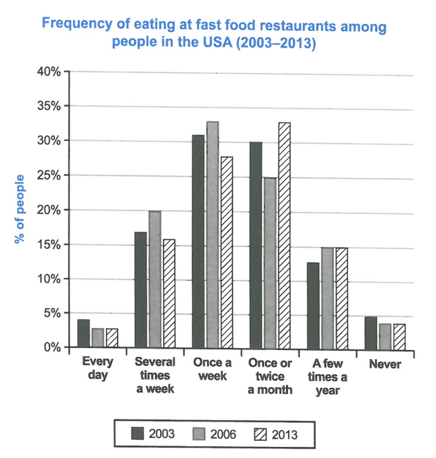
The chart below shows how frequently people in the USA ate in fast food restaurants between 2003 and 2013.
Summarise the information by selecting and reporting the main features, and make comparisons where relevant.
Student answer (Band 5.5)
The graph illustrates that how the USA people ate fast food from restaurants between 2003 and 2013.
Firstly, the total ratio of every day ate fast food less than 5% in the year 2003, 2006 and 2013 where peoples who never take fast food was almost similar . Secondly, the males and females who ate junk food several times a week in year 2003 and 2013 the percentage was more than 15% while the year 2006 the ratio was 20%. Meanwhile the guys who ate unhealthy food once a week in the year 2003 ratio was 31% and the year 2006 data was 35% approximately but 2013 the percentage decrease to 27% only. The peoples wo try to ate fast food once or twice a month ratio was 30% in the year 2003 while the percentage decline by 5% in the year 2006 and 2013 the data was 35% almost. Some people who ate very less time in the year ratio was more than 10% in 2003 but the year 2006 and 2013 ratio was 15% which almost remain same.
Overall, in the year 2003 the highest ratio found in several time a week who ate junk diet alongwith in 2006 the highest data was collected in once a week they ate fast food and 2013 who ate unhealthy diet more than two time in a month get highest number of people .
AI examiner evaluation
| Criterion | Band |
|---|---|
| Task Achievement / Task Response | 5.5 |
| Coherence and Cohesion | 5.5 |
| Lexical Resource | 5.0 |
| Grammatical Range and Accuracy | 5.0 |
| Overall | 5.5 |
Task Achievement / Task Response: Band 5.5
You identify the chart’s subject and report several relevant categories, including daily eating, weekly visits, monthly visits and eating only a few times a year. You also note the broad shift from weekly eating being most common in 2003 and 2006 to monthly eating in 2013. However, some key figures are inaccurate: once a week in 2006 is about 33%, not 35%, and in 2013 it is about 28%, not 27%; the 2003 highest category is once a week, not several times a week. The overview is also unclear, particularly the final comparison. To strengthen the response, select the main patterns accurately and state them clearly, including that daily and never eating remained the least common frequencies.
Coherence and Cohesion: Band 5.5
The response has an identifiable opening, a body containing comparisons, and a concluding overview, so the reader can recognise an attempt to organise the report. However, progression within the body is difficult to follow: the repeated sequence of “Firstly,” “Secondly,” and “Meanwhile” does not consistently clarify how the categories relate, and several long sentences combine multiple years and figures. The final paragraph repeats some information but its meaning is unclear, especially “more than two time in a month get highest number of people.” Use one paragraph to group the main trends and another to compare the remaining categories, with clear links such as “by contrast” or “whereas.” Ensure each sentence makes one comparison at a time.
Lexical Resource: Band 5.0
You use a range of terms connected with the topic, such as “percentage,” “ratio,” “decline,” and “highest,” and you attempt to avoid repeating the chart’s wording. However, vocabulary choices are often inaccurate or informal for an academic report. “Guys,” “junk diet,” and “unhealthy food” are not suitable substitutes for people eating at fast-food restaurants, while “ratio” is repeatedly used where “proportion” or “percentage” is intended. Phrases such as “very less time” and “highest data was collected” also make the meaning less precise. Aim for consistent, neutral language and use the chart’s frequency labels accurately; this will make comparisons clearer without needing many synonyms.
Grammatical Range and Accuracy: Band 5.0
You attempt to use longer sentences and linking clauses, but these structures are often faulty, and errors frequently make the comparisons harder to understand. For example, “The graph illustrates that how” has an unnecessary “that,” while “the percentage decrease to 27%” has an incorrect verb form. There are also problems with articles, agreement and sentence construction in phrases such as “the USA people” and “the peoples who never take fast food was almost similar.” Several sentences lack clear grammatical relationships between their clauses. Practise writing short, accurate comparisons first, then combine them using controlled clauses. Check subject–verb agreement and keep past-tense reporting consistent.
See this exact question answered at other band scores. The same prompt compared across bands.
Browse more IELTS Writing model answers or get your own writing scored by the same AI examiner.