Band 5.0 IELTS Writing Task 1 Model Answer
Overall Band Score: 5.0 · Cambridge IELTS 12 · 2026-11-14
IELTS Writing Task 1 question
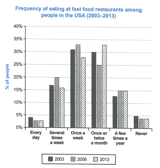
The chart below shows how frequently people in the USA ate in fast food restaurants between 2003 and 2013.
Summarise the information by selecting and reporting the main features, and make comparisons where relevant.
Student answer (Band 5.0)
the chart illustrate the percentage of eating at fast food restaurants among people in the USA between 2003 and 2013.
Overall , it is clear that most of the people in 2013 eat outside once or twice month. While , in 2003 they eat junk food once a week.
To begin with people in 2003, around 4% of people eat outside everyday. This number has increased to reach approximately 31% for the among of USA habitant that go to restaurants once a week and 30% for the type that go once or twice a month. A signfically decreasing is shown for people who never eat junk food with a percentage of 5%.
Moving to 2006 and 2013, it is the same number for both years with approximately 3% . While, people who eat outside once a week a more with 33% and 27% respectively. In contrast for the among of USA habitant that eat once or twice a month with 25% for 2006 people and 33% for 2013. It is the same for both years for people who never eat junk food with a percentage of 3% approximately.
AI examiner evaluation
| Criterion | Band |
|---|---|
| Task Achievement / Task Response | 5.0 |
| Coherence and Cohesion | 5.0 |
| Lexical Resource | 5.0 |
| Grammatical Range and Accuracy | 5.0 |
| Overall | 5.0 |
Task Achievement / Task Response: Band 5.0
You identify the broad pattern that once a week was most common in 2003, while eating once or twice a month was most common in 2013. You also include several relevant figures, such as 31% and 30% in 2003 and 25% and 33% for monthly eating in 2006 and 2013. However, the overview is limited and does not summarise the main changes across all three years. Some details are inaccurate: the 2013 once-a-week figure is 28%, not 27%, and the 2006 figure is 33%; the claim that the daily figures are the same in 2006 and 2013 overlooks that they are approximately 3% in both, but this should be clearly tied to the daily category. Several categories, including eating several times a week and a few times a year, are omitted. A fuller, more accurate overview and selective coverage of these trends would strengthen the response.
Coherence and Cohesion: Band 5.0
The response has a basic paragraph structure: an introduction, an overview, and two paragraphs organised by year. This gives the reader some sense of how the information is grouped. However, progression is not consistently clear because the final paragraph moves between daily, weekly, monthly and never categories without a stable comparison pattern. Linking phrases such as “To begin with” and “Moving to” help signal shifts, but “While” and “In contrast” are sometimes used awkwardly or without a clear contrast. References such as “This number” are also unclear because they follow a sentence containing more than one figure. Organise the body by frequency categories or by clear year-to-year comparisons, and use linking words only where the relationship between the figures is explicit.
Lexical Resource: Band 5.0
You use some relevant vocabulary for describing the chart, including “percentage,” “increased,” “decreasing,” and “approximately.” However, the range is limited, and several choices are inaccurate or unnatural for this topic. “Eat outside” does not clearly mean eating at a fast-food restaurant, while “junk food” changes the chart’s meaning; “USA habitant” is also not an appropriate expression for people in the USA. There are noticeable spelling and word-form errors, including “signfically” and “among,” which make parts of the description harder to understand. Use precise chart language consistently, such as “the proportion of people who ate at fast-food restaurants,” and check spelling and collocations when revising.
Grammatical Range and Accuracy: Band 5.0
The response attempts some complex sentence forms, including “Overall, it is clear that…” and a contrast beginning with “While,” but the range is limited and errors occur frequently. Verb forms and agreement are often inaccurate: “the chart illustrate” should be “the chart illustrates,” and “most of the people in 2013 eat” would be clearer as “most people in 2013 ate.” Sentence construction is also faulty in phrases such as “people who eat outside once a week a more,” where the comparison is incomplete. Articles, plurals and punctuation need attention too, as in “once or twice month” and the spaces before commas. Practise writing complete comparison sentences with consistent past-tense forms, and proofread each sentence for a clear subject and verb.
See this exact question answered at other band scores. The same prompt compared across bands.
Browse more IELTS Writing model answers or get your own writing scored by the same AI examiner.