Band 5.0 IELTS Writing Task 1 Model Answer
Overall Band Score: 5.0 · Cambridge IELTS 12 · 2026-11-14
IELTS Writing Task 1 question
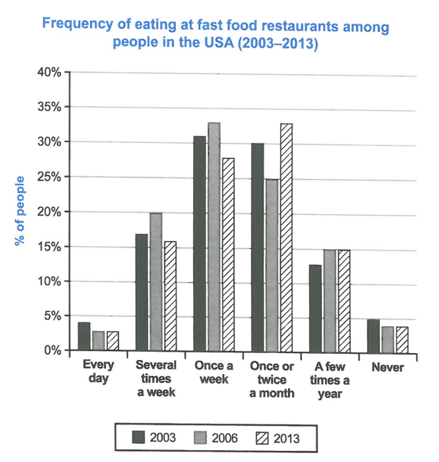
The chart below shows how frequently people in the USA ate in fast food restaurants between 2003 and 2013.
Summarise the information by selecting and reporting the main features, and make comparisons where relevant.
Student answer (Band 5.0)
The chart illustrates how frequently people in the USA ate in fats food restaurants between2003 and 2013.
Overall, it is noticeable that the highest percentage of eating in restaurants is 33% in 2006 which is once a week. The lowest percentage of every day eating in restaurants in 2006 which is only 3%.
It is evident that every day eating percentage in 2003, 2006 and 2013 is 4%, 3% and 3%, several times a week is 17%, 20% and 16%, once a week is 31%, 33% and 28%, once or twice a month is 30%,25% and 33%, a few teams a year is 13%, 15% and 15% and never eating percentage is 5%, 4% and 5%.
A closer look reveals that there is large difference between the percentage of eating in a restaurants in once a week and every day. Which is 32% once a week and 4% every day in 2003.
AI examiner evaluation
| Criterion | Band |
|---|---|
| Task Achievement / Task Response | 4.5 |
| Coherence and Cohesion | 5.5 |
| Lexical Resource | 5.0 |
| Grammatical Range and Accuracy | 5.0 |
| Overall | 5.0 |
Task Achievement / Task Response: Band 4.5
You identify several relevant figures and include an overview, noting the peak of 33% for weekly visits in 2006 and the low daily figures. However, the overview is incomplete: the most important overall shift is that monthly visits became the most common frequency by 2013, while weekly visits declined. The final comparison between weekly and daily eating in 2003 is relevant but gives little additional coverage of the chart. Some figures are also inaccurate: “never” is reported as 5%, 4%, and 5%, rather than approximately 4.5%, 3.5%, and 3.5%. The response is 144 words, below the 150-word minimum; the eight words copied from the prompt are excluded. Develop the main trends and comparisons more fully.
Coherence and Cohesion: Band 5.5
The response has a recognisable structure: an introduction, an overview, a paragraph listing the data, and a final comparison. This makes the chart’s subject and the broad purpose of each section understandable. However, progression is limited because the third paragraph presents nearly all categories as a long sequence, rather than grouping related trends, and the final paragraph repeats a comparison without connecting it clearly to the overview. Linking is also sometimes awkward: “A closer look reveals” does not lead to a developed analysis, while “Which is 32%...” is an incomplete follow-on. Organise the body around meaningful patterns—for example, weekly versus monthly visits—and use clear sentence links to show how the figures change over time.
Lexical Resource: Band 5.0
You use enough topic vocabulary to identify the categories, including “once a week,” “once or twice a month,” and “a few times a year.” The repeated category labels help keep the data recognisable. However, the range is limited, and several phrases are inaccurate or unnatural, such as “fats food restaurants,” “a few teams a year,” and “eating in a restaurants.” Repetition of “percentage” and “eating” also makes the report less precise and fluent. Choose concise chart-reporting expressions such as “the proportion of people who ate out” and “daily visits,” and check spelling carefully. More varied verbs such as “rose,” “fell,” and “accounted for” would help describe the comparisons without repeatedly listing category names.
Grammatical Range and Accuracy: Band 5.0
You attempt a few different sentence forms, including an overview beginning “Overall” and a longer sentence listing figures across all six categories. However, the range is limited, and errors recur in sentence construction, articles, and punctuation. For example, “The lowest percentage of every day eating in restaurants in 2006 which is only 3%” is not a complete sentence, and “Which is 32% once a week...” is a fragment. The list sentence also needs clearer punctuation and parallel structure. Practise writing complete comparisons, such as “In 2003, 31% ate at fast-food restaurants weekly, compared with 4% who did so daily.” This will improve accuracy while allowing you to use a wider range of structures.
See this exact question answered at other band scores. The same prompt compared across bands.
Browse more IELTS Writing model answers or get your own writing scored by the same AI examiner.