Band 6.0 IELTS Writing Task 1 Model Answer
Overall Band Score: 6.0 · Cambridge IELTS 12 · 2026-11-14
IELTS Writing Task 1 question
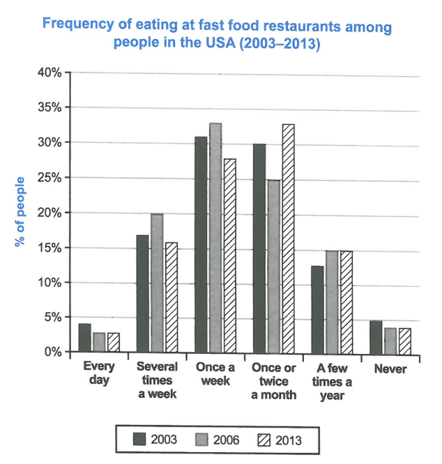
The chart below shows how frequently people in the USA ate in fast food restaurants between 2003 and 2013.
Summarise the information by selecting and reporting the main features, and make comparisons where relevant.
Student answer (Band 6.0)
The bar chart illustrates frequency of fast food intake among citizens in America from 2003 to 2013.
Overall, the most common eating trend was once a week or once or twice a month. Both trend were consistent in 2003 while once a week frequency increased and once a month had a fall in 2006 but once a week had a fall and once a month had surged in 2013. In addition, everyday and no intake frequency was less and consistent.
In 2003, once a week frequency of fast food among people was around 32% while once in month was approximately 30%. Everyday intake or no intake was almost less than 5%. Several times a week was about 17% and few times a year was around 13 %.
In 2006, once a week was around 33% the highest percentage and once a month was 25% which was decreased as compared to 2003.
In 2013, once a week fall to around 28% and once a month raised to around 33% highest frequency.
AI examiner evaluation
| Criterion | Band |
|---|---|
| Task Achievement / Task Response | 6.5 |
| Coherence and Cohesion | 6.5 |
| Lexical Resource | 6.0 |
| Grammatical Range and Accuracy | 5.5 |
| Overall | 6.0 |
Task Achievement / Task Response: Band 6.5
You identify the main pattern accurately: weekly and monthly visits account for the largest shares, and the leading frequency shifts from once a week in 2006 to once or twice a month in 2013. The figures you give for these categories are broadly consistent with the chart, as are the low daily and never figures. This provides a relevant overview and supports it with selected data. However, the overview is difficult to follow in places, especially “Both trend were consistent in 2003,” and the claim that the two leading trends were consistent is not quite clear given their changes across the period. The less frequent categories are reported mainly for 2003, with little comparison thereafter. Clearer trend statements and a brief account of how these categories changed would make the coverage more complete.
Coherence and Cohesion: Band 6.5
The response has a recognisable structure: an introduction and overview are followed by paragraphs organised by year. This makes the information generally easy to locate, and time markers such as “In 2006” and “In 2013” help signal progression. However, the overview combines several trends in a long sentence, and the links between ideas are sometimes unclear—for example, “once a week frequency increased and once a month had a fall in 2006 but once a week had a fall…” The year-by-year approach also leads to some repetition of the two main categories rather than grouping their changes for comparison. Use shorter, more clearly connected overview sentences, then organise the details around the main categories or trends. This would strengthen progression while retaining the clear overall arrangement.
Lexical Resource: Band 6.0
You use enough task-related vocabulary to describe the chart, including “frequency,” “percentage,” “increased,” “decreased,” and “surged.” These choices communicate the main movements, and the range is adequate for a data summary. Some word choices and collocations are imprecise or repetitive, however. “Fast food intake” is less natural here than “eating at fast-food restaurants,” while “once in month” and “everyday intake” do not express the chart labels accurately. “Less” in “was less and consistent” is also unclear, and “raised” is not the natural verb for a figure that went up. Aim to use the chart’s category labels consistently and choose precise verbs such as “rose,” “fell,” or “remained stable.”
Grammatical Range and Accuracy: Band 5.5
You attempt both simple statements and longer sentences with contrast, such as “In 2006, once a week was around 33% … and once a month was 25%.” The main comparisons are usually understandable, but some grammatical errors remain and occasionally make the overview harder to interpret. For example, “Both trend were consistent” has an agreement error, and “once a week frequency increased and once a month had a fall” has awkward tense and clause construction. Articles and sentence structure also need attention in “once in month was approximately 30%.” Use complete, parallel clauses when comparing categories, and check subject–verb agreement and article use. More consistently accurate complex sentences would improve control without requiring more complicated ideas.
See this exact question answered at other band scores. The same prompt compared across bands.
Browse more IELTS Writing model answers or get your own writing scored by the same AI examiner.