Band 5.0 IELTS Writing Task 1 Model Answer
Overall Band Score: 5.0 · Cambridge IELTS 12 · 2026-11-14
IELTS Writing Task 1 question
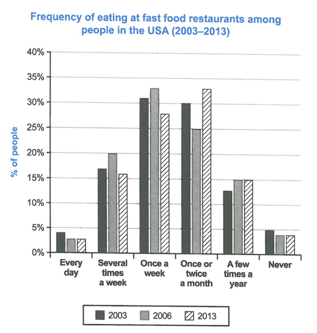
The chart below shows how frequently people in the USA ate in fast food restaurants between 2003 and 2013.
Summarise the information by selecting and reporting the main features, and make comparisons where relevant.
Student answer (Band 5.0)
The given bar graph represents frequency of eating at fast food restaurants among people in the USA between 2003 and 2013.
Initially by the year 2003 we can observe that 30% of people were eating fast food once a week and coming to 2013 we can clearly see that more then 33% of the people ate fast food once or twice a month.
Back then in 2003 we can observe that less then 5% people like to ate fast food every day and similarly its the same for the year 2006 and 2013.
But if we watch the weekly data we can observe that 20% of people in 2006 ate fast food several times a week but in 2003 and 2013 less then 18% of people eat fast food several times a week.
We can clearly observe that more then 33% of people in 2013 like to ate fast food once or twice in a month but in the same scenario we can clearly see difference in 2003 and 2006. In 2003 we can see that 25% of the people like to ate fast food and in 2006 30% of people like to eat fast food.
At last by observing the bar graph we can observe that rather then the year 2003 less then 5% people never ate fastfood.
AI examiner evaluation
| Criterion | Band |
|---|---|
| Task Achievement / Task Response | 5.0 |
| Coherence and Cohesion | 5.0 |
| Lexical Resource | 5.5 |
| Grammatical Range and Accuracy | 5.0 |
| Overall | 5.0 |
Task Achievement / Task Response: Band 5.0
You identify the chart’s subject and report several relevant comparisons, including the peak for weekly eating in 2006 and the rise in monthly eating by 2013. However, the response only partially summarises the main features: it has no clear overview of the overall pattern, and some figures are misreported. For example, you say that in 2003 “25%” ate fast food once or twice a month, whereas the chart shows about 30%; you then give 30% for 2006, although it is about 25%. The statement that 2013 was “more then 33%” is also slightly high, though close to the chart’s approximate 33%. Include the main shifts accurately and distinguish the categories more clearly to develop the summary.
Coherence and Cohesion: Band 5.0
The response follows a broadly chronological approach and uses basic linking expressions such as “But,” “similarly,” and “At last,” so the reader can identify the years and categories being discussed. However, there is no clear overall progression from an overview to selected comparisons, and several points are repeated: the 2013 monthly figure is mentioned twice, while the final sentence introduces the “never” category without explaining its comparison fully. Repeated framing such as “we can observe” and “we can clearly see” makes the links mechanical rather than helping organise the information. Group the main trends into a short overview followed by focused comparisons, and use references that make each comparison unambiguous.
Lexical Resource: Band 5.5
You use enough topic vocabulary to communicate the chart’s subject, including “frequency,” “weekly data,” and “once or twice a month.” However, the range is limited and several phrases are repetitive or imprecise, particularly “we can observe” and “like to ate fast food.” “Back then” is conversational for an academic report, and “fastfood” should be written as two words. Some wording also makes the category or comparison less clear, such as “in the same scenario.” Aim for concise, neutral reporting language and use precise verbs for changes and comparisons. This would make the description more natural and accurate while retaining the relevant vocabulary you already use.
Grammatical Range and Accuracy: Band 5.0
You attempt some longer sentences with contrast, for example, “But if we watch the weekly data…” and “more then 33% … but…,” but the range is limited and errors recur. The phrase “people like to ate” uses an incorrect verb form; use “people ate” or “people liked to eat.” There are also missing articles or plural forms in “less then 5% people,” and tense shifts between “ate” and “eat” when describing past data. Several sentences are joined with “but” without clear punctuation, and the repeated introductory clauses make sentence patterns monotonous. Practise accurate past-tense reporting and build comparisons with controlled clauses and punctuation.
See this exact question answered at other band scores. The same prompt compared across bands.
Browse more IELTS Writing model answers or get your own writing scored by the same AI examiner.