Band 5.5 IELTS Writing Task 1 Model Answer
Overall Band Score: 5.5 · Recent IELTS Exams (Canada & India) · 2026-11-06
IELTS Writing Task 1 question
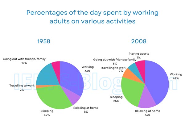
The pie charts below show how working adults in a particular country spent their time in 1958 and 2008.
Summarise the information by selecting and reporting the main features, and make comparisons where relevant.
* Note: these aren’t the original diagrams given in the test, they were recreated for the purpose of demonstration.
Student answer (Band 5.5)
The pie charts illustrates the way working adults spent their time in a particular country between 1958 and 2008.
Overall, the proportion of relaxing at home and travelling to work increase are similar. While percentage of slepping and going out with family and friend have had reduced. Meanwhile, percentage of working times expericenced increased.
In 1958, going out with friends/family was at 19 percent of time in a day. This figure is sharply decreased to 6 percent in 2008. Working adults spent their 32 percent of time sleeping in 1958. While this trend has decreased by 7 percent in 2008, stood at 25 percent.
The percentage of adults spent their time travelling to work rose from 2 percent to 7 in 1958 and 2008. The proportion of adults spent their times relaxing at home was at 8 percent in 1958. Which then slightly increased in 2008, at 13 percent. In 1958, adults spent their time at working was 33 percent. This figure eventually increased to 42 percent in 2008.
AI examiner evaluation
| Criterion | Band |
|---|---|
| Task Achievement / Task Response | 6.0 |
| Coherence and Cohesion | 6.0 |
| Lexical Resource | 5.5 |
| Grammatical Range and Accuracy | 5.0 |
| Overall | 5.5 |
Task Achievement / Task Response: Band 6.0
You cover the main categories and report most figures accurately: for example, going out falls from 19% to 6%, sleeping from 32% to 25%, and working rises from 33% to 42%. The overview also identifies the broad increase in work and decreases in sleep and socialising. However, its comparison of relaxing and commuting is unclear: these categories both rise, but by different amounts, and the wording does not explain their changes. The account would be more complete with a clearer overview of the largest shifts, including the new sports category in 2008, and more precise comparisons. Also correct the statement that commuting rose “from 2 percent to 7 in 1958 and 2008”: 2% is the 1958 figure and 7% is the 2008 figure.
Coherence and Cohesion: Band 6.0
The response has a recognisable structure, with an introduction, an overview and two paragraphs of supporting details. The figures are generally grouped in a sensible way, and time markers such as “In 1958” and “in 2008” help readers follow the comparisons. However, some linking is mechanical or unclear. The overview’s “Overall” sentence strings together several trends without clearly distinguishing them, while “While this trend has decreased…” begins a fragment rather than a complete sentence. The sentence beginning “Which then slightly increased” is also incomplete, and the commuting comparison’s time reference is confusing. Use complete sentences and organise the details into clearer comparisons between categories that rose and those that fell.
Lexical Resource: Band 5.5
You use relevant vocabulary for describing charts, including “proportion,” “sharply decreased,” “rose” and “increased,” so the main trends are understandable. There is some repetition of “percentage,” “figure” and “spent their time,” and several word-choice or form errors reduce precision. For example, “working times” is not a natural way to describe the share of the day devoted to work, and “the proportion of relaxing at home” is awkward. Spelling errors such as “slepping” and “expericenced,” along with the inconsistent phrase “friends/family” versus “family and friend,” also affect accuracy. Aim for a small range of precise chart language, such as “accounted for,” “share” and “rose from … to …,” and check spelling and collocations.
Grammatical Range and Accuracy: Band 5.0
You attempt both simple and more complex sentence forms, and the reader can usually understand the comparisons. However, errors occur in agreement, verb forms and sentence construction. “The pie charts illustrates” should use a plural verb, while “the proportion … increase” needs a correctly formed verb. The clause “While this trend has decreased by 7 percent in 2008, stood at 25 percent” is not grammatically complete, and “Which then slightly increased” is a fragment. There are also problems with articles and patterns, as in “adults spent their time at working.” Practise building complete comparison sentences with a clear subject and verb, and check agreement and tense consistency. Greater control of these structures would make the information easier to follow.
See this exact question answered at other band scores. The same prompt compared across bands.
Browse more IELTS Writing model answers or get your own writing scored by the same AI examiner.