Band 4.5 IELTS Writing Task 1 Model Answer
Overall Band Score: 4.5 · Recent IELTS Exams (Canada & India) · 2026-11-09
IELTS Writing Task 1 question
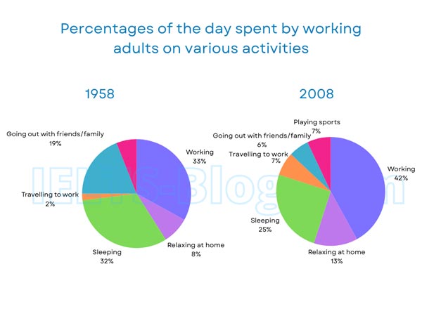
The pie charts below show how working adults in a particular country spent their time in 1958 and 2008.
Summarise the information by selecting and reporting the main features, and make comparisons where relevant.
* Note: these aren’t the original diagrams given in the test, they were recreated for the purpose of demonstration.
Student answer (Band 4.5)
The pie chart illustrate that the working of adults in a particular country spent their time in different era's of 1958 and 2008. The pie chart of 2008 describes firstly 19 percent of adults going out with family and friends,only 2% traveling to work. Now if we talk about how many adults spend their time in sleeping its about 20 percent more than adults traveling to work and who's rate is about 32%. additional there is also 8% of adults who spend their time for relaxing at home. Finally there are 33% of adults are involved in working and that is great deal rather than others factor. Move to pie chart of 2008 we can see that there are only 6% adults who's going with family and friends, 7% traveling to work ,25% spend thir time in sleeping ,13% adults relaxing at home and 42 % are involved in working. In comparison with 1958 pie chart working there is great management of everything related to adults in 2008. That's is great and very successful for adults in 2008 because they mange everything propery in specific range.
AI examiner evaluation
| Criterion | Band |
|---|---|
| Task Achievement / Task Response | 4.5 |
| Coherence and Cohesion | 4.0 |
| Lexical Resource | 5.0 |
| Grammatical Range and Accuracy | 5.0 |
| Overall | 4.5 |
Task Achievement / Task Response: Band 4.5
You report several figures accurately, including working (33% to 42%), sleeping (32% to 25%), and travel to work (2% to 7%). However, the opening says “The pie chart of 2008” before giving the 1958 figures, which misidentifies the year and makes the data difficult to follow. The response also omits playing sports, shown at 7% in 2008, and does not provide a clear overview of the main changes. Instead, the final comments that adults “manage everything” and that 2008 was “very successful” are unsupported opinions rather than chart summaries. To strengthen the response, identify the major trends—such as increased working time and reduced socialising—and compare the years accurately and objectively.
Coherence and Cohesion: Band 4.0
There is an attempt to move through the charts in sequence, using markers such as “Firstly,” “Finally,” and “Move to pie chart of 2008.” This gives the response some basic organisation. However, the first set of figures is incorrectly introduced as belonging to 2008, and the reader must infer that these are actually the 1958 values. The response is also presented as one long paragraph, with no clear separation between an overview and supporting details. Some links, including “Now if we talk about” and “In comparison with 1958 pie chart working,” are awkward or unclear, while the concluding opinion does not follow logically from the data. Group the information by year, add a concise overview, and use clear comparisons to guide the reader.
Lexical Resource: Band 5.0
You use some relevant vocabulary for describing the charts, including “spend their time,” “involved in working,” and “in comparison.” However, the range is limited and several choices are inaccurate or unnatural, such as “different era’s,” “great deal rather than others factor,” and “great management of everything.” These expressions make the intended comparisons less precise, and the evaluative language about success is not suitable for an objective chart report. There are also noticeable spelling and word-form errors, including “thir,” “mange,” and “propery.” Aim for precise terms such as “proportion,” “accounted for,” and “increased,” and check spelling and collocations before submitting.
Grammatical Range and Accuracy: Band 5.0
The response attempts both simple and longer sentence forms, and some figures are expressed in understandable clauses. However, errors occur frequently enough to make several sentences difficult to follow. For example, “The pie chart illustrate” has subject–verb disagreement, while “there are 33% of adults are involved” combines incompatible sentence patterns. The sentence about sleeping and travelling is also confusing: “who’s rate is about 32%” does not clearly connect the figures. Articles, plurals, and punctuation are inconsistent, as in “the pie chart of 2008” and the missing spaces after commas. Use a reliable pattern such as “Working accounted for 33% of the day in 1958,” and check agreement and sentence boundaries.
See this exact question answered at other band scores. The same prompt compared across bands.
Browse more IELTS Writing model answers or get your own writing scored by the same AI examiner.