Band 6.0 IELTS Writing Task 1 Model Answer
Overall Band Score: 6.0 · Recent IELTS Exams (Canada & India) · 2026-11-09
IELTS Writing Task 1 question
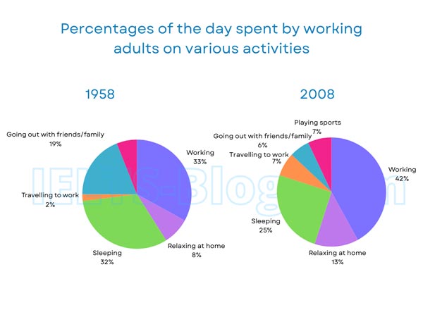
The pie charts below show how working adults in a particular country spent their time in 1958 and 2008.
Summarise the information by selecting and reporting the main features, and make comparisons where relevant.
* Note: these aren’t the original diagrams given in the test, they were recreated for the purpose of demonstration.
Student answer (Band 6.0)
The given pie charts shows the proportion of various activities done by working adults throughout their day in year 1958 and 2008.
Overall, working accounted for the highest proportion of time spent in both years, while travelling to work remained least.
Talking about the year 1958 first, as working shared the highest proportion with 33% of day's time, travelling to work remained the least with just about 2% of share and going out with family and friends shared 19%. Sleeping shared 32% while relaxing at home about 8% and playing sports less than 6%.
In contrast to this, in 2008, working hours still shared the highest proportion with increase of 9% at 42% but going out with friends and family significantly reduced to just 6%. Travelling to work increased to 7%. Sleeping reduced to 25% while relaxing at home increased to 13%. Playing sports largely remained same at 7%.
AI examiner evaluation
| Criterion | Band |
|---|---|
| Task Achievement / Task Response | 5.5 |
| Coherence and Cohesion | 6.5 |
| Lexical Resource | 5.5 |
| Grammatical Range and Accuracy | 5.5 |
| Overall | 6.0 |
Task Achievement / Task Response: Band 5.5
You identify the main pattern that working takes the largest share in both years and report several relevant comparisons, including the rise in work from 33% to 42% and the fall in socialising from 19% to 6%. However, the overview is incomplete: travelling was the smallest category in 1958, but in 2008 sports and travelling were tied at 7%, so it did not remain the least. You also introduce sports in the 1958 account even though the chart gives no figure for that year; the 7% figure applies only to 2008. The response is one word below the required minimum. Include a clearer overview and ensure every reported figure is supported by the chart.
Coherence and Cohesion: Band 6.5
The response has a clear overall arrangement: an introduction, a brief overview, and separate paragraphs for 1958 and 2008. This makes the year-by-year comparison easy to follow, and transitions such as “In contrast to this” help signal the shift between years. The progression is generally logical, though the overview’s claim about the least category is not consistent with the later data, which weakens the connection between the summary and details. Some linking phrases, such as “Talking about the year 1958 first,” are conversational and could be more concise. A more comparative structure that groups increases and decreases across both years would make the progression more flexible and cohesive.
Lexical Resource: Band 5.5
You use a relevant range of chart vocabulary, including “proportion,” “accounted for,” “increased,” and “reduced,” and the meaning is generally clear. However, several expressions are repetitive or imprecise: “shared the highest proportion” and “shared 19%” are repeated, while “working hours” is not quite the same as the chart’s share of the day spent working. “Playing sports largely remained same” also suggests a comparison that cannot be made because no 1958 sports figure is shown. Aim for more precise collocations and varied reporting verbs, such as “represented,” “rose,” or “declined.” This would improve accuracy and flexibility without making the description unnecessarily elaborate.
Grammatical Range and Accuracy: Band 5.5
Your response includes both simple statements and longer clauses, and most of the information remains understandable. However, errors in agreement and articles are noticeable, as in “The given pie charts shows” and “33% of day’s time”; these should be “charts show” and “33% of the day’s time.” The phrase “with increase of 9% at 42%” is also grammatically awkward; a clearer construction is “increasing by 9 percentage points to 42%.” In “playing sports largely remained same,” an article is missing, although the underlying comparison is also unsupported by the chart. Check subject–verb agreement, article use, and sentence patterns when describing changes. More consistently accurate complex sentences would strengthen control.
See this exact question answered at other band scores. The same prompt compared across bands.
Browse more IELTS Writing model answers or get your own writing scored by the same AI examiner.