Band 5.5 IELTS Writing Task 1 Model Answer
Overall Band Score: 5.5 · Recent IELTS Exams (Canada & India) · 2026-11-09
IELTS Writing Task 1 question
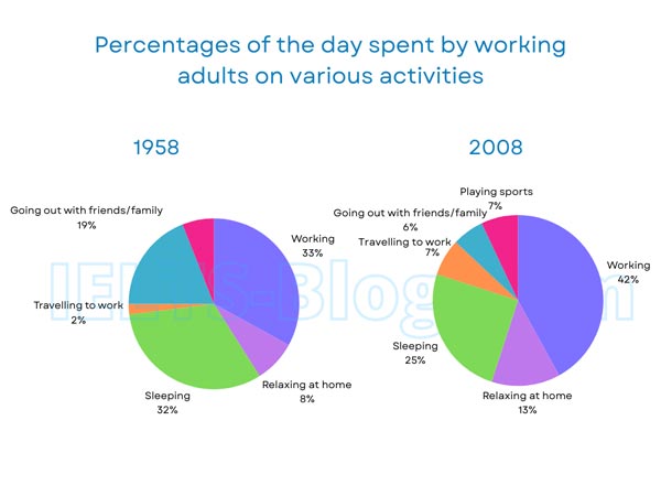
The pie charts below show how working adults in a particular country spent their time in 1958 and 2008.
Summarise the information by selecting and reporting the main features, and make comparisons where relevant.
* Note: these aren’t the original diagrams given in the test, they were recreated for the purpose of demonstration.
Student answer (Band 5.5)
The pie chart basically demonstrates the comparison between activities of working adults. The chart shows how working adults engage themselves into different sort of activities. This comparison is between adults of 1958 and 2008.
It clearly explains how their sleeping, working, travelling and relaxing routines evolved over time. In 2008, adults spent most of their time working and their sleeping and relaxing schedule disturbed due to increased working hours. It also lessened their time, which they used to spent with their families. In 1958, they worked less but they used to play sports which made them physically and mentally more healthy and sound than the adults of 2008. Later adults work more but spend less time on relaxing themselves, this work affected their sleeping schedules and travelling routines. I think this comparison is based on reality as people nowadays work more neglecting other beautiful aspects of life. People should do work and other things in parallel to make the harmony and balance of a healthy lifestyle.
AI examiner evaluation
| Criterion | Band |
|---|---|
| Task Achievement / Task Response | 5.5 |
| Coherence and Cohesion | 5.0 |
| Lexical Resource | 5.5 |
| Grammatical Range and Accuracy | 5.5 |
| Overall | 5.5 |
Task Achievement / Task Response: Band 5.5
You identify the broad comparison and note several genuine changes, including increased work and reduced time spent sleeping and with family. However, the response does not report any chart figures, and some claims are inaccurate or unsupported: the charts show no sports category in 1958, while sports appears only in 2008; nor do they establish that longer working hours caused changes to sleep or travel. The task requires a factual summary, but the final comments about modern life and healthy lifestyles replace useful chart detail. To strengthen the response, give an overview of the main shifts and support it with accurate percentages—for example, work rose from 33% to 42%, while sleeping fell from 32% to 25%.
Coherence and Cohesion: Band 5.0
The response has a recognisable sequence: an introduction, comments about 2008 and 1958, and a concluding opinion. However, the ideas do not progress as a clear chart summary. The opening repeats the same point in “demonstrates the comparison” and “shows how working adults engage,” while the body moves between chart observations, assumed causes, and personal advice. Linking phrases such as “Later” and “I think” do not clearly connect the data or comparisons. Organise the response into a brief introduction, an overview of the main trends, and a paragraph comparing the figures by activity. Use references and transitions to show how each comparison relates to the charts.
Lexical Resource: Band 5.5
You use a reasonable range of topic-related vocabulary, including “routines,” “increased working hours,” and “harmony and balance.” However, some choices are imprecise or unnatural for an objective chart report. “Engage themselves into” is an awkward collocation, and “their sleeping and relaxing schedule disturbed” does not express the chart data precisely. Phrases such as “beautiful aspects of life” and “physically and mentally more healthy and sound” are evaluative rather than suitable for describing percentages. Aim for concise, neutral language that names activities and changes accurately, such as “the proportion of time spent working increased” or “time devoted to socialising declined.”
Grammatical Range and Accuracy: Band 5.5
You attempt a mix of sentence forms, including the complex sentence beginning “In 2008” and the contrast between the two years. Meaning is generally understandable, but some grammatical errors and awkward constructions reduce accuracy. For example, “their sleeping and relaxing schedule disturbed” is missing a suitable verb form, and “which they used to spent” should use the base form after “used to.” The sentence beginning “Later adults work more” also shifts tense inconsistently when describing past chart data. Use past tense consistently for the years shown, check verb patterns after “used to,” and ensure each clause has a complete, correctly formed verb.
See this exact question answered at other band scores. The same prompt compared across bands.
Browse more IELTS Writing model answers or get your own writing scored by the same AI examiner.