Band 5.0 IELTS Writing Task 1 Model Answer
Overall Band Score: 5.0 · Recent IELTS Exams (Canada & India) · 2026-11-10
IELTS Writing Task 1 question
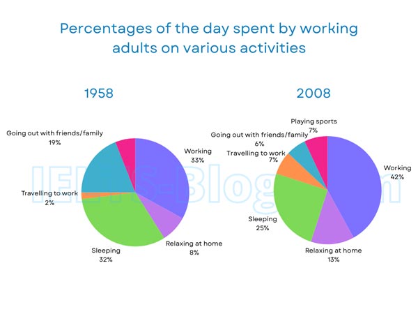
The pie charts below show how working adults in a particular country spent their time in 1958 and 2008.
Summarise the information by selecting and reporting the main features, and make comparisons where relevant.
* Note: these aren’t the original diagrams given in the test, they were recreated for the purpose of demonstration.
Student answer (Band 5.0)
The given pie chart illustrate the distribute the working percentage in adult in 1958 and 2008.
Overall, it can be clear seen that working activities is dominant in over the two year, percentage of showed a significant during the period, while the proption of lowest is travelling to work has least percentage.
In details, working has significan hike in pie chart,In 1958 working has 33% which increased to 2008 in at 42%. Furthermore other activities are saditary growth compaired to 1958 to 2008.going with friends and family is decreased to compaired with 1958 which is double, while sleeping is increase to 1958 to 2008 which is 8%.
In additions, travelling to work is lowest percentage in 1958 which is least 2% and in 2008 increased in small percentage on 5%. forthermore thise pie chart is increased in 1958 to 2008 people haqs spent more working hours compaired to past activities.
AI examiner evaluation
| Criterion | Band |
|---|---|
| Task Achievement / Task Response | 5.5 |
| Coherence and Cohesion | 5.5 |
| Lexical Resource | 5.0 |
| Grammatical Range and Accuracy | 4.5 |
| Overall | 5.0 |
Task Achievement / Task Response: Band 5.5
You identify the main rise in working, from 33% to 42%, and note that travelling to work was the smallest category in 1958. These are relevant features, and you attempt an overall comparison. However, the overview is unclear and partly inaccurate: travel was not the lowest category in 2008, when it was 7%, equal to playing sports, and the chart shows working as the largest share in both years. Several comparisons are also misreported or difficult to interpret. Going out with friends and family fell from 19% to 6%, while sleeping fell from 32% to 25%; it did not increase by 8%. Relaxing at home and the new sports category are omitted. Select the main changes accurately and support them with clear figures.
Coherence and Cohesion: Band 5.5
The response has an attempted introduction, overview and detail section, so the reader can see a basic plan. You also use linking expressions such as “Overall,” “Furthermore” and “In additions.” However, progression is difficult to follow because several sentences combine unrelated or unclear points, for example the sentence beginning “Furthermore other activities…” and the final sentence about people spending more working hours. Some connectors are used mechanically or do not show the relationship between ideas, and punctuation around them is inconsistent. Group the information into a clear overview followed by comparisons of the main increases and decreases. Use shorter, complete sentences and make each comparison explicit so that the reader can follow the data without having to infer your meaning.
Lexical Resource: Band 5.0
You attempt vocabulary suited to describing charts, including “percentage,” “increased,” “decreased” and “dominant.” However, the range is limited, and frequent spelling and word-choice problems sometimes make the intended meaning hard to understand. Examples include “distribute,” “proption,” “significan hike,” “saditary growth” and “forthermore.” Some phrases are also unnatural, such as “working activities is dominant” and “increased in small percentage.” Use precise chart language and check the spelling and form of key terms. For instance, describe a category as “accounted for” a share, and say that a figure “rose” or “fell” from one percentage to another. This would make your comparisons clearer and more appropriate to an academic report.
Grammatical Range and Accuracy: Band 4.5
There are attempts to form longer sentences and to use comparative structures, but control is inconsistent. Errors in agreement, articles, verb forms and sentence construction occur throughout, as in “The given pie chart illustrate,” “working activities is dominant,” and “which increased to 2008 in at 42%.” Several clauses are incomplete or joined in ways that obscure their meaning, particularly in the middle paragraph. Punctuation also needs attention: there is a comma splice and missing spaces after commas. Build accuracy first with clear subject–verb sentences, such as “The proportion for working rose from 33% in 1958 to 42% in 2008.” Then add a small number of correctly formed complex sentences using “while” or “whereas.”
See this exact question answered at other band scores. The same prompt compared across bands.
Browse more IELTS Writing model answers or get your own writing scored by the same AI examiner.