Band 6.0 IELTS Writing Task 1 Model Answer
Overall Band Score: 6.0 · Recent IELTS Exams (Canada & India) · 2026-11-11
IELTS Writing Task 1 question
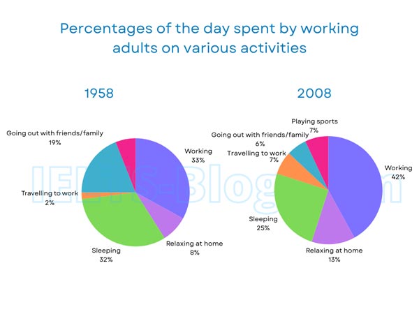
The pie charts below show how working adults in a particular country spent their time in 1958 and 2008.
Summarise the information by selecting and reporting the main features, and make comparisons where relevant.
* Note: these aren’t the original diagrams given in the test, they were recreated for the purpose of demonstration.
Student answer (Band 6.0)
The pie charts illustrates the time a number of adults spent in their particular country between 1958 to 2008.
Overall, the first pie chart has a greater number of proportion in working followed by travelling to work which is of lower proportion while the second pie chart also has higher proportion at working and relatively lower proportion at going out with friends and family.
By analyzing the early pie chart carefully, the time spent by adults in 1958 was mostly with working which is 33% followed by sleeping which is 32%.However, 19% of their time is spent with going out with family and friends and 8% is of relaxing at home while 2% if their time was given to travelling to work.
In the second pie chart, the time spent by adults in 2008 was mainly consist of working by having a percentage of 42% which is greater from the early times.Although 25% of their time was depended on sleeping which is lower from the 1958 adults.Furthermore, 13% of adults relax at home which is greater from the early pie chart. 7% of their time is consisted of playing sports and travelling to work which is same. In last, adults spent 6% time going out their family and friends which is relatively a smaller percentage as compare to the 1958 adults.
AI examiner evaluation
| Criterion | Band |
|---|---|
| Task Achievement / Task Response | 6.0 |
| Coherence and Cohesion | 6.5 |
| Lexical Resource | 5.5 |
| Grammatical Range and Accuracy | 5.5 |
| Overall | 6.0 |
Task Achievement / Task Response: Band 6.0
You cover both years and report several key figures accurately, including working (33% to 42%), sleeping (32% to 25%), and the sharp fall in socialising (19% to 6%). Your account also includes the 2008 figures for relaxing, commuting and sport. The main features are present, but the overview is not fully clear: saying that working has the “greater number of proportion” does not directly summarise the overall shifts, and the claim that commuting is the lowest category applies only to 1958. The introduction also describes time spent “between 1958 to 2008,” rather than time allocated to activities in each year. Make the overview more precise by highlighting increased work and commuting, reduced sleep and socialising, and the new sports category.
Coherence and Cohesion: Band 6.5
The response has a clear overall arrangement: an introduction, an overview, and separate paragraphs for the two years. This makes the information easy to locate, and sequencing within each year is generally understandable. You also use linking expressions such as “However,” “Furthermore,” and “Although” to connect comparisons. To make the progression more natural, avoid formulaic openings such as “By analyzing the early pie chart carefully” and “In last,” and use direct comparisons between years rather than repeatedly describing each chart in isolation. Some links are not quite logical—for example, “Although 25%...” does not complete a clear contrast—and punctuation spacing after full stops needs attention. These issues keep cohesion from being consistently flexible and smooth.
Lexical Resource: Band 5.5
You use relevant vocabulary for describing charts, including “percentage,” “proportion,” “relaxing,” and “travelling to work,” so the main information remains understandable. However, the range is limited by repeated and sometimes inaccurate phrases such as “higher proportion,” “time spent,” and “early pie chart.” Several collocations are unnatural: “a greater number of proportion,” “time was depended on sleeping,” and “spent 6% time going out their family” make the description less precise. Choose standard chart language and vary it carefully—for example, “accounted for,” “share,” “rose,” and “fell.” Also use “socialising” or “going out with friends and family” consistently, rather than changing the activity’s meaning. More accurate collocations would improve clarity and flexibility.
Grammatical Range and Accuracy: Band 5.5
You attempt both simple and more complex sentences, including comparisons with “while,” “although,” and “which,” and the reader can generally follow the figures. However, some errors in sentence structure, agreement, tense and punctuation reduce accuracy. For example, “The pie charts illustrates” has subject–verb disagreement, while “was mainly consist of working” combines incompatible verb forms. “Between 1958 to 2008” uses an incorrect preposition pattern, and “2% if their time” appears to be a typing or word-form slip that disrupts the sentence. Several sentences also run together because there is no space after a full stop. Check agreement and verb forms, and use shorter, complete comparison sentences where complex structures become difficult to control.
See this exact question answered at other band scores. The same prompt compared across bands.
Browse more IELTS Writing model answers or get your own writing scored by the same AI examiner.