Band 5.0 IELTS Writing Task 1 Model Answer
Overall Band Score: 5.0 · Recent IELTS Exams (Canada & India) · 2026-11-11
IELTS Writing Task 1 question
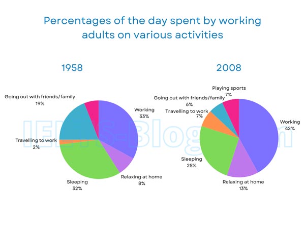
The pie charts below show how working adults in a particular country spent their time in 1958 and 2008.
Summarise the information by selecting and reporting the main features, and make comparisons where relevant.
* Note: these aren’t the original diagrams given in the test, they were recreated for the purpose of demonstration.
Student answer (Band 5.0)
The two pie charts illustrate the percentage of the day spent by working adults on various activities from 1958 to 2008.
Overall, it can be seen that the higest proportion of on working. While, the lowest figure for travelling to work adults in particular nation spent their time.
In 1958, working was the most sector from others categories. Which was the rate of at 33%. The next stage of sleeping accounted for 32%. After that, going out with friends and family just under 19%. Individual spent by working adults on relaxing at home. It was the percentage of 8%. The least of the sector travelling to work by 2%.
Conversely. in 2008 by working adults on spent their time about 42%. It was the most figure in this categories. By sleeping was the second highest proportion at 25%. Moreover, relaxing at home the a little most accounted at 13%. The two sector were both remained stable at 7%.
AI examiner evaluation
| Criterion | Band |
|---|---|
| Task Achievement / Task Response | 5.0 |
| Coherence and Cohesion | 5.5 |
| Lexical Resource | 5.0 |
| Grammatical Range and Accuracy | 4.5 |
| Overall | 5.0 |
Task Achievement / Task Response: Band 5.0
You identify the broad pattern that work takes the largest share in 2008 and include several relevant figures, such as work rising from 33% to 42% and sleep falling from 32% to 25%. However, the overview is unclear: “the higest proportion of on working” does not clearly state the main changes, and the claim that travelling to work is the lowest applies only to 1958, not 2008. The report also misses the key comparison that going out with friends and family fell sharply from 19% to 6%, and it does not mention sports, which appears at 7% in 2008. Some figures are reported, but the main features are only partially selected and explained. State the overall shifts clearly and compare the categories that changed most.
Coherence and Cohesion: Band 5.5
The response has a basic paragraph structure, moving from an introduction and overview to separate descriptions of 1958 and 2008. This gives the reader some sense of how the information is organised. However, progression within paragraphs is often disrupted by incomplete or awkwardly connected sentences, such as “Which was the rate of at 33%” and “Individual spent by working adults on relaxing at home.” Connect each figure directly to its category and use complete sentences. Some linking words are also inaccurate or mechanical: “Conversely” does not introduce a clear contrast, while “Moreover” does not clarify the relationship between the figures. A clearer sequence—overview, then grouped comparisons—would make the report easier to follow.
Lexical Resource: Band 5.0
You use relevant chart vocabulary, including “percentage,” “accounted for,” “proportion,” and “categories,” and the activity labels are generally recognisable. However, the range is limited and several word combinations are inaccurate or unclear, which sometimes makes the meaning difficult to follow. Examples include “the most sector from others categories,” “the most figure in this categories,” and “the a little most.” “Stable” is also unsuitable for the two 7% categories, since they are different activities and there is no earlier value for sports to compare. Choose precise terms such as “largest share,” “second-highest,” and “remained unchanged” only when the data supports them, and check spelling, including “highest.”
Grammatical Range and Accuracy: Band 4.5
There are attempts to use more than simple statements, but sentence structures are often incomplete or faulty, and errors frequently make the relationships between ideas hard to understand. For example, “Which was the rate of at 33%” is a fragment, while “By sleeping was the second highest proportion at 25%” has an incorrect sentence structure. The overview sentence beginning “While” is also incomplete, and “Conversely. in 2008” uses punctuation that breaks the sentence incorrectly. Articles and prepositions are often misplaced, as in “the percentage of 8%” and “accounted at 13%.” Build complete subject–verb sentences, use consistent past-tense reporting, and check punctuation and sentence boundaries before submitting.
See this exact question answered at other band scores. The same prompt compared across bands.
Browse more IELTS Writing model answers or get your own writing scored by the same AI examiner.