Band 5.0 IELTS Writing Task 1 Model Answer
Overall Band Score: 5.0 · Recent IELTS Exams (Canada & India) · 2026-11-12
IELTS Writing Task 1 question
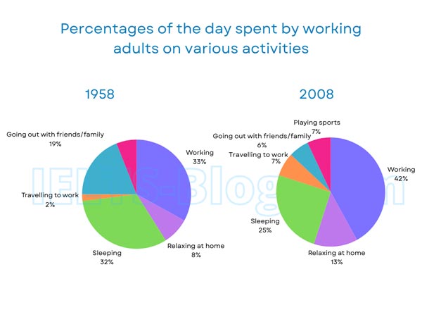
The pie charts below show how working adults in a particular country spent their time in 1958 and 2008.
Summarise the information by selecting and reporting the main features, and make comparisons where relevant.
* Note: these aren’t the original diagrams given in the test, they were recreated for the purpose of demonstration.
Student answer (Band 5.0)
In this pie chart we can see the percantages of the day spent by working adults on various activities of 1958 and 2008. In 1958, the most time people spend in working which was 33% . Although in 2008, it reamins same but people started working more. Then the highest percantages of activitiy is sleeping but the percentage of sleeping reduced from 32 to 25 at 2008. Adults stopped sleeping less as they have to earn more money because the price of essentials are increasing day by day. Then the next bigger percantage was going out with friends/ family in 1958 which was 19% but in 2008 because of the traffic jam and increase of the population people spend like 7% of the day travelling to work. Another reason ogf this could be people started moving to different cities for work as they have better oppotunites there. So, the percantages of going out with family/ friends decreased. Also people started playing sports which is obviously a good thing. As people from 2008 have to go through a lot they tend to relax at home much than the people in 1958. It increased from 8% to 13%.
AI examiner evaluation
| Criterion | Band |
|---|---|
| Task Achievement / Task Response | 5.5 |
| Coherence and Cohesion | 4.5 |
| Lexical Resource | 5.0 |
| Grammatical Range and Accuracy | 5.0 |
| Overall | 5.0 |
Task Achievement / Task Response: Band 5.5
You identify several important comparisons, including the rise in working time from 33% to 42%, the fall in sleeping from 32% to 25%, and the increase in relaxing at home from 8% to 13%. However, the overview is not clearly stated, and some figures or interpretations are inaccurate: going out with friends and family fell to 6% in 2008, not 7%; 7% refers to travelling to work. The claim that working “remains same” also conflicts with the figures you give. Explanations about rising prices, traffic and moving cities are not shown by the charts, so they distract from reporting the data. A concise overview of the main rises and falls, followed by accurate comparisons, would make the response more complete and focused.
Coherence and Cohesion: Band 4.5
The response follows a broadly chronological pattern, moving from 1958 to 2008, and uses linking words such as “Although,” “Then” and “Also.” However, it is presented as one long paragraph, so the main overview and supporting details are not clearly separated. The progression is also difficult to follow when chart reporting shifts into speculation—for example, the discussion of traffic and moving cities interrupts the comparison of travel and socialising. Some links are unclear or contradictory, particularly “Although in 2008, it remains same but people started working more.” Organise the response into an introduction, a brief overview and grouped comparisons, and use transitions to show how each figure relates to the previous one.
Lexical Resource: Band 5.0
You use relevant activity vocabulary, including “working,” “sleeping,” “travelling to work” and “relax at home,” so the reader can generally understand the topic. However, the range is limited and several words or phrases are repeated, especially “percentage” and “people started.” Spelling errors such as “percantages,” “rema ins” (written as “reamins”), “oppotunites” and “ogf” make the writing less clear. Some expressions are imprecise or unsuitable for describing chart data, such as “the next bigger percentage” and “spend like 7%.” Use more precise reporting language and check spelling; for example, describe a figure as “accounted for” a share or say it “rose/fell to” a percentage.
Grammatical Range and Accuracy: Band 5.0
You attempt some longer sentences and comparisons, but the range is limited and complex constructions are often faulty. For example, “In 1958, the most time people spend in working” has an incorrect verb form and sentence structure; “Although in 2008, it remains same but people started working more” combines clauses awkwardly and gives conflicting tense forms. There are also errors with articles, agreement and comparison patterns, as in “the price of essentials are increasing” and “relax at home much than the people in 1958.” Punctuation is inconsistent, including spaces before full stops. Practise accurate past-tense reporting and straightforward comparative structures before adding longer clauses.
See this exact question answered at other band scores. The same prompt compared across bands.
Browse more IELTS Writing model answers or get your own writing scored by the same AI examiner.