Band 6.0 IELTS Writing Task 1 Model Answer
Overall Band Score: 6.0 · Recent IELTS Exams (Canada & India) · 2026-11-12
IELTS Writing Task 1 question
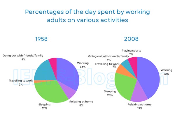
The pie charts below show how working adults in a particular country spent their time in 1958 and 2008.
Summarise the information by selecting and reporting the main features, and make comparisons where relevant.
* Note: these aren’t the original diagrams given in the test, they were recreated for the purpose of demonstration.
Student answer (Band 6.0)
The pie charts compares the proportions of the day spent by working adults on a number of activities in 1958 and 2008.
Overall, in both years adults spent their mejority of time by working and sleeping. however, in 2008, going out with family or friends time decreased, while relaxing time and travelling to work increased.
In 1958, people spent 33% of their whole day by working, whereas in 2008 the number increased by 9%, which stood at 42%. Moreover, relaxing time at home was 13% in 2008, while it was 8% in 1958. Working adults spent 33% of their day by sleeping in 1958, however the proportion declined by 7% in 2008.
Another activitie was travelling to work only required 2% of their whole day in 1958, the percentage rose to 7% in 2008. In 1958, people use to go out with friends and family more, and they spent about 19% of the whole day there, in contrast the percentage go down by 13%. And playing sport remaind same as 1958, at 7%, in 2008.
AI examiner evaluation
| Criterion | Band |
|---|---|
| Task Achievement / Task Response | 6.5 |
| Coherence and Cohesion | 6.5 |
| Lexical Resource | 6.0 |
| Grammatical Range and Accuracy | 5.5 |
| Overall | 6.0 |
Task Achievement / Task Response: Band 6.5
The response identifies the main overall shifts: working and travelling took a larger share in 2008, while sleeping and socialising declined. It also reports most key figures accurately, including work rising from 33% to 42%, travel from 2% to 7%, and going out falling from 19% to 6%. This gives the reader a relevant comparison across both years. However, the overview says working and sleeping accounted for the “majority” of time in both years, which is not accurate as a combined description of the largest activities: in 2008, work was the largest category, but sleeping was 25%. The final claim that sports “remained same as 1958” is unsupported because the chart shows no 1958 sports figure. More precise selection and qualification of these points would strengthen the summary.
Coherence and Cohesion: Band 6.5
The response has a clear overall structure: an introduction, an overview, and two paragraphs comparing the figures. The sequence from work and home activities to travel and socialising is generally easy to follow, and linking expressions such as “whereas,” “Moreover,” and “in contrast” help signal comparisons. This coherent arrangement is a strength. Some connections are less controlled, however. “Another activitie was travelling…” creates a sentence boundary problem, while “And playing sport…” begins an additional point without integrating it smoothly into the comparison. The overview also groups work and sleep together without clearly distinguishing their different positions. More consistent paragraph-level grouping and clearer links between each comparison would make progression more fluent.
Lexical Resource: Band 6.0
The vocabulary is adequate for describing the chart, and the response uses relevant terms such as “proportions,” “declined,” “increased,” and “in contrast.” These allow the main trends to be communicated, although some choices are imprecise or unnatural. “Spent their day by working” and “relaxing time” are less idiomatic than standard chart language, while “the percentage go down” does not express the change accurately in form. There are also spelling and word-form errors, including “mejority,” “activitie,” and “remaind.” These do not prevent understanding, but they limit the accuracy and range of the vocabulary. Aim for precise collocations and check spelling and word forms before submitting.
Grammatical Range and Accuracy: Band 5.5
The response attempts a mix of simple and complex sentences, including comparisons with “whereas” and “while,” and most of the intended meaning remains clear. Some grammatical errors nevertheless recur. The opening has subject–verb disagreement in “The pie charts compares,” and “people use to go out” uses an incorrect verb form for a past description. The sentence beginning “Another activitie was travelling…” is a comma splice, and “the percentage go down” has an incorrect verb form. Capitalisation after a full stop is also inconsistent in “however.” These errors show that complex comparisons are being attempted, but control is not yet consistent. Check agreement, past-tense forms, and sentence boundaries, while retaining the useful range of comparison structures.
See this exact question answered at other band scores. The same prompt compared across bands.
Browse more IELTS Writing model answers or get your own writing scored by the same AI examiner.