Band 5.0 IELTS Writing Task 1 Model Answer
Overall Band Score: 5.0 · Recent IELTS Exams (Canada & India) · 2026-11-13
IELTS Writing Task 1 question
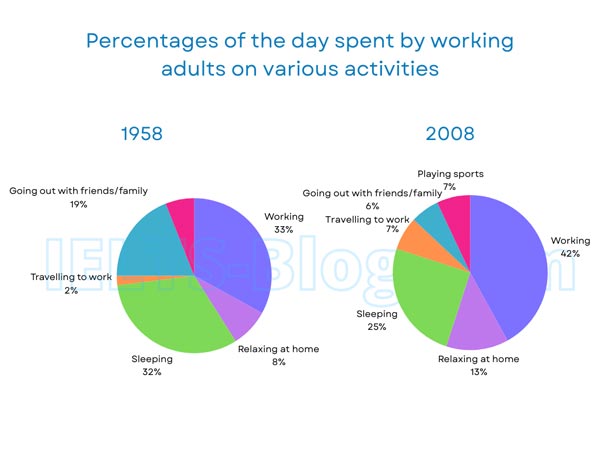
The pie charts below show how working adults in a particular country spent their time in 1958 and 2008.
Summarise the information by selecting and reporting the main features, and make comparisons where relevant.
* Note: these aren’t the original diagrams given in the test, they were recreated for the purpose of demonstration.
Student answer (Band 5.0)
The provided two pie chart illustrate information about how working adults in a specific country spent their time in 1958 and 2008.
Overall, in both pie chart working adults held the higest percentage and travelling to work is lowest in first pie chart but in second outing with friends is least.
In first pie chart, violet colour define the working adults which coveres one-third portion of the pie chart, on second number there is sleeping adults represented by green colour that is only 1% less than the major percentage after that there is outing with friends is at 19% shown by blue colour. There are some other colours also like pink, orange and purple which shows relaxing at home, playing sports and travelling to work they held together 16%.
In second pie chart, the higest portion is covered by same working represented by violet colour is 42% and same green colour which shows sleeping is on second place with coverage of 25%. But the purple which show relaxing replaced the position of blue with 13%. Where other playng sports, going out with friends and travelling to work represented by pink, blue and orange held together 20%.
AI examiner evaluation
| Criterion | Band |
|---|---|
| Task Achievement / Task Response | 5.0 |
| Coherence and Cohesion | 5.0 |
| Lexical Resource | 5.0 |
| Grammatical Range and Accuracy | 5.0 |
| Overall | 5.0 |
Task Achievement / Task Response: Band 5.0
You identify the main categories and several important comparisons: work is the largest share in both years, sleeping is second, and the smallest category changes from commuting in 1958 to socialising in 2008. However, the overview is not fully clear, and some details are inaccurate or incomplete. In particular, the 1958 categories grouped as “together 16%” actually total 17% (8% relaxing, 7% sports and 2% commuting), and sports is not shown as a separate category in your description of that year. The 2008 grouping of the remaining activities totals 20%, but it would be more informative to report their individual figures. Focus on accurate key data and a clear summary of the main changes.
Coherence and Cohesion: Band 5.0
The response has a basic structure, with an introduction, an overview and separate paragraphs for the two charts. This gives the reader a general route through the information. However, progression within the paragraphs is sometimes difficult to follow: phrases such as “on second number” and “after that” do not clearly signal the comparisons being made, while repeated references to colours distract from the data. The overview also combines several points in one sentence without clearly distinguishing the overall trends. Organise the details by ranking or by changes between years, and use precise links such as “whereas,” “by contrast” and “in comparison.” Clearer referencing would help readers understand which year and category each statement concerns.
Lexical Resource: Band 5.0
You use some relevant chart vocabulary, including “percentage,” “represented,” “portion” and “held together,” and you attempt to describe rankings and comparisons. However, the range is limited and several word choices or collocations are unnatural, such as “working adults held the highest percentage,” “on second number” and “covered by same working.” Spelling errors, including “higest,” “coveres” and “playng,” are noticeable and reduce the accuracy of the report. Repeated reliance on colour descriptions also uses space without adding much analytical meaning. Build a more precise set of terms for proportions and change, and check spelling carefully. For example, describe a category as “accounted for” a share rather than saying it “held” a percentage.
Grammatical Range and Accuracy: Band 5.0
You attempt both simple and more extended sentences, and the overall meaning can usually be understood. However, errors are frequent, and some longer sentences are difficult to process. For example, “The provided two pie chart illustrate” has problems with number agreement, while “in both pie chart working adults held the higest percentage” lacks clear article and plural forms. Several clauses are joined without a clear grammatical structure, as in “after that there is outing with friends is at 19%.” Articles, subject–verb agreement and sentence boundaries need more consistent control. Use shorter, complete sentences when describing each figure, and check that plural nouns and verbs agree—for example, “The two pie charts illustrate” and “Working accounted for the largest share.”
See this exact question answered at other band scores. The same prompt compared across bands.
Browse more IELTS Writing model answers or get your own writing scored by the same AI examiner.