Band 5.5 IELTS Writing Task 1 Model Answer
Overall Band Score: 5.5 · Recent IELTS Exams (Canada & India) · 2026-11-13
IELTS Writing Task 1 question
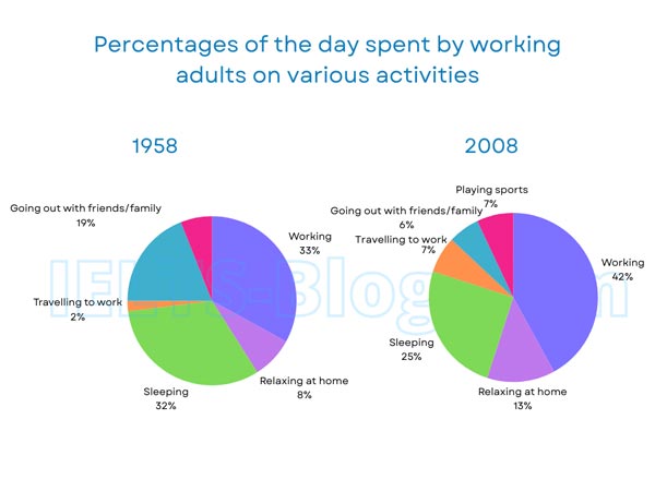
The pie charts below show how working adults in a particular country spent their time in 1958 and 2008.
Summarise the information by selecting and reporting the main features, and make comparisons where relevant.
* Note: these aren’t the original diagrams given in the test, they were recreated for the purpose of demonstration.
Student answer (Band 5.5)
Pie chars illustrate how working adults in a particular country spent their time in 1958 and 2008.
Overall, it is noticeable that in 2008 42 percent of more people are working compared to 1958 are 33 percent. It is huge increment in the working people. 7 percent are playing sport in 2008 which are approximately same in 1958 there 6 percent people. 13 percent people are relaxing at home in 2008 whereas 8 percent are in 1958. 7 percent people are travelling to work in 2008 which are higher compared to 1958 are on;y 2 percent people travelling to work. 25 percent are sleeping in 2008 which is huge decremental compared to 1958 are 32 percent. 6 percent peole are going out with family/friends which is huge decrimental in 2008 compared to 1958 ther are 19 percent of people are going out with family/ friends. Like i compared the whole pie chart people rise in percentage over time are iin working, relaxing at home, travelling to work and decline in sleeping going out with friends/family.
AI examiner evaluation
| Criterion | Band |
|---|---|
| Task Achievement / Task Response | 6.5 |
| Coherence and Cohesion | 5.0 |
| Lexical Resource | 5.0 |
| Grammatical Range and Accuracy | 4.5 |
| Overall | 5.5 |
Task Achievement / Task Response: Band 6.5
You cover the main categories and make several accurate comparisons: work rises from 33% to 42%, sleeping falls from 32% to 25%, and going out declines from 19% to 6%. You also identify the increases in travel and time relaxing at home. This gives the response a relevant overview of the broad changes. However, the overview is embedded in a long sequence of figures rather than clearly summarising the most important patterns, and the sports comparison is inaccurate: the chart shows sports only in 2008, at 7%, not approximately 6% in 1958. Some comparisons are repeated, while the significance of the largest changes is not developed. A more concise overview and precise reporting of every comparison would strengthen the response.
Coherence and Cohesion: Band 5.0
The response follows a generally understandable order, moving through the activities and ending with a summary of which categories rose or fell. However, it is presented as one continuous paragraph, so the overview and supporting details are not clearly separated. Linking phrases such as “whereas,” “compared to,” and “Like i compared the whole pie chart” are repetitive or awkward, and the repeated “which” clauses make the progression feel like a list rather than a connected report. Group the overview separately, then organise details into increases and decreases, using clear comparisons without restating the same trend. This would give the information a more purposeful progression and make relationships between figures easier to follow.
Lexical Resource: Band 5.0
You use relevant chart vocabulary, including “working,” “relaxing at home,” “travelling to work,” and “sleeping,” so the reader can identify the categories being compared. You also attempt evaluative language such as “increment” and “decremental.” However, the range is limited and several choices are inaccurate or unnatural, including “Pie chars,” “huge increment,” “huge decremental,” and “people rise in percentage.” Spelling errors such as “peole” and “ther” also reduce control. Prefer standard reporting expressions such as “the proportion increased,” “fell considerably,” and “accounted for.” Use the chart’s category labels consistently, and avoid calling a change “huge” unless the comparison supports that emphasis.
Grammatical Range and Accuracy: Band 4.5
You attempt some longer comparative sentences, for example, “13 percent people are relaxing at home in 2008 whereas 8 percent are in 1958,” and the main figures can usually be understood. However, many sentences contain faulty clause construction and agreement, as in “42 percent of more people are working compared to 1958 are 33 percent.” The repeated pattern “which are higher compared to 1958 are…” also joins clauses incorrectly. There are problems with articles and plural forms, and the final sentence has unclear structure: “people rise in percentage over time are…” Most sentences rely on similar simple or loosely joined patterns. Build accurate sentences with a clear subject and verb, such as “The proportion working rose from 33% to 42%,” and check agreement and punctuation.
See this exact question answered at other band scores. The same prompt compared across bands.
Browse more IELTS Writing model answers or get your own writing scored by the same AI examiner.