Band 5.0 IELTS Writing Task 1 Model Answer
Overall Band Score: 5.0 · Recent IELTS Exams (Canada & India) · 2026-11-14
IELTS Writing Task 1 question
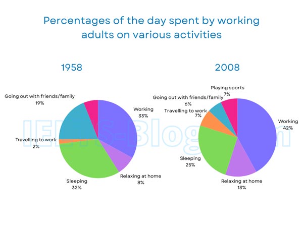
The pie charts below show how working adults in a particular country spent their time in 1958 and 2008.
Summarise the information by selecting and reporting the main features, and make comparisons where relevant.
* Note: these aren’t the original diagrams given in the test, they were recreated for the purpose of demonstration.
Student answer (Band 5.0)
The given pie chart demostrate the working of people in specific country from 1958 to 2008.From 1958 to 2008 it seems a dramatic change in past people trevel for work purposes 2% while in 2008 it reaches about 7%.In 1958 people went for outing 19% but this level relitevly reduce upto 6% in 2008.Similarly adults work usually 33% in1958 on the other side this rate increase about 42% in 2008.In 1958 relaxing and sleeping were on 8% and 32% respectiely.however,it shows that sports are steady in both from 1958 to 2008.But in 2008 sleeping and relaxing time decrease about 25% and 13%.Overall, diagram express the large difference with the passage of time people became more engaged then in past.Both figures are presented by different colors for exact identification of each profession and adults activity.
AI examiner evaluation
| Criterion | Band |
|---|---|
| Task Achievement / Task Response | 5.0 |
| Coherence and Cohesion | 5.0 |
| Lexical Resource | 5.0 |
| Grammatical Range and Accuracy | 5.0 |
| Overall | 5.0 |
Task Achievement / Task Response: Band 5.0
You identify several important changes, including working rising from 33% to 42%, travel increasing from 2% to 7%, and social outings falling from 19% to 6%. However, the response only partly fulfils the task: it gives no clear, accurate overview of the main pattern, and the claim that sports were “steady in both” is unsupported because sports are listed only for 2008, at 7%. The final comment about colours and “profession” does not report a meaningful feature of the data. The response is also 16 words below the required minimum, limiting the opportunity to select and explain the key comparisons. Add a concise overview and accurately cover the main categories and changes.
Coherence and Cohesion: Band 5.0
The response follows a broadly chronological approach, moving from 1958 figures to 2008 comparisons, and linking expressions such as “however” and “overall” show an attempt to guide the reader. Nevertheless, it is presented as one continuous paragraph, so the overview and supporting details are not clearly separated. Several transitions are awkward or do not express the intended relationship, as in “Similarly adults work usually 33%” and “however,it shows that sports are steady.” The sequence of figures also makes the main trends difficult to distinguish. Use separate paragraphs for the overview and details, group related categories, and connect each comparison clearly rather than relying on a few linking words.
Lexical Resource: Band 5.0
You use some relevant chart vocabulary, including “increase,” “reduce,” “sleeping,” and “relaxing,” so the reader can identify the activities being compared. However, the range is limited and several inaccurate or misspelled choices make parts difficult to understand: “demostrate,” “trevel,” “relitevly,” and “respectiely.” Some phrases are also unnatural, such as “people went for outing” and “people became more engaged then in past.” Use precise terms for proportions and trends, and check spelling carefully. For example, describe a category as “accounted for” a percentage and say that a figure “rose” or “fell,” rather than using unclear constructions.
Grammatical Range and Accuracy: Band 5.0
The response attempts to compare figures using clauses introduced by “while,” “but,” and “however,” but the range of sentence structures is limited and errors occur frequently. Examples include “The given pie chart demostrate,” where the subject and verb do not agree, and “in 1958 people went for outing 19%,” which lacks a clear grammatical structure for reporting the percentage. Punctuation and spacing are also inconsistent, particularly where sentences run together after full stops. These problems sometimes make relationships between figures unclear. Practise accurate comparison patterns such as “X stood at …, whereas it rose to …” and check verb forms, articles, sentence boundaries, and punctuation.
See this exact question answered at other band scores. The same prompt compared across bands.
Browse more IELTS Writing model answers or get your own writing scored by the same AI examiner.