Band 5.0 IELTS Writing Task 1 Model Answer
Overall Band Score: 5.0 · Recent IELTS Exams (Canada & India) · 2026-11-14
IELTS Writing Task 1 question
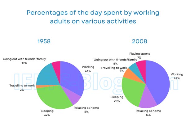
The pie charts below show how working adults in a particular country spent their time in 1958 and 2008.
Summarise the information by selecting and reporting the main features, and make comparisons where relevant.
* Note: these aren’t the original diagrams given in the test, they were recreated for the purpose of demonstration.
Student answer (Band 5.0)
The pie chart illustrates the percentage of the time spent by working adults in diffrent countries from 1958 to 2008 in certain country.
Overall, pie chat represents the largest percentage of time for working activities and shows minimum ratio of adults activities like playing games and going out with friends and family.
Pie chart represents the largest percentage of adults were work around 33% in 1958 and 42% in 2008. While second dominent percentage by adult activities were sleeping about 32% but after few years this activies dip off to 25% in 2008.
Furthermore, adults going with their friends and family were their third most favorable activity in certain countries in 1958 that was 19% and then fall from this ratio to 6% in 2008 due to shortage of time. Moreover, relaxing at home were their favourite activity about to 8% but rose in 2008 around 13%.
pie chart also shows the least common activity of playing games were 5% and 7%
according to years that are mentioned above.
AI examiner evaluation
| Criterion | Band |
|---|---|
| Task Achievement / Task Response | 5.5 |
| Coherence and Cohesion | 5.0 |
| Lexical Resource | 5.0 |
| Grammatical Range and Accuracy | 5.0 |
| Overall | 5.0 |
Task Achievement / Task Response: Band 5.5
You identify several important comparisons accurately: working rises from 33% to 42%, sleeping falls from 32% to 25%, and time spent going out with friends and family drops from 19% to 6%. However, the overview is unclear and partly inaccurate: working is the largest activity, but playing sports is not shown as the minimum in both years, and the 1958 chart has no sports category. You also report sports as 5% and 7%, whereas the chart shows 7% in 2008 only. Travelling to work, which increases from 2% to 7%, is omitted, and the claim that the decline in socialising was “due to shortage of time” is unsupported. Select the main changes accurately and avoid explanations not shown by the charts.
Coherence and Cohesion: Band 5.0
The response has a basic sequence: an introduction, an overview, and paragraphs describing changes in activities. Linking expressions such as “Overall,” “Furthermore,” and “Moreover” help signal movement between points. However, the progression is not consistently clear because the overview does not accurately summarise the main features, and several ideas are placed in a list-like sequence rather than grouped by meaningful comparisons. The final sentence about playing sports is separated from the preceding discussion and does not clarify that this category appears only in 2008. Some transitions, including “While” at the start of a sentence, are awkwardly connected. Group related increases and decreases together, and use clear paragraphing to distinguish the overview from supporting details.
Lexical Resource: Band 5.0
You use some relevant vocabulary for describing charts, including “percentage,” “largest,” “rose,” and “fall,” so the reader can generally understand the comparisons. However, the range is limited and several word choices or collocations are inaccurate, such as “minimum ratio of adults activities,” “second dominent percentage,” and “dip off.” Spelling errors—including “diffrent,” “domin ent” (written as “dominent”), and “activies”—also reduce precision. “Playing games” is not the chart’s label; use “playing sports.” Aim for standard chart language such as “accounted for,” “increased,” and “declined,” and use the activity labels consistently. More accurate phrasing would make the report clearer and more formal.
Grammatical Range and Accuracy: Band 5.0
The response attempts some longer sentence forms, for example, “While second dominent percentage by adult activities were sleeping about 32% but after few years this activies dip off to 25% in 2008.” However, this construction is incomplete and contains problems with articles, agreement, and verb forms. Other examples include “Pie chart represents the largest percentage of adults were work,” where the sentence structure is faulty, and “relaxing at home were their favourite activity,” where the subject and verb do not agree. Missing articles and inconsistent sentence boundaries also occur. These errors sometimes make relationships between ideas difficult to follow. Build a reliable base with complete simple sentences, then add subordinate clauses while checking subject–verb agreement, tense, and punctuation.
See this exact question answered at other band scores. The same prompt compared across bands.
Browse more IELTS Writing model answers or get your own writing scored by the same AI examiner.