Band 5.5 IELTS Writing Task 1 Model Answer
Overall Band Score: 5.5 · Recent IELTS Exams (Canada & India) · 2026-11-14
IELTS Writing Task 1 question
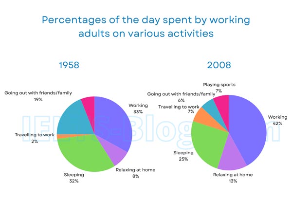
The pie charts below show how working adults in a particular country spent their time in 1958 and 2008.
Summarise the information by selecting and reporting the main features, and make comparisons where relevant.
* Note: these aren’t the original diagrams given in the test, they were recreated for the purpose of demonstration.
Student answer (Band 5.5)
The pie charts illustrate the comparison between 1958 to 2008 how adults spend their day in a specific countryduing alot of different activities.
overall, it is shown people spend most of their time in working and by the time it increases before they have time for family and friends now they dont have alot of time.
In 1958 adults spend 33% of time in working in 2008 it is 42% it inceases 11%. 1958 they have alot of time to relax at home , playing and going out with family and friends but in 2008 this time decreases.Due to traffic the time spend on the travelling to office also increase by 5% it means they spend 14% more time in working and travelling for work in comparison to 1958. Now mostly people wants to relax at home rather then going outside so their time is increases.
To sum up in 1958 people balance their personal and professional lives they play rest and work as well as they also went out at meat and greet with family and friends now people are stuck with the work they got exhausted and they just wants to relax and sleep rather then going outside with loved ones.
AI examiner evaluation
| Criterion | Band |
|---|---|
| Task Achievement / Task Response | 6.0 |
| Coherence and Cohesion | 6.0 |
| Lexical Resource | 5.0 |
| Grammatical Range and Accuracy | 5.0 |
| Overall | 5.5 |
Task Achievement / Task Response: Band 6.0
You identify the main broad change: working takes a larger share of the day in 2008, while time spent going out with friends and family falls. You also report the working figures correctly (33% and 42%) and note the rise in commuting. However, several important details are missing or unclear: sleeping falls from 32% to 25%, relaxing at home rises from 8% to 13%, and sports appears only in 2008 at 7%. The claim that people have “more time for family and friends” is not supported by the chart, and the explanation about traffic and people being exhausted is speculation rather than chart information. A clearer overview and more accurate coverage of the categories would make the summary more complete.
Coherence and Cohesion: Band 6.0
The response has an overall sequence, moving from an introduction and overview to comparisons and a concluding summary. Paragraphing also helps separate the opening from the details. However, the progression is weakened by ideas being combined without clear links: the sentence beginning “1958 they have alot of time to relax” moves across several categories without giving their figures, and the final paragraph repeats interpretations from earlier rather than adding a focused summary. Some linking is mechanical, particularly “To sum up,” while references such as “this time” are not always precise. Organise the body around clear comparisons—for example, increases in work and travel, then changes in sleep, leisure and socialising—and use explicit category names to guide the reader.
Lexical Resource: Band 5.0
You use enough topic vocabulary to communicate the general subject, including “working,” “relax at home,” “travelling,” and “family and friends.” However, the range is limited and several expressions are imprecise or informal for an academic chart summary. Phrases such as “alot of time,” “stuck with the work,” and “meat and greet” do not describe the data precisely; “meat and greet” also appears to be a mistaken expression. Spelling and word-form errors, including “duing,” “inceases,” and “wants,” are noticeable and sometimes make the reader pause. Aim for accurate chart language such as “accounted for,” “rose,” “declined,” and “share of the day,” and avoid explanations or emotional descriptions that the charts do not show.
Grammatical Range and Accuracy: Band 5.0
You attempt both simple and more extended sentence forms, including a cause-and-effect construction with “Due to traffic” and a contrast between 1958 and 2008. Some meaning remains understandable, but errors in tense, agreement, articles and sentence boundaries occur across the response. For example, “adults spend 33%” should use past tense for the 1958 data, while “people wants” and “their time is increases” have agreement and verb-form problems. The opening sentence also lacks a clear grammatical structure, and several clauses run together without appropriate punctuation. Build accuracy by using a consistent past-tense frame for both years and checking subject–verb agreement; practise controlled comparisons such as “The proportion rose from 33% to 42%.”
See this exact question answered at other band scores. The same prompt compared across bands.
Browse more IELTS Writing model answers or get your own writing scored by the same AI examiner.