Band 5.5 IELTS Writing Task 1 Model Answer
Overall Band Score: 5.5 · Recent IELTS Exams (Canada & India) · 2026-11-14
IELTS Writing Task 1 question
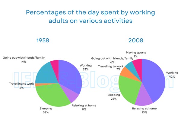
The pie charts below show how working adults in a particular country spent their time in 1958 and 2008.
Summarise the information by selecting and reporting the main features, and make comparisons where relevant.
* Note: these aren’t the original diagrams given in the test, they were recreated for the purpose of demonstration.
Student answer (Band 5.5)
The pie charts compare how working adults in a particular country spend their time in different activities between 1958 and 2008.
Overall, it is evident that inittially Working contributed the largest percentage of activities, while travelling to work had the lowest. In 2008 ,Even through working made the largest segment in all kind of activities, going out with friends or families made the smallest contribution.
At the beginning of the period, working accounted for the highest spent activites,at 33% and over the period it experienced a slight increase to 42%. In 1958,they are only 8% adults who enjoyed to relax at home while in 2008 it saw a slight increase, at 13%. The proportion for travelling to work and playing sports increased from 2% to 7% and 6% to 7%,respectively between 1958 and 2008.
Meanwhile, The interest in going out with friends and families experiend most significant fall, it decline from19% in 1958 to 6% in 2008. Falling from 32% to 25%,between 1958 and 2008 adults sleeping acitivity accounted for a decrease.
AI examiner evaluation
| Criterion | Band |
|---|---|
| Task Achievement / Task Response | 6.0 |
| Coherence and Cohesion | 5.5 |
| Lexical Resource | 5.5 |
| Grammatical Range and Accuracy | 5.5 |
| Overall | 5.5 |
Task Achievement / Task Response: Band 6.0
You identify the main overall pattern: working takes the largest share in both years, while the smallest category changes from commuting in 1958 to going out in 2008. You also report several key figures accurately, including work (33% to 42%), sleep (32% to 25%), and socialising (19% to 6%). This gives the response a relevant overview and covers the main changes. However, the overview is not fully precise: sports is shown only in 2008, at 7%, but the response says it rose from 6% to 7%, confusing it with the socialising figure. The comparison of commuting and sports is therefore inaccurate, and the decline in sleeping is mentioned without much explanation. Check each category against both charts and distinguish newly shown activities from changing ones.
Coherence and Cohesion: Band 5.5
The response has a recognisable structure, with an introduction, an overview, and separate paragraphs for increases and decreases. This helps the reader follow the broad comparison, and transitions such as “Meanwhile” signal a shift to falling figures. However, progression within the detail paragraphs is uneven: the increase paragraph groups several categories together, and the final paragraph ends abruptly after the sleeping figure. Some linking is mechanical or unclear, particularly “At the beginning of the period” followed by “over the period,” and the overview repeats the point that working is largest. Use a clearer sequence—first the overview, then related increases, then decreases—and make each comparison explicit so the relationships between figures are easier to follow.
Lexical Resource: Band 5.5
You use relevant chart vocabulary, including “accounted for,” “proportion,” “segment,” and “contribution,” and the reader can generally understand the categories and trends. There is some variety in describing change, such as “increase,” “fall,” and “decline.” However, several word choices and collocations are inaccurate or awkward: “highest spent activities,” “enjoyed to relax,” and “interest … experienced most significant fall” do not express the data naturally. Spelling errors such as “inittially,” “experiend,” and “activites” also reduce control. Aim for precise, conventional chart language—for example, “the share of adults spending time relaxing at home” and “the proportion who went out with friends and family fell.” Proofread spelling and avoid using “interest” when describing a percentage.
Grammatical Range and Accuracy: Band 5.5
You attempt both simple and more complex sentence forms, including comparisons across years and clauses introduced by “while” and “Meanwhile.” The main trends are usually understandable, but some grammatical errors affect clarity. For example, “it decline from19%” has an incorrect verb form, while “they are only 8% adults” has faulty sentence structure and agreement. The sentence beginning “Falling from 32% to 25%” is also awkwardly attached to the rest of the clause. Punctuation and spacing are inconsistent, as in “In 2008 ,Even through” and “between 1958 and 2008 adults.” Build comparisons with a clear subject and verb, such as “The proportion of adults sleeping fell from 32% to 25%,” and check tense consistency and sentence boundaries.
See this exact question answered at other band scores. The same prompt compared across bands.
Browse more IELTS Writing model answers or get your own writing scored by the same AI examiner.