Band 5.0 IELTS Writing Task 1 Model Answer
Overall Band Score: 5.0 · Recent IELTS Exams (Canada & India) · 2026-11-15
IELTS Writing Task 1 question
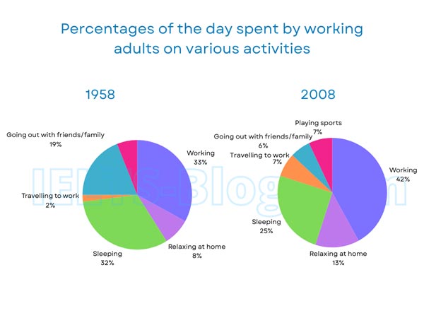
The pie charts below show how working adults in a particular country spent their time in 1958 and 2008.
Summarise the information by selecting and reporting the main features, and make comparisons where relevant.
* Note: these aren’t the original diagrams given in the test, they were recreated for the purpose of demonstration.
Student answer (Band 5.0)
The chart illustrate the working time in 1958 and 2008.In these two years that are huge percentage difference.Moreover also activities different before that there is no extre activities.However after a few years there is alot of change.
First of all in 1958 there is huge number of people working highest percentage show 33%.Addionally only one percentage low of sleeping peoples.Futhermore there is minimum lowest percentage show about travelling to work.
Secondly In 2008 there is one new activities started in this year playing sports.Adults very interested in sports in 2008.During this year more adults want ot working around 42%.After comparesions sleeping adults ratio decrease.
After both compare Adults are in 2008 very good in working and also travelling to work rather then 1958.Futhermore sleeping and relaxing at home there is no very big difference.Maybe all there percentage is same.Most least percentage is playing sports in both charts there is low percentage.
AI examiner evaluation
| Criterion | Band |
|---|---|
| Task Achievement / Task Response | 5.0 |
| Coherence and Cohesion | 5.0 |
| Lexical Resource | 4.5 |
| Grammatical Range and Accuracy | 4.5 |
| Overall | 5.0 |
Task Achievement / Task Response: Band 5.0
You identify several relevant features, including the rise in working time from 33% to 42%, the introduction of sports in 2008, and a decline in sleeping. However, the response only partially summarises the charts: the overview is vague (“there is alot of change”) and does not clearly identify the main overall shifts. Some details are inaccurate or unclear: sleeping was 32% in 1958, not “only one percentage,” and sports appears only in 2008, so it cannot be the least activity “in both charts.” The claim that sleeping and relaxing show “no very big difference” also overlooks the changes from 32% to 25% and 8% to 13%. Select the largest changes and report their figures accurately in a clear overview.
Coherence and Cohesion: Band 5.0
The response has some organisation: it moves from an opening statement to separate discussion of 1958 and 2008, then attempts a comparison. Basic signposts such as “First of all,” “Secondly,” and “After” help indicate this sequence. However, progression is not consistently clear, and several links are inaccurate or mechanical. For example, “After a few years” does not accurately describe the 50-year interval, while “After both compare” makes the final comparison difficult to follow. Ideas are also repeated, particularly the general claims that there was a large change and that adults worked more. Use a concise overview followed by paragraphs grouping the main increases and decreases, and connect comparisons directly rather than relying on repeated sequencing phrases.
Lexical Resource: Band 4.5
You use some task-relevant vocabulary, including “percentage,” “working,” “sleeping,” “travelling to work,” and “playing sports,” so the reader can recognise the activities being discussed. However, the range is limited and several word choices or collocations make the meaning unclear, such as “huge number of people working” when the chart reports proportions of time, “one new activities,” and “sleeping adults ratio.” There are also noticeable spelling and word-form errors, including “Addionally,” “Futhermore,” “alot,” and “comparesions.” Aim for precise chart language such as “the proportion of time spent,” “accounted for,” and “increased/decreased,” and check spelling and singular/plural forms before submitting.
Grammatical Range and Accuracy: Band 4.5
Most sentences rely on simple patterns, and attempts to combine ideas often contain errors that make the relationships difficult to understand. For instance, “The chart illustrate the working time” has subject–verb disagreement and an unclear noun phrase, while “In these two years that are huge percentage difference” lacks a complete, well-formed clause. Missing spaces after full stops and inconsistent sentence punctuation also affect readability. There are occasional understandable statements, such as “During this year more adults want ot working around 42%,” but the verb pattern is faulty. Practise accurate simple sentences first, then add controlled comparisons using forms such as “Working rose from 33% to 42%, whereas sleeping fell from 32% to 25%.”
See this exact question answered at other band scores. The same prompt compared across bands.
Browse more IELTS Writing model answers or get your own writing scored by the same AI examiner.