Band 5.5 IELTS Writing Task 1 Model Answer
Overall Band Score: 5.5 · Recent IELTS Exams (Canada & India) · 2026-11-16
IELTS Writing Task 1 question
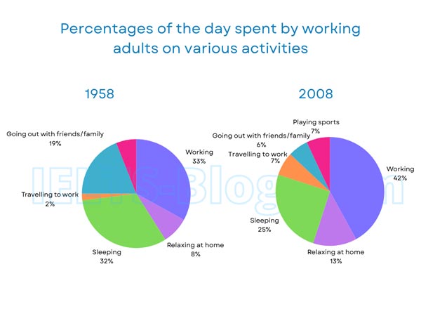
The pie charts below show how working adults in a particular country spent their time in 1958 and 2008.
Summarise the information by selecting and reporting the main features, and make comparisons where relevant.
* Note: these aren’t the original diagrams given in the test, they were recreated for the purpose of demonstration.
Student answer (Band 5.5)
The pie charts, showed above , depict the working adults spending their time on specific activities throughout the years of 1958 upto 2008 .Activities which are taken into account in both years are work, relaxation at home , sleep, travel to workplaces , recreational activities outside home with family and friends and time for sports. Both pie charts clearly indicate that time spent for working had been more than spent on any other activity during the years of 1958 and 2008 . Although the percentage of people increased from 33 percent to 42 percent . While time spent on sleep decreased simultaneously .In 1958 ,32 percent of time in a day was spent on sleeping which fell in 2008 to 25 percent. Interestingly , when in 2008 people spent less time for sleep as compared to 1958 , they spent more time for relaxation at home as it was 13 percent as compared to 8 percent in 1958. However, the percentage of time spent on playing sports had been almost in both years , but a sharp decline can be seen in timing spent for going out with family and friends from 19 percent to 6 percent in 2008. In addition to it , time for travelling to work also surged slightly from 2 percent to 7 percent in 1958 and 2008 respectively.
AI examiner evaluation
| Criterion | Band |
|---|---|
| Task Achievement / Task Response | 6.0 |
| Coherence and Cohesion | 5.5 |
| Lexical Resource | 5.5 |
| Grammatical Range and Accuracy | 5.5 |
| Overall | 5.5 |
Task Achievement / Task Response: Band 6.0
You identify the main pattern that working took the largest share in both years, and you report several accurate comparisons: work rose from 33% to 42%, sleep fell from 32% to 25%, and going out with friends and family dropped from 19% to 6%. The increase in travel and relaxation is also correctly described. However, the overview is not fully developed: it would be clearer to summarise the broad shift towards work and travel and away from sleep and social outings. The sports comparison is unclear and potentially inaccurate, since sports appears only in the 2008 chart, at 7%; it cannot be described as almost unchanged across both years. Clarifying this point and covering the categories more precisely would make the report more complete.
Coherence and Cohesion: Band 5.5
The response follows a generally understandable order, moving from an introduction to comparisons of work, sleep, relaxation, socialising and travel. Linking expressions such as “Although,” “Interestingly” and “In addition to it” help signal relationships between points. However, the ideas are presented as one continuous paragraph, so the overview and detailed comparisons are not clearly separated. Some links are also awkward or incomplete: “Although the percentage of people increased…” is left as a fragment, and “However” does not clearly establish a contrast in the sports sentence. Grouping the main trends into paragraphs and using transitions that accurately express comparison or contrast would create clearer progression and reduce the impression of a list.
Lexical Resource: Band 5.5
You use a reasonable range of topic vocabulary, including “percentage,” “decreased,” “sharp decline” and “surged,” which helps describe changes. Some choices, however, are unnatural or imprecise for chart reporting. “The working adults spending their time” is an awkward description, while “timing spent” and “percentage of people” do not accurately express the share of a day allocated to an activity. The phrase “had been almost in both years” is also unclear, particularly for sports, which is shown only in 2008. Aim for precise collocations such as “the proportion of the day spent” and “remained stable,” using the latter only when the charts provide values for both years. This would make the comparisons more fluent and exact.
Grammatical Range and Accuracy: Band 5.5
You attempt a mix of simple and complex sentences, including comparisons with “as compared to” and clauses introduced by “Although” and “when.” The main meaning is usually recoverable, but some sentence structures are incomplete or awkward. “Although the percentage of people increased from 33 percent to 42 percent” is a dependent clause without a main clause, and “However, the percentage … had been almost in both years” lacks a complete grammatical structure. There are also inconsistent tense choices, such as “had been” for chart data, and punctuation spacing is uneven. Use the present simple for chart descriptions (“work accounted for”), and check that every subordinate clause is attached to a complete sentence. These changes would improve accuracy while retaining sentence variety.
See this exact question answered at other band scores. The same prompt compared across bands.
Browse more IELTS Writing model answers or get your own writing scored by the same AI examiner.